


For this blog post, we’re joined by performance marketing & growth consultant Elise Zareie.
When iOS 14+ rolled out, targeting precision disappeared overnight. Meta responded with Andromeda, its AI-driven ad infrastructure, shifting the industry toward broad audiences. And in this new reality, ad creatives took over the job that targeting algorithms used to do.
Phil Carter, founder & CEO of Elemental Growth, explained it in a recent FunnelFox State of web2app report webinar: “Creative is the new targeting. Especially with Andromeda now, creative is really the only way to differentiate and get maximum paid ad efficiency.”
For web2app, this makes creative quality even more critical. The user journey is longer than in traditional app install campaigns: ad → landing page → quiz → paywall → payment → download → app. Each additional step creates friction. Each screen is a potential drop-off point.
In this article, we’ll cover the 3 essential functions ad creatives must perform to reduce those drop-offs, boost conversion, and ultimately improve ROAS and LTV.
What makes web-to-app ad creatives different
Traditional mobile install ads optimize for app store visits. The App Store page does the heavy lifting from there. Users make decisions in a familiar, trusted environment with reviews, screenshots, and Apple’s credibility backing the transaction.
Web-to-app sends users to an unfamiliar website. They’ll answer quiz questions, see personalized results, and make a payment decision—all before they ever reach an app store. The creative must prepare them for this entire journey.
According to data from the FunnelFox State of web2app report, more than 50% of users drop off after the very first screen in the onboarding experience:
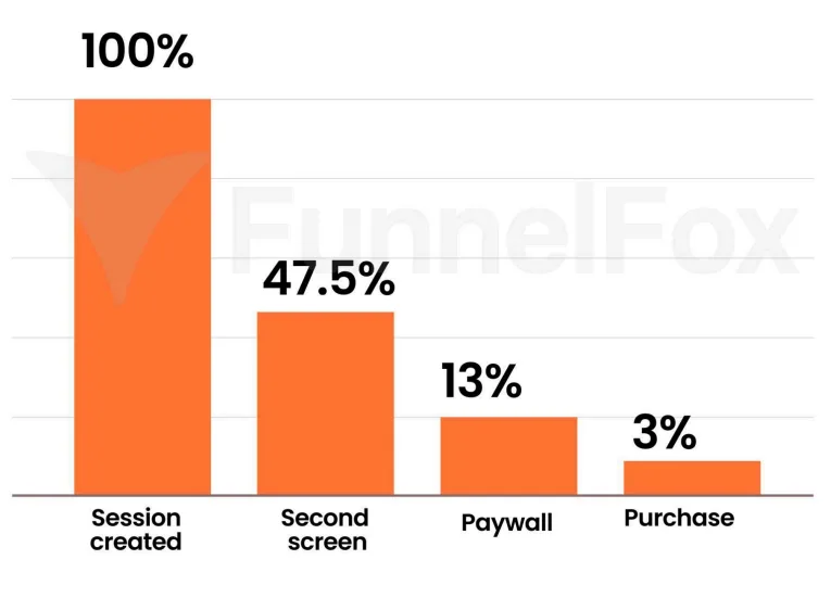
What this reveals: the ad creative determines who enters your funnel, making it the first and most critical filter in your conversion path.
Here’s an example. The same funnel can produce wildly different results purely based on which creative drove the traffic:
| Creative | CTR | Conversion Rate | Cost Per Purchase |
| Creative A | 0.5% | 3.3% | $85 |
| Creative B | 2.5% | 0.6% | $75 |
| Creative C | 0.8% | 6.8% | $70 |
Creative B and Creative C both hit similar cost per purchase numbers. But Creative B converts at 0.6% while Creative C converts at 6.8%—that’s more than 10x difference. Same funnel but different audience intent.
This proves why audience qualification is critical. Web-to-app creatives must filter for intent and set accurate expectations from the first impression.
3 jobs every web-to-app ad creative must do
Pre-qualify the right users
Your creative should filter for intent, clearly signaling who your app is for and who it’s not for. Generic promises like “Reduce stress instantly” attract curiosity clicks from anyone scrolling past. Specific positioning like “Guided meditation for busy professionals struggling with anxiety and sleep” pre-qualifies your audience before they click.
The best creatives show the actual quiz interface or mention the effort required upfront. “Answer 12 questions to get your customized plan” tells users exactly what to expect. Users who aren’t willing to answer 12 questions will scroll past. That’s exactly what you want.
Include qualifying criteria directly in your creative copy:
- Target demographic: “For professionals 25-45”;
- Specific goal: “Struggling with racing thoughts at bedtime”;
- Commitment level: “Ready to practice 10 minutes daily”;
- Current state: “New to meditation or inconsistent practice”.
When you skip this qualification step, the wrong audience enters your funnel, realizes it’s not for them, and bounces. You just burned ad spend on users who were never going to convert.
Web funnels tend to target & convert older audiences more effectively, so web2app creatives should reflect this. Visuals and messaging shouldn’t just address the pain points in your funnel, they should also speak to a more mature audience in tone & emotional resonance.

Pre-educate expectations
If your creative doesn’t prepare users for what comes next, they’ll feel confused as soon as they land on your page. That confusion creates immediate friction and erodes trust before the funnel even begins.
Preview the quiz in your creative: “Answer a few questions about your lifestyle and goals.” Show what they’ll get: “Receive your personalized 12-week meal plan.” Indicate time investment: “Takes 2 minutes to complete.”
Use actual screenshots or interface previews when possible. Show the quiz questions. Show the results screen. Make it clear this isn’t a one-click solution—it’s a brief personalized experience that leads to real value.
Here’s a critical insight from the FunnelFox webinar from Phil Carter:
Never ask a question in your quiz that your ad creative already answered. If your ad targets “nutrition” specifically, don’t make the first quiz question “Are you interested in nutrition or strength training?” The ad already established nutrition interest. Asking again creates unnecessary friction and makes users question your competence.

Your first quiz question should build on what the ad established, not repeat it. Each question should feel like a natural progression toward personalization.
Elise Zareie recommends taking this transparency even further:
A body format worth reusing for web2app: film someone answering the funnel questions over the shoulder on their phone. It keeps it authentic: users aren’t getting a false experience before they click. Test different hooks/intros around it, but keep the core footage the same.
Pre-frame value
By the time users see your paywall, they should already understand why they need to pay. Your creative starts building this value perception before the click even happens. Focus on outcomes, not features.
Compare these two approaches:
- Feature-focused: “Access to 500+ guided meditations and breathing exercises”
- Outcome-focused: “Fall asleep in 10 minutes with personalized bedtime meditations for your stress patterns”
The outcome version connects directly to what users actually want. Nobody wakes up wanting “access to 500 meditations.” They wake up wanting to sleep better, feel calmer, or reduce anxiety.
Use before/after visuals strategically. Show personalization benefits: “Plans customized to your metabolism and schedule.” Make the value-to-price equation obvious before users ever reach your paywall. When the paywall appears, it should feel like a natural next step, not a surprise roadblock.
Remember this framework: your creative makes a promise, your funnel delivers on that promise. Any mismatch between the two creates drop-off. Alignment between ad promise and funnel delivery is non-negotiable for strong conversion rates.
If your funnel has assessment results (language learning, education apps especially), use it in creative. Show someone reacting to their result: “I can’t believe this, I’m actually a visual learner, not a passive learner.” LP should mirror it: “Find out what kind of learner you are + build a study plan.”
Where teams get ad creatives wrong
1. Optimizing for CTR instead of payback
High CTR feels like success. Your team celebrates the 2.5% CTR. But if those clicks convert at 0.6%, you’re just burning money faster.
Track cost per purchase (CPS) or ROAS, not proxy metrics. Creative A with 0.5% CTR and 3.3% conversion can outperform Creative B with 2.5% CTR and 0.6% conversion on actual business metrics. Track what actually matters: how much revenue each creative generates per dollar spent.
Web2app creative success follows the same rules as D2A: clicks don’t matter, conversions do. The difference is you’re not optimising for a trial started in-app, you’re optimising for a subscription on a hard paywall.
2. Testing the wrong things
Teams A/B test button colors, image variations, and CTA copy. While the real driver is your value proposition and positioning. Different promises attract different audiences with completely different intent levels.
Test different value propositions, not just visual variations:
- Promise A: “Reduce anxiety with personalized meditation”
- Promise B: “Sleep better with science-backed breathing techniques”
- Promise C: “Find calm with mindfulness practices for busy schedules”
These positioning tests will attract fundamentally different audiences with different goals, different willingness to pay, and different conversion behaviors.
| 💡BetterMe demonstrates this principle at scale. They produce 500-1,000 creatives per funnel monthly, testing the same core message across different formats, voices, and audiences. Only 1-2% become winners—but those winners are built on systematic promise testing, not aesthetic tweaks.s. Learn how they structure their creative production system in our analysis of 75,000+ BetterMe ads. |
3. Scaling ads before validating the funnel
Better creatives amplify what already exists in your funnel. If your funnel converts poorly, more traffic just means more wasted spend. Start with small tests. Validate conversion at low volume. Prove unit economics work. Then scale with confidence.
4. Viewing ads, landing pages, and monetization as separate efforts
Ad teams optimize for clicks. Product teams optimize pages. Monetization teams optimize pricing. But users experience one connected journey. Optimize the entire creative → landing → paywall → conversion flow together, not as isolated pieces.
How ad creatives fit into your web-to-app system
Your creative is just one part of a connected loop: Creative → Landing page → Quiz → Paywall → Purchase → Onboarding → Retention. Each stage must reinforce what came before. Breaking the chain anywhere breaks overall performance.
Consider these scenarios:
| Scenario | Result |
| Great creative + weak landing page | Ad promises personalization, landing is generic → drop-off on first screen |
| Great creative + great landing + wrong paywall | Ad attracts sleep-focused audience, paywall focuses on stress management features → drop-off at payment |
| Great creative + weak product | Users subscribe based on promise, product doesn’t deliver → high churn, efficiency drops over time |
This alignment requirement becomes even more critical at scale:
Funnels that scale have a clear line from creative → first page → paywall. If you want to test fast, build a base funnel where you can swap in the language from your top creative (ex: if your ad says “cortisol spike”, it should show up on the first page and paywall too). You don’t need to rework every question, just make sure the main selling point is reinforced along the way.
Better creatives bring more qualified users into your funnel—but if the funnel itself is broken, they’ll only expose the problems faster.
Start by fixing the funnel. Make sure your quiz flow works, your paywall converts, and your product delivers on its promises. Once that foundation is solid, optimize creatives to bring the right users into a system you’ve already validated.
Begin with a funnel that works, even if it’s simple. Use creatives to attract qualified users, observe how they move through the flow, and improve the funnel based on what you learn. Then repeat.
What to validate before scaling
Before investing heavily in ad creative testing and scale, validate these four critical alignment points:
Does your landing page repeat the ad promise? Show your ad creative and welcome screen side by side. Do they feel connected? Is the visual language consistent? Does the tone match? If a user clicks your ad and lands on a completely different experience, you’ve already lost them.
Is friction explained before asking for payment? Does your quiz set clear expectations about length and effort? Is the value proposition visible throughout the journey? Does the pre-paywall screen build enough value that payment feels justified? Users should understand exactly what they’re paying for before they see the price.
Is value visible early enough? Can users see or experience value before committing money? Do they receive personalized feedback during the quiz? Can they preview their results or plan? Are trust signals and social proof present throughout? The paywall should feel like the natural next step after experiencing value, not a surprise barrier.
Can this flow be tested quickly? Do you have the technical setup to launch new variants rapidly? Are analytics in place to measure each step? Can you launch a new creative → funnel variant in hours or days instead of weeks? Speed of iteration often matters more than perfection.
Use this validation checklist before scaling:
The new reality of web-to-app advertising
Creative is the new targeting. With iOS 14+ privacy changes, broad audiences became standard. Creatives now do the filtering work that targeting algorithms used to handle. For web-to-app specifically, this matters even more because the user journey is longer and each step adds potential drop-off risk.
Marcus Burke, Meta Ads & App Growth Consultant, noted in the State of web2app webinar: “Everything is accelerating – more funnels, more creatives. Creative production is happening at a much faster pace. Web funnels become an extension of the ad when you make one for each ad.”
Your ad creatives must do three jobs: pre-qualify the right users, pre-educate expectations, and pre-frame value. Skip any of these jobs and your funnel performance suffers, regardless of how well-built the funnel itself might be.
High-performing teams optimize differently. They test value propositions, not just visual variations. They optimize for cost per purchase and ROAS, not click-through rate. They validate funnels with small tests before scaling spend. Most importantly, they align every step of the user journey from ad creative through product delivery.
Tools like FunnelFox make this iterative approach possible. No-code funnel building means you can test creative → funnel alignment in hours instead of weeks. Start with one winning creative and one aligned funnel. Validate the unit economics and then scale from proven performance.
The opportunity is clear: web-to-app ad spend is growing rapidly because it works. But only when every piece of the system—from creative to funnel to product—works together as one connected experience.