


So your lead went through onboarding. They got a personalized plan, saw the pricing, reached the checkout, and… disappeared.
At this point, they already understand what your product is and how it could help. But something is stopping them from paying. Here’s what usually gets in the way:
- Doubt in personal value: They get what the product does in general, but they’re not sold on what it’ll do for them specifically.
- Price hesitation: It sounds useful, but the price feels too high “right now”, or they’re unsure they’ll use it often enough to justify the subscription.
- Subscription anxiety: The product itself isn’t the problem; it’s the commitment, auto-charges, hidden cancellations, and forgetting to unsubscribe that make users doubt.
- Delayed intent: They closed the tab, got distracted, or decided to come back later. It’s not a rejection, something else blocked the next step.
No matter the reason, one thing is clear: these are your warmest, highest-intent users. They made it all the way to the end, but didn’t cross the line. The good news? App retargeting gives more than one shot to change their mind. What makes the difference is how you show up in those next conversations.
How to structure app retargeting funnel after an abandoned checkout: 6 mechanics
One retargeting email won’t do much. What works is a layered strategy that chips away at hesitation and brings the user back to complete the purchase.
1. Personalize the message
Your message should be about the user, not the product. Their goal, plan, expected outcome, their pain point, and their path.
Users shouldn’t see a generic offer — instead, show them a clear continuation of the onboarding they started.
2. Reframe the value
If the original pitch didn’t work, repeating it won’t help. Instead, approach it from a different angle. Highlight something new: the time they’ll save, a specific outcome they can measure, or a quick win they’ll get right after paying.
3. Remove the risk
Users often hesitate to pay when they’re unsure about the financial commitment. To ease that hesitation, use risk-reducers: a free trial, money-back guarantee, flexible pause options instead of fixed plans, and a clear cancellation flow. They should feel in control and know they can cancel anytime without stress.
4. Use social proof
People want to know they’re not the only ones hesitating and that others like them have already made the leap. Add success stories that match their profile, use case, and experience level to your retargeting emails. Ratings, reviews, and real results help lower uncertainty and replace hesitation with confidence: “If it worked for them, it can work for me too.”
5. Add time-limited offers
Deadlines create a natural push to act, and a simple “today only” or “48 hours left” can turn passive intent into real action. Make sure the offer supports the decision: it should speed it up, not replace the product’s value.
6. Get the timing and rhythm right
App retargeting should be a short, focused series — not a one-off nudge, and not an endless chase.
The first 24–72 hours matter most, so that’s when you want the highest frequency. After that, ease the pace and move toward a clear deadline around day 10–14.
And know when to stop. If the user’s opening, clicking, and revisiting your pricing, you can gently increase urgency. If they ignore multiple touches in a row, it’s better to wrap the sequence and move them into a low-pressure nurture flow — ending well lowers frustration and leaves the door open for a return later.
Now that you know the mechanics, let’s see how top apps put them to work and what you can borrow from their strategies.
Noom: Deadlines and the fear of missing out
Noom treats post-onboarding retargeting like a full conversion system. Each of the tactics they use to guide users back to a purchase decision maps directly to a core reason why they drop off after onboarding.
1. Framing the message through the user’s personal goal
Noom doesn’t re-explain the product after onboarding. Instead, it brings the user back to their personal goal and the custom plan that’s been created by:
- Showing a clear expected outcome (target weight, timeline, goal).
- Lowering commitment pressure by offering a free trial upfront.
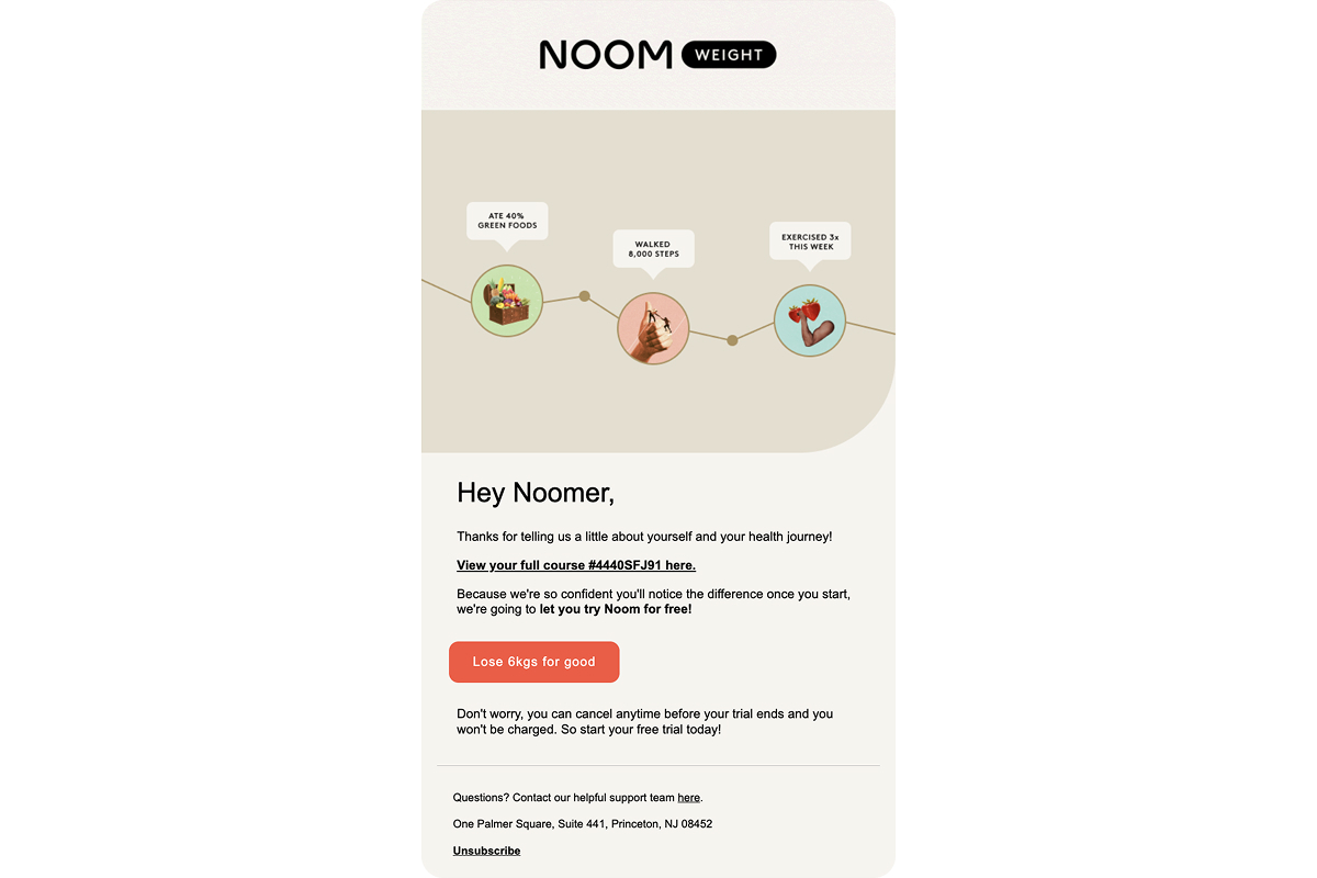
Why it works: The email picks up right where the user left off with a clear, personal plan in place. It returns the user to their own success path they started, not to the product.
2. Reinforcing confidence with social proof
This retargeting email builds trust by showing scale and real results. Here’s how:
- Shares a clear stat: how much the average user loses.
- Includes a quote from a real person.
- Sets expectations with a time frame for early results.
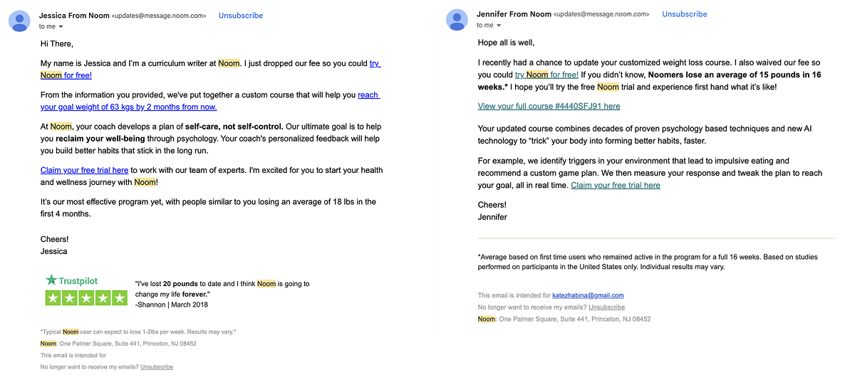
Why it works: Seeing real outcomes from real people helps users feel more certain. It replaces abstract value with proof that the product works for people like them.
3. Deadline as a pure trigger for action
This email doesn’t explain the product. It exists purely to prompt action:
- Announces a time limit and sets a 24-hour deadline.
- Puts the promo code at the top.
- Skips the argumentation and goes straight for the push.
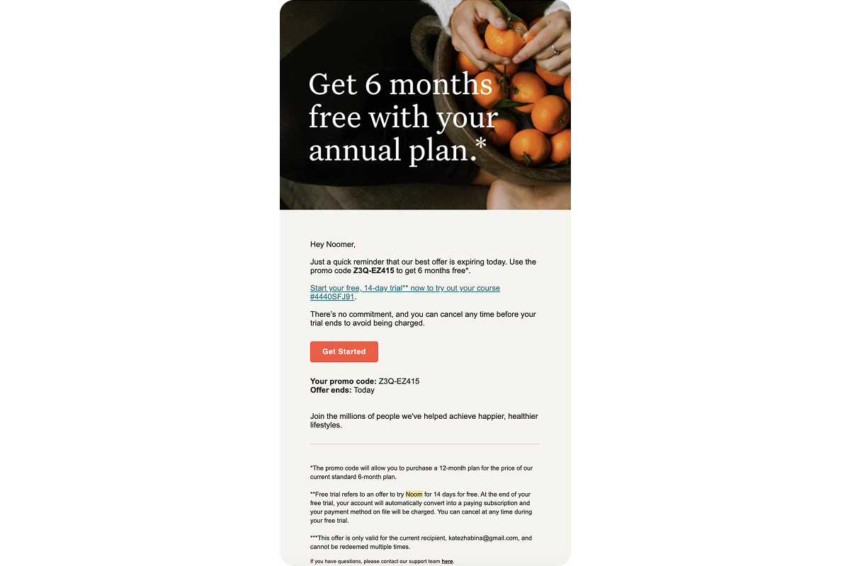
Why it works: The user has seen the value and offer. The deadline adds urgency and pushes them to act now.
4. Reframing the value through a different lens
Look how Noom changes the perspective with this email by:
- Shifting focus from weight loss to habits.
- Highlighting a sustainable, long-term process over quick results.
- Introducing new angles like structure, consistency, and small daily wins.
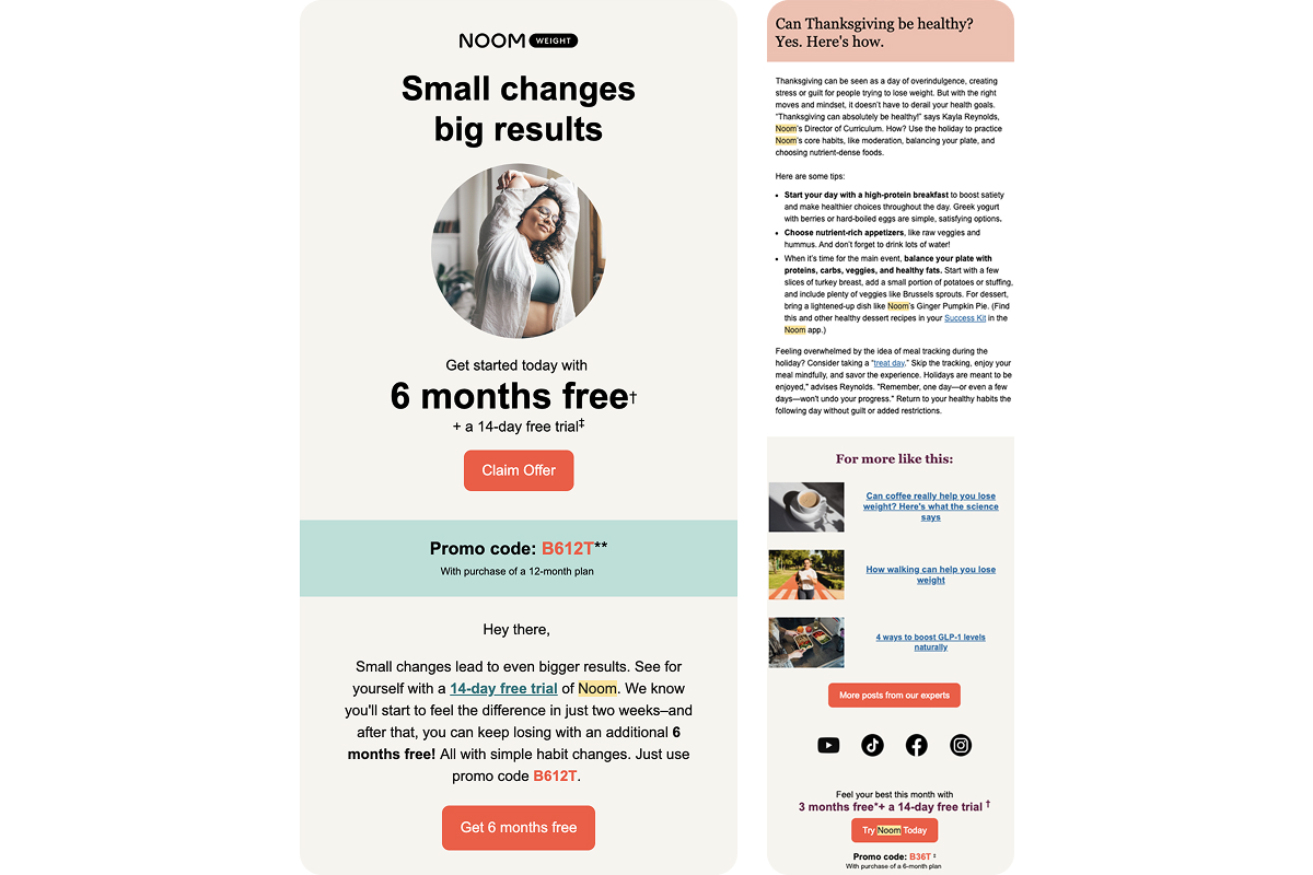
Why it works: Sometimes value doesn’t land the first time. A new framing can make the same offer resonate more clearly and feel more achievable.
5. Addressing subscription anxiety upfront
For many users, the main hesitation isn’t the product — it’s the subscription model. Here’s how Noom addresses this anxiety:
- Repeats “cancel anytime” in every email.
- Highlights that there’s no long-term commitment.
- Presents the free trial as a low-pressure way to begin
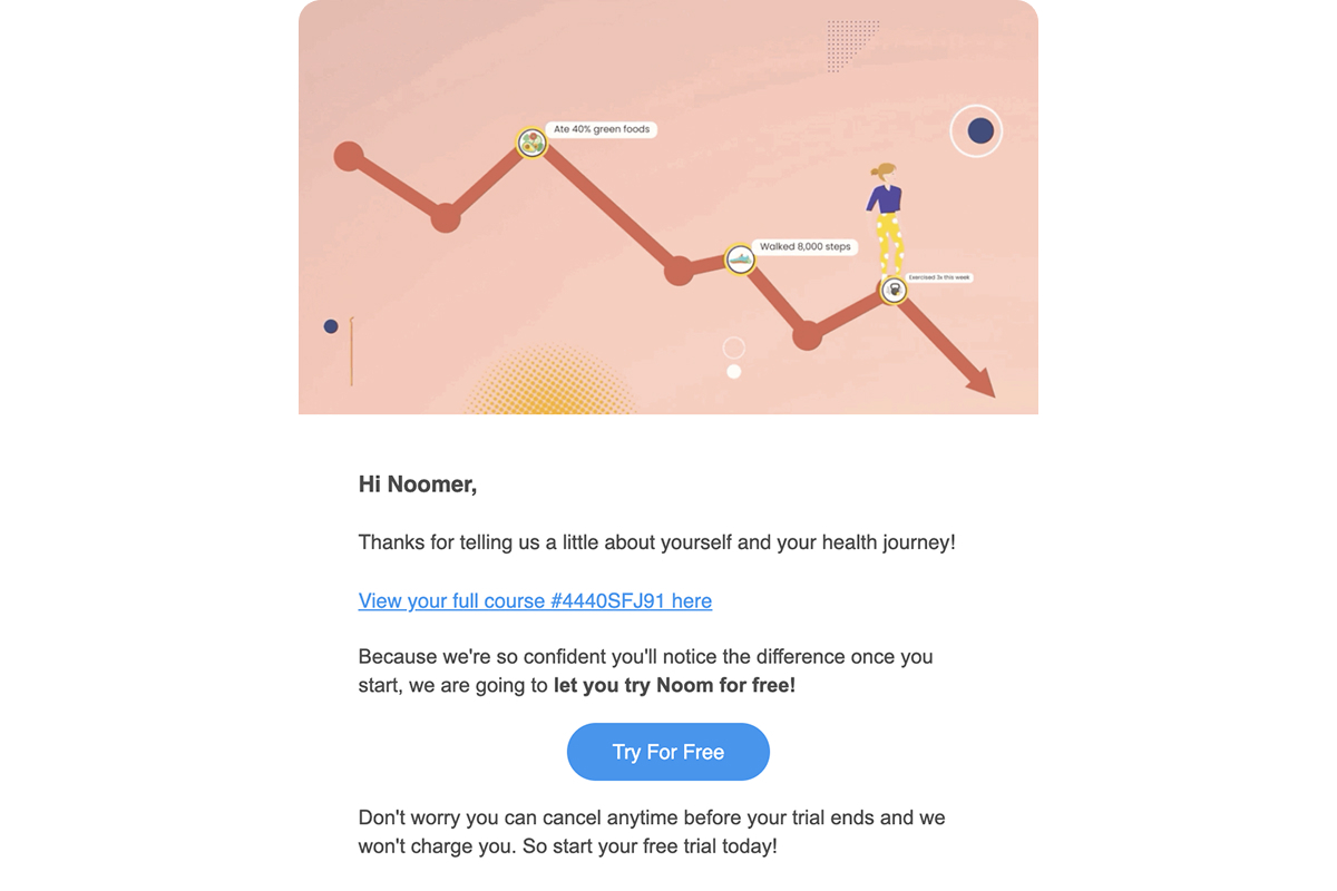
Why it works: Clear, repeated language helps reduce uncertainty. When users feel in control of canceling, they’re more open to trying.
Key takeaways from Noom’s strategy
Noom’s retargeting funnel isn’t about discounts. It doesn’t repeat the same arguments. And they’re not trying to sound friendly just for the sake of it.
This is a system built to remove the four biggest blockers that stop users from converting after onboarding:
- “I’m not sure it’ll work for me” — personalize the plan.
- “I don’t think I can follow through” — show proof from others.
- “Now’s not the right time” — create urgency.
- “I don’t trust subscriptions” — lower the risk.
BetterMe: Aggressive personalization and escalating offers
BetterMe’s post-onboarding flow mimics a personal coaching dialogue where every message adds a little more pressure using three main levers:
- a personalized plan,
- a deadline,
- an increasing discount.
The tone feels one-on-one, but the entire sequence is fully automated.
1. Personalization with a sense of missed opportunity
The message frames the offer as something prepared but still unclaimed. That small change softens the emotional tone of the decision:
- Uses the user’s name from the start.
- Confirms that a custom plan is ready.
- Points out it hasn’t been claimed yet.
- Adds a 24-hour deadline to create urgency.
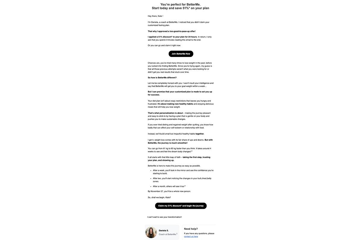
Why it works: The plan feels like it belongs to the user. Choosing not to act feels like missing out on something personal.
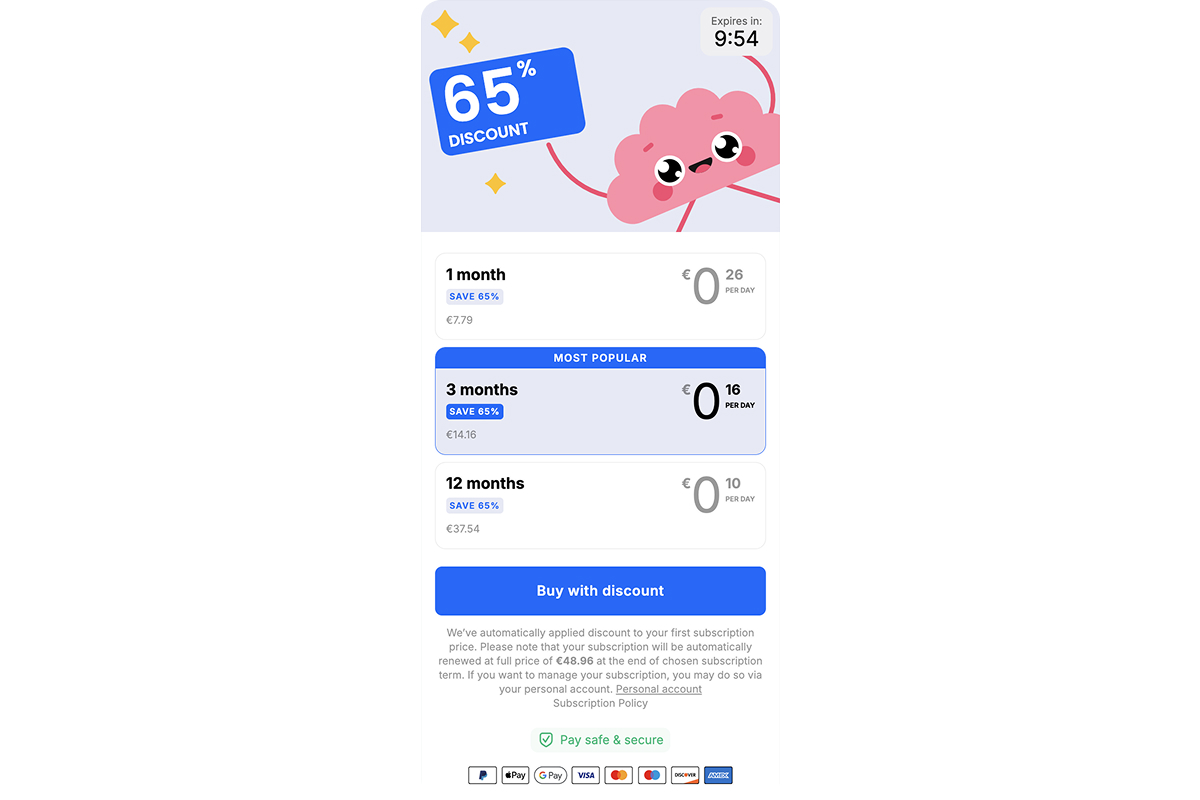
2. Visualizing the result before payment
Before asking for a purchase, BetterMe shows users what success could look like, and they do it in visual, personal terms:
- Displays the current state alongside the target.
- Highlights a specific goal in kg.
- Presents three plan options with pricing.
- Labels one as the “Most popular” choice.
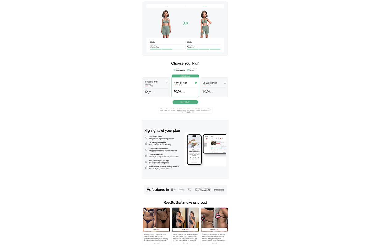
Why it works: The user mentally steps into the outcome before they’ve paid. They’re not buying a subscription — they’re committing to a result they’ve already imagined.
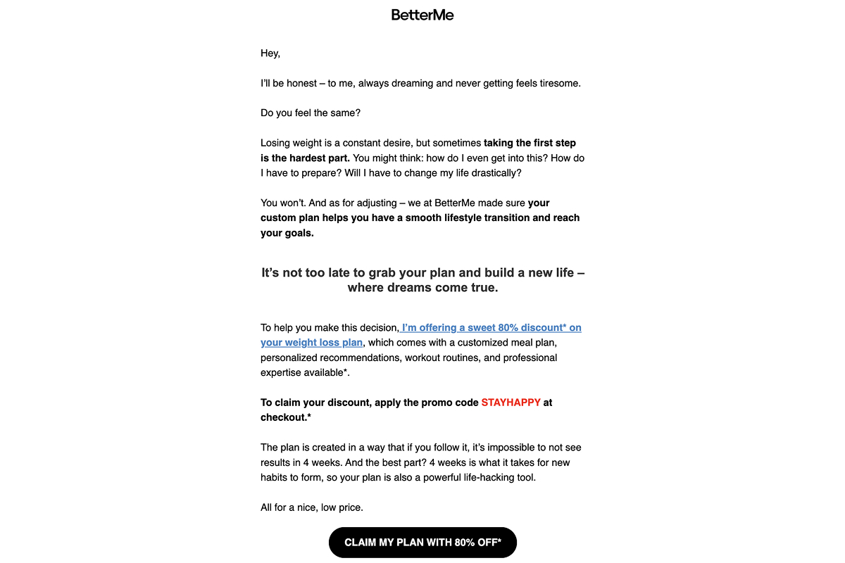
3. Hard deadline and a steep discount jump
The pressure increases sharply at this stage. The message leans into urgency and adds a heavier discount:
- Signals that the offer is about to expire.
- Frames it as a last chance.
- Adds a visible countdown timer.
- Boosts the discount to 80% to justify fast action.
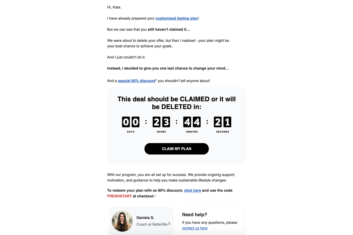
Why it works: The sense of “I’ll think about it” disappears. Urgency kicks in, and the bigger discount gives users a reason to act quickly without overthinking.
4. Building trust and reducing risk
After several urgency-driven touches, this message brings in reassurance. The tone moves toward safety and trust:
- Acknowledges the abandoned cart directly.
- Repeats the key benefits of the plan.
- Introduces a 30-day money-back guarantee.
- Confirms the refund is “no questions asked.”
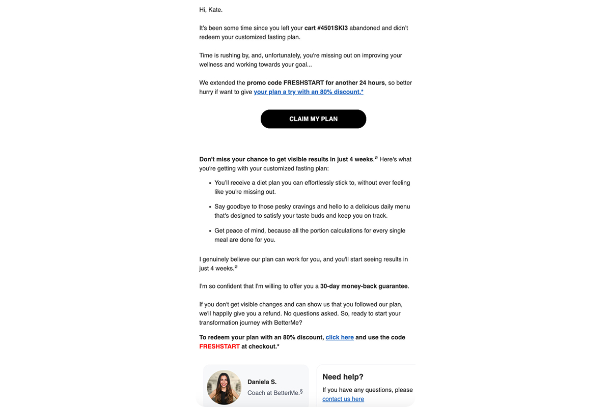
Why it works: It offsets the pressure from earlier emails by making the decision feel safe. The perceived risk moves away from the user and lands on the product instead.
5. Escalating the offer to reinforce action
The offer keeps evolving. The next retargeting email introduces a sense of negotiation and urgency layered over time:
- Frames a “technical issue” as the reason for upgrading the discount from 80% to 90%.
- Sends a follow-up sequence with messages like “offer expiring,” “price going back up,” “12 hours left.”
- Repeats the same CTA throughout: Claim my plan.
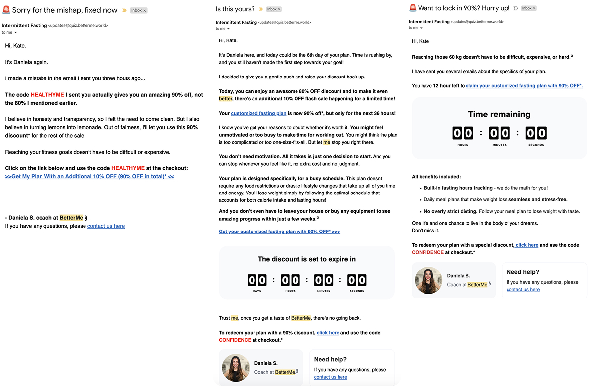
Why it works: The user feels like they’ve earned a better deal. Each new deadline creates a fresh reason to act, while the repeated CTA lowers friction with every touch.
6. Emotional push over functional logic
At the end of the sequence, BetterMe drops the rational pitch entirely. The tone moves to pure emotion:
- Uses emotionally loaded language.
- Taps into fear of missing out on change.
- Reassures the user that it will be easy.
- Frames the discount as one final nudge.
Why it works: By this point, logic gives way to feeling. The user stops comparing products and starts comparing who they are now with who they could be.
Key takeaways from BetterMe’s strategy
BetterMe follows a clear escalation model. It starts with a personalized plan delivered in a calm tone, then introduces a limited-time offer, followed by a hard deadline. From there, the discount increases, a money-back guarantee is added, and the final touch is a purely emotional push. Each email builds more pressure by raising the stakes and moves the user closer to making a decision.
Headway: Scenario-based nudging with a soft discount ramp
Unlike wellness apps, Headway doesn’t sell a physical outcome — it sells a mental habit. That calls for a different tone.
The retargeting strategy creates a quiet sense of progress in motion. Instead of urgency or pressure, it relies on small cues that gently bring users back in. Here are four tactics Headway uses to re-engage users after onboarding.
1. Personalization anchored to a saved plan
The message refers back to the quiz results and positions the plan as built. There’s no re-explaining, no feature selling — only a gentle prompt to pick up where the user left off:
- Highlights that the plan is personalized (“based on your answers…”).
- Shows visual progress (e.g., day 1 → day 30).
- Invites the user to unlock a tailored path.
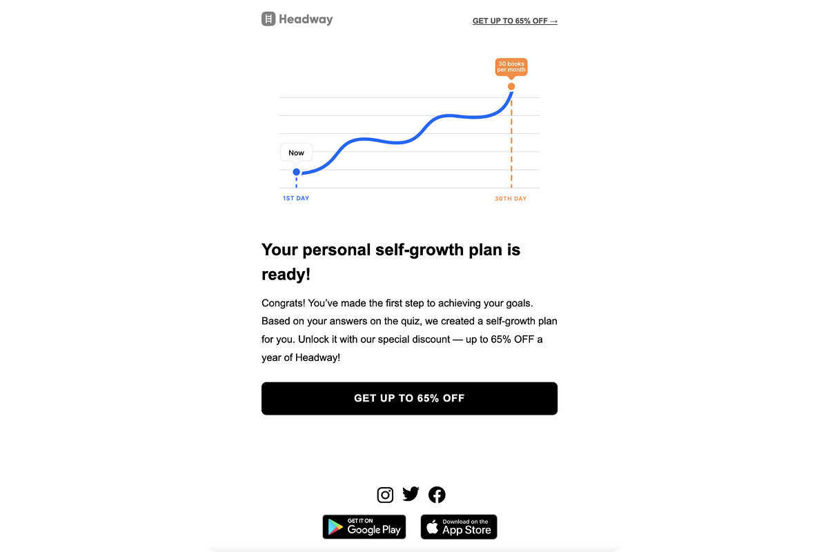
Why it works: The user isn’t being re-sold the product. They’re continuing a journey they started on their own terms.
2. Turning value into a daily habit
The message shifts focus from reading more to growing a little every day. It lowers the barrier to entry and makes the value feel concrete and doable:
- Specifies a short, daily commitment (“15 minutes a day”).
- Frames Headway as a tool rather than a content library.
- Presents personal growth as simple, light, and part of your routine.
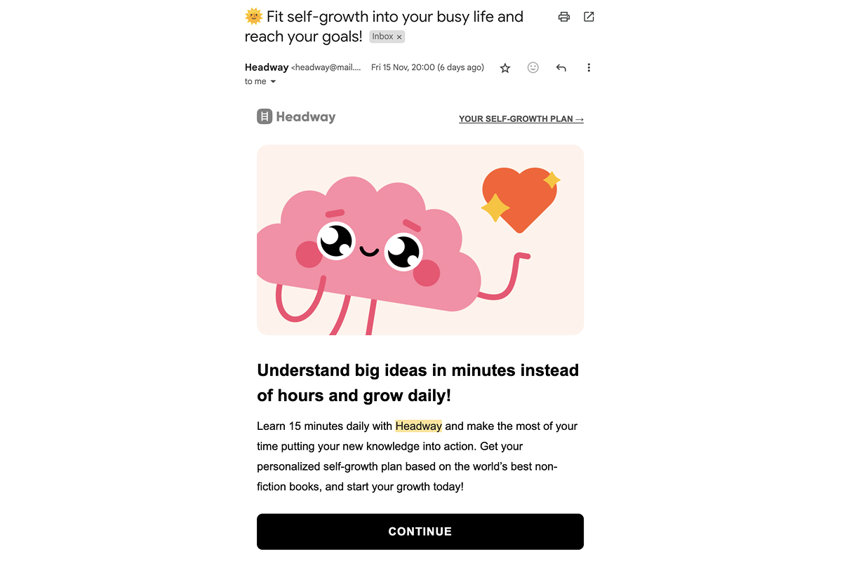
Why it works: The value feels real and easy to act on. Headway connects personal growth to a daily rhythm that the user can stick to.
3. Social proof without people
Instead of showing user photos or reviews, Headway leans on taste. The email presents a curated list of books chosen by people with similar goals:
- Displays visual book covers.
- Notes that the selection comes from users “like you.”
- Builds trust through relevance, not testimonials.
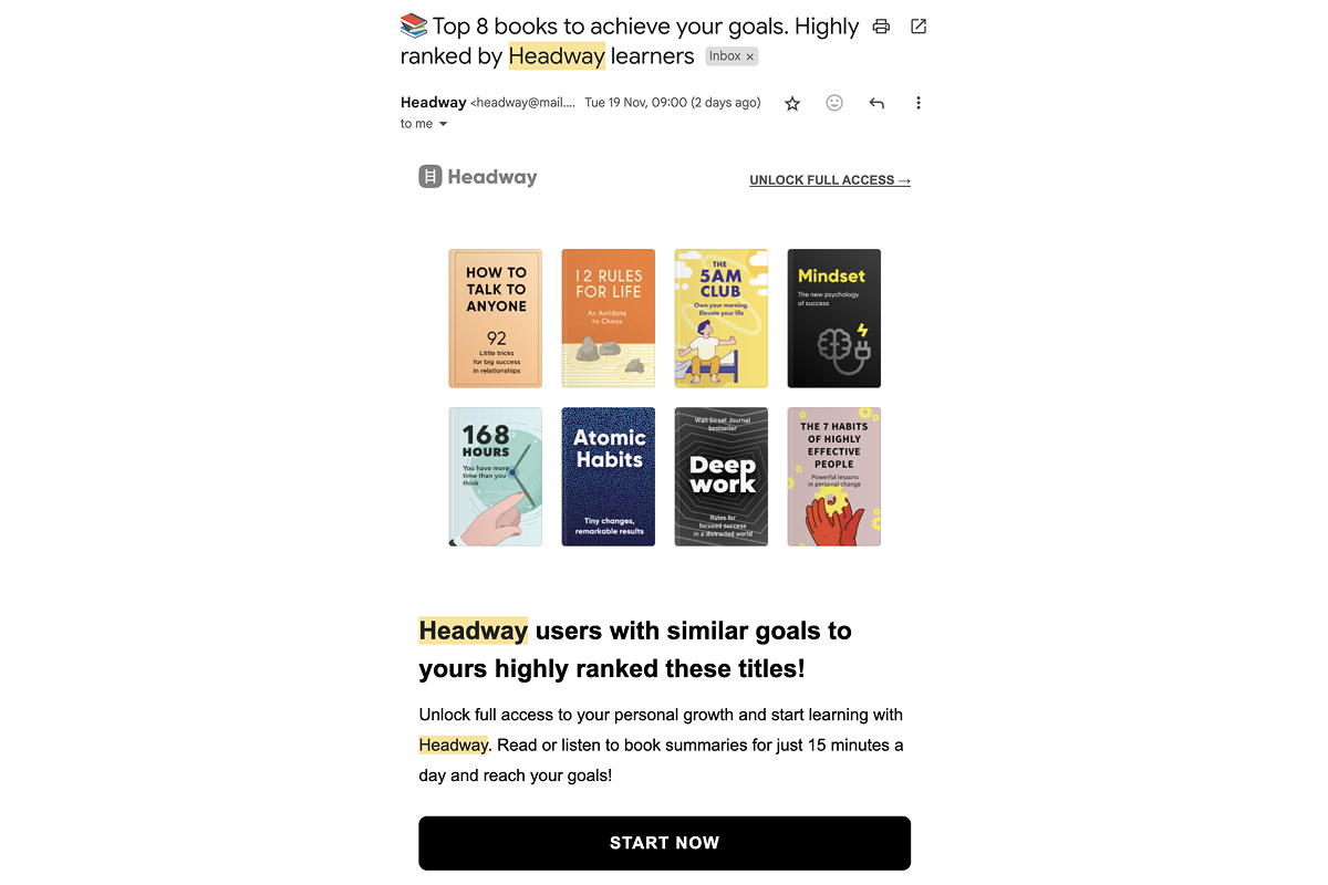
Why it works: This type of proof feels neutral and non-intrusive. It lowers resistance by showing content that resonates with similar users.
4. Soft deadline with visual framing
The offer comes with simple visuals: a branded brain character and a countdown timer. It adds light urgency without creating pressure:
- Mentions that the discount is available for a limited time.
- Places a visible timer near the pricing.
- Repeats the discount message across touchpoints (email + landing page).
Why it works: The time limit feels gentle. It nudges the user to act without making the decision feel forced.
Key takeaways from Headway’s strategy
Headway isn’t focused on selling a subscription. The strategy lowers resistance to taking the next step — gently, without pressure, fear, or big promises. The core message is simple: your progress has begun.
MadMuscles: Data-driven personalization with early wins and peer pressure
MadMuscles does more than simply showing a plan — it sells a personalized body upgrade built from quiz data. The focus is on making the plan feel tailored, real, and already started, backed by light social pressure and a clear promise of early results.
1. Personalization as justification for price
From the start, the email makes it clear that the plan was built using the user’s quiz answers, including body type, age, goals, and fitness level. The message positions customization as the reason for the price:
- Lists individual data points like age, goal, body type, and difficulty level.
- Explains how those inputs shaped the plan.
- Reinforces the sense that the product was built specifically for this user.
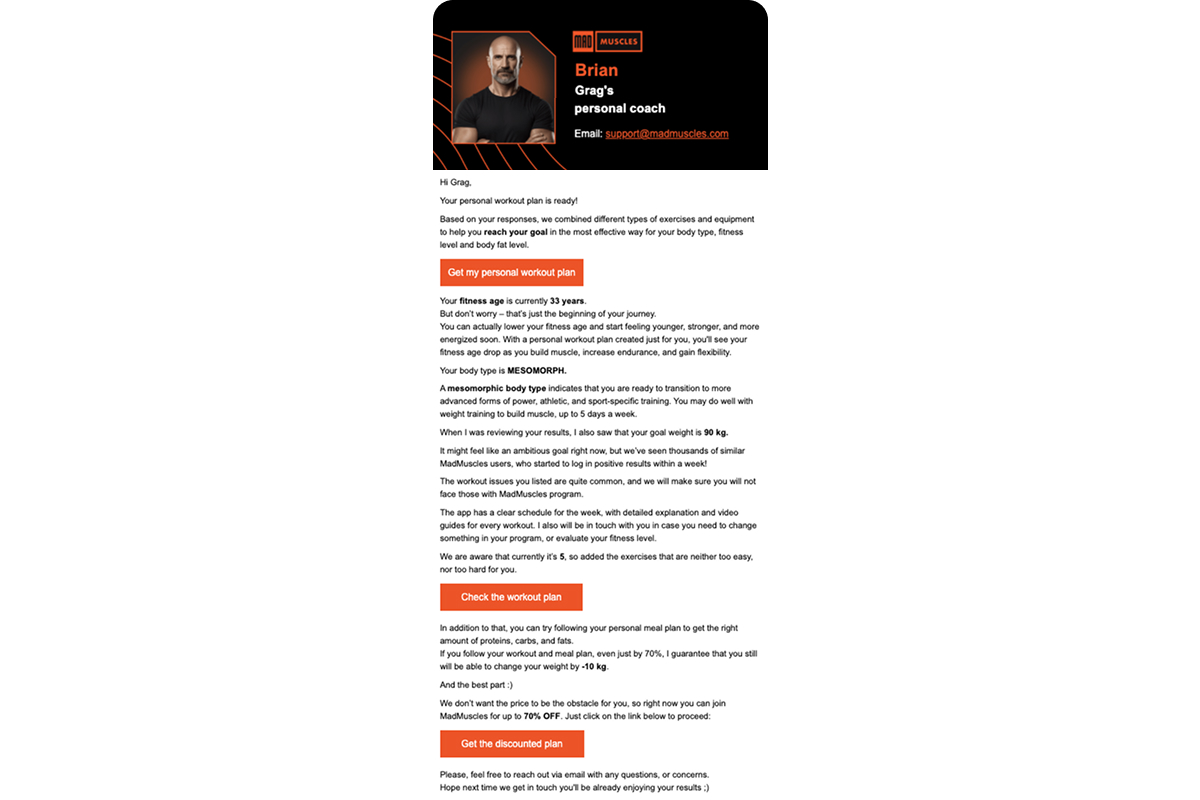
Why it works: Instead of listing features, the message emphasizes the effort put into personalization, which makes the cost feel tied to real work, not merely the outcome.
2. Reducing the fear of not being able to follow through
This message helps ease the anxiety that comes with starting something new. It introduces key metrics and tips in a calm, low-pressure tone:
- Shares BMI, daily calorie needs, and water intake targets.
- Explains how the program adjusts to the user’s level.
- Includes a soft coaching tip (like balancing sugar and protein).
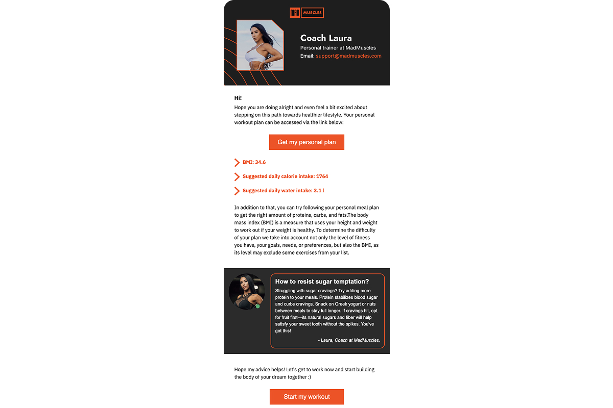
Why it works: The user sees a clear, manageable plan. Progress feels possible, and the first step doesn’t feel overwhelming.
3. Using scale as social proof
MadMuscles leans on big numbers to build credibility, both playful and precise. The message stacks data points to show how many users have succeeded:
- Mentions over 745,000 users, 60,000+ biceps tracked, and typical results within 7–10 days.
- Answers key concerns directly: what’s included, how soon results show up.
- Repeats the 24-hour deadline to keep urgency in play.
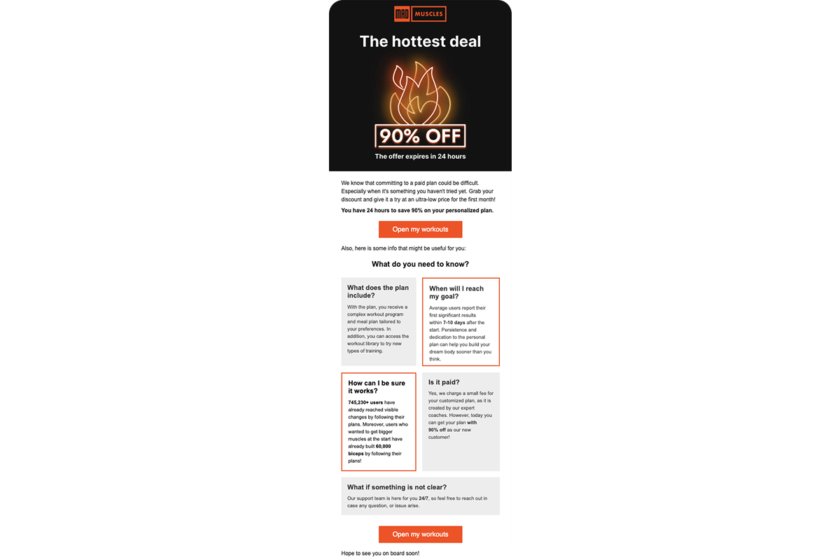
Why it works: Large, specific numbers feel more trustworthy than marketing language. They create a sense that the system is proven and working at scale.
4. Escalating the offer with a “just for you” trigger
This is a classic move: the user has been active (opening emails), and the system responds by reactivating their offer, now with an extra 5% off. The setup builds subtle pressure to act:
- Calls out user behavior: “I saw you’ve been opening emails…”
- Frames the offer as reactivated and short-lived: “only 24 hours.”
- Reinforces the CTA with a stacked discount.
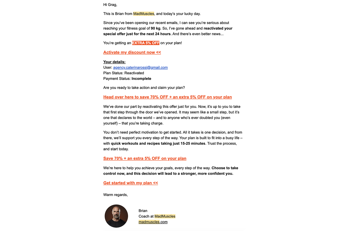
Why it works: The offer feels customized and time-sensitive. Even if the original discount didn’t convert, this version adds enough tension to push the user closer to action.
5. Disarming rational doubts
This retargeting email taps into the user’s inner hesitation (is it even worth starting?) and answers it with a light, self-aware tone. It’s framed as a joke, but it serves a clear purpose: reducing tension.
- Turns rational doubt into mild self-irony.
- Eases the fear of falling short (“no judgmental looks…”).
- Makes the decision feel simple, not dramatic.
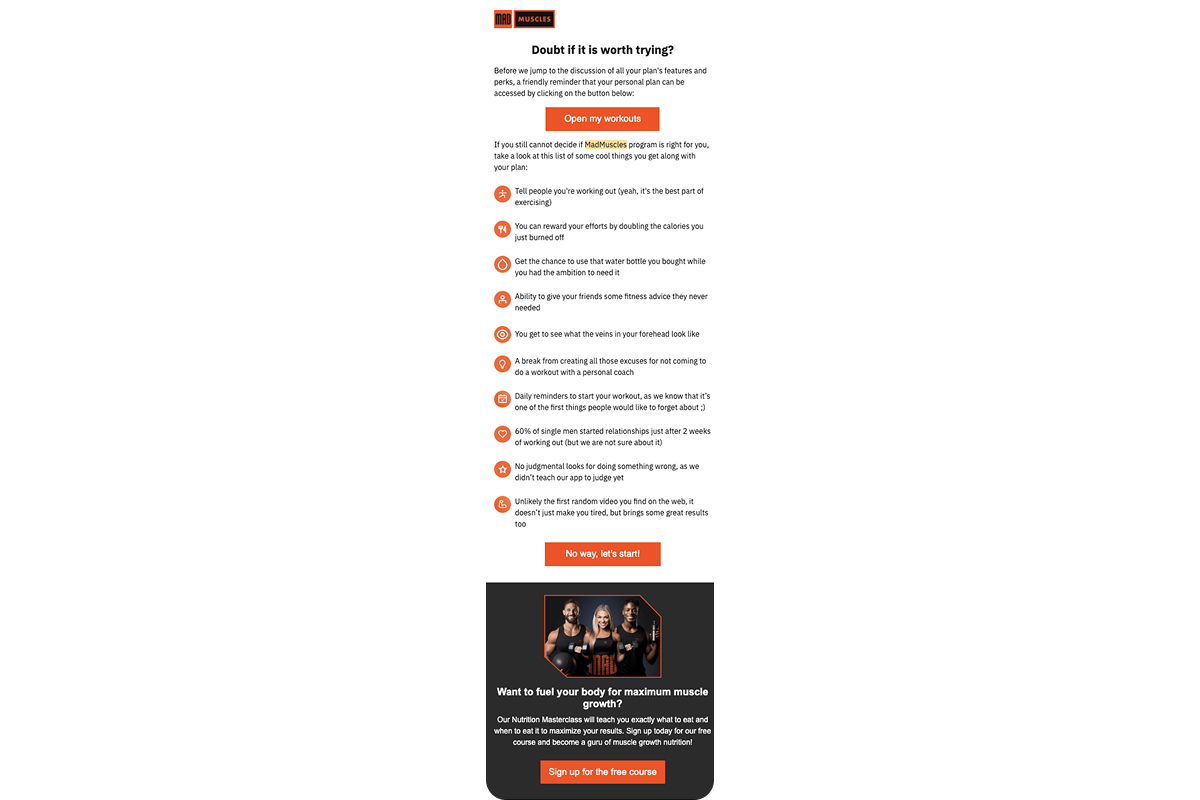
Why it works: When there’s no strong objection left, what remains is often procrastination. This message speaks directly to that moment and gently breaks the loop.
Key takeaways from MadMuscles’ strategy
MadMuscles offers a personal transformation path built for the individual. Every email supports a decision the user has nearly made, reinforcing commitment instead of pushing a sale.
Zing AI Coach: Lightweight commitments and instant readiness
Zing AI Coach sells a simple, low-cost, ready-to-go way to lose weight powered by AI. The entire messaging flow is built around quick actions ($1 today), zero effort (everything’s done for you), and clear, time-bound outcomes (results in 7 days).
1. $1 as a psychological anchor
Zing opens nearly every message with one thing: the price. The offer is about how easy it is to start:
- Puts “$1” front and center in emails, buttons, and landing pages.
- Anchors the value by comparing it to a higher reference price ($19.99).
- Repeats the same hook across all surfaces for consistency.
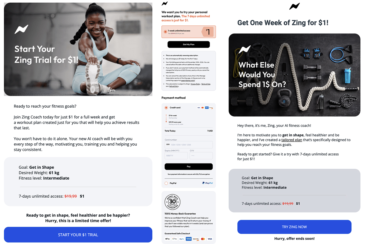
Why it works: $1 doesn’t feel like a purchase, but feels like a small gesture of interest. That symbolic commitment lowers resistance, while the real subscription kicks in automatically later.
2. The promise of personalization without real customization
The messages repeatedly emphasize that the plan is “tailored for you”, even if the actual customization is minimal:
- Highlights goal, weight, and fitness level in a visual card.
- Uses words like “personalized” or “your plan” across messages.
- Positions the plan as already done — everything’s set, time to start.
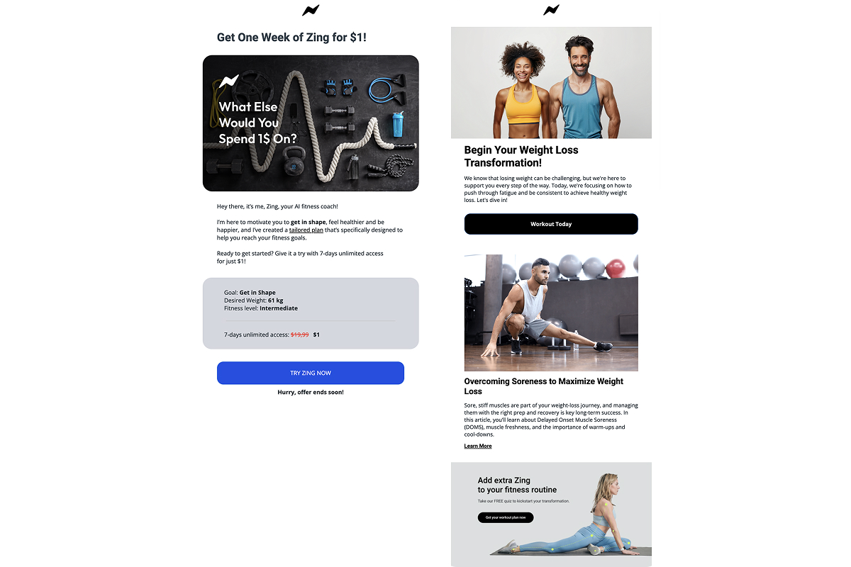
Why it works: The setup gives a strong sense of personal relevance. Even without deep customization, users feel like the product is aligned with their goals, and that makes starting feel easier and safer.
3. Creating urgency through time-limited offers
Each message reinforces the same idea: the offer won’t last forever. Even after user inactivity, follow-ups mention a reactivated offer, signaling a second (and possibly final) chance:
- Emphasizes limited-time availability in every email.
- Re-engages inactive users with time-sensitive hooks.
- Keeps the offer top of mind through consistent reminders.
Why it works: When users don’t have strong objections, urgency becomes the push they need. Time pressure helps cut through hesitation and turns “later” into action.
4. Simplifying the decision with structure and AI
The emails offer a clear, step-by-step roadmap (often framed as “7 steps to start”) along with checklists and starter tips. The tone feels supportive, not salesy:
- Lays out an easy-to-follow plan: steps, checklists, guidance.
- Signals empathy: “We know getting started is hard, here’s how.”
- Builds credibility by mentioning the AI coach and structured system.
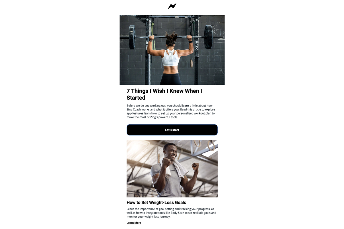
Why it works: The user gets the sense that everything is organized and within reach. The structure lowers uncertainty and makes it easier to commit.
5. Infotainment to keep the user warm
These messages show up between sales pushes to maintain engagement. The content feels helpful, not promotional:
- Shares tips, explanations, and small fitness hacks.
- Keeps interest alive without adding pressure.
- Gently brings the user back to action — “Get your workout plan now.”
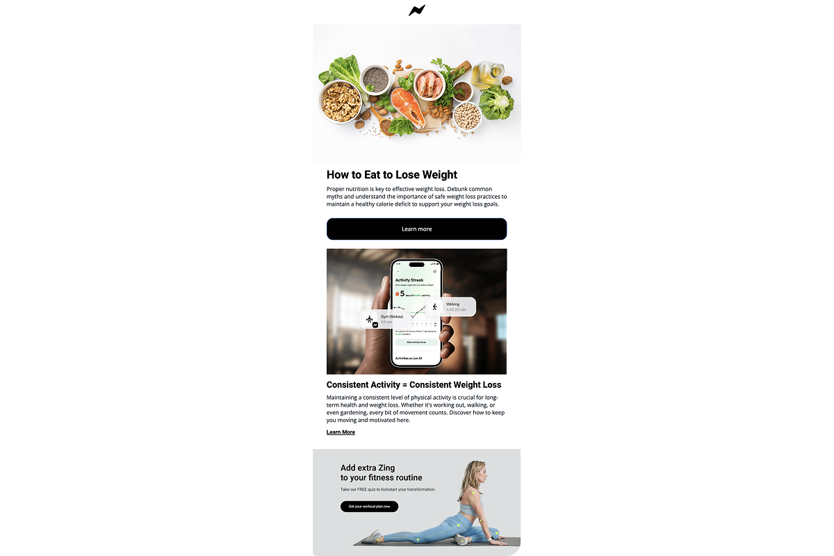
Why it works: As initial urgency fades, these emails keep Zing top of mind. They warm up the user just enough for the next retargeting or push to land effectively.
Key takeaways from Zing’s strategy
Zing is selling the feeling fitness is ease, inexpensive, and done for the user. The $1 entry point removes friction, and every email and landing page reinforces the idea that your plan is built. The pressure comes from simplicity, not motivation. Say yes and get started.
Babbel: Risk-free start and a nudge to the Live plan
Babbel meets the user where they left off, skipping pressure and focusing on ease. Once the user is re-engaged, Babbel introduces expert-led Live classes as the next step framed not as an upgrade, but as a natural way to get better, faster.
1. Welcome offer + removing the “I don’t have time” excuse
Babbel doesn’t waste time. The welcome email hits fast: clear outcome (“start learning Italian”), instant 50% off the preferred plan, and a bold CTA: get 50% off.
And before the classic “I’m too busy” excuse kicks in, Babbel shuts it down. The whole pitch is built around minimal effort:
- Catches the user while motivation is still high.
- Anchors value with a strong discount and clear savings.
- Frames the course as a small daily ritual, not a big commitment.
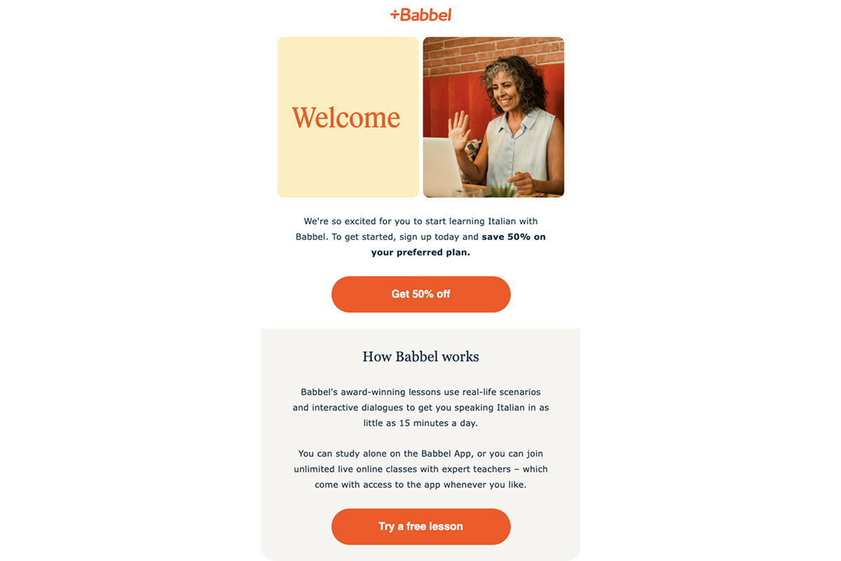
Why it works: Right after signup, the user’s halfway in. Babbel locks in that intent with a time-sensitive deal and removes friction before it builds.
2. Building trust through real teachers + lowering the barrier with a free experience
Babbel introduces users to actual language tutors with names, photos, and short bios and offers two free live classes as part of the re-engagement flow. These are full sessions, not limited trials.
- The email shows who the teachers are and what to expect.
- The offer removes payment as a decision barrier.
- The format feels personal, which builds emotional commitment early.
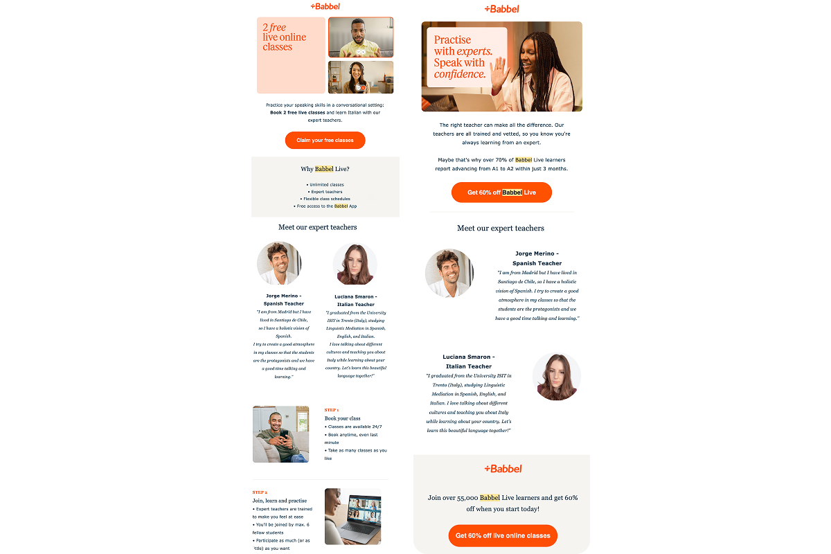
Why it works: The hardest part for many users isn’t starting a course — it’s speaking with someone. Showing the people behind the product and removing the cost of first contact helps reduce hesitation and builds early trust.
3. Deadline as a trigger for fast decisions
Babbel brings Live classes to the front, offering a premium learning format at 60% off, but only until midnight:
- The visual layout highlights the discount front and center.
- A time limit pushes users to act before the window closes.
- The focus moves toward the value of real-time learning with a tutor.
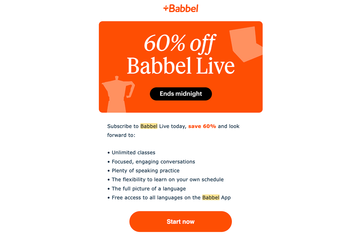
Why it works: A clear deadline provides the light pressure to commit, especially when the offer feels valuable and fleeting.
4. Soft upsell through side-by-side comparison
This email introduces two paths: app learning and live classes. Instead of pushing the user, Babbel lays out the options in a clean comparison table, letting the format speak for itself.
- The table highlights what’s included in each plan.
- Live naturally comes across as the more complete experience.
- The tone stays neutral, giving the user space to decide.
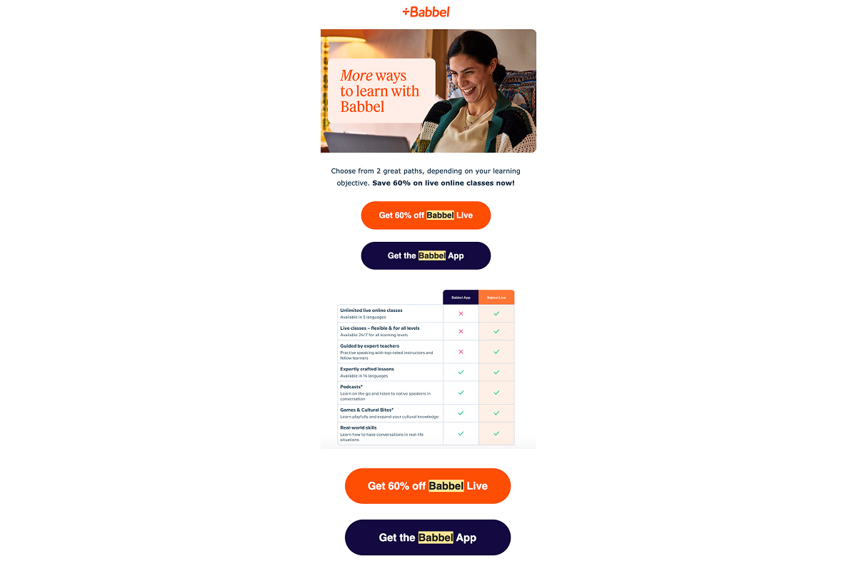
Why it works: When the choice feels self-directed, there’s less friction and a higher chance the user picks the better option on their own.
5. Rational reassurance through structured value
This email drops the urgency and focuses on clarity. It lists out seven reasons why Babbel Live is worth it, from flexible scheduling to expert teachers and a wide range of topics:
- Helps the user make a logical case for the purchase.
- Frames the offer as practical and well-rounded.
- Reinforces the decision for users who are almost there.
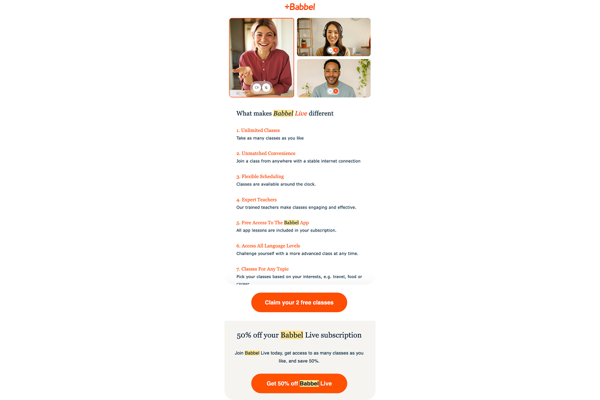
Why it works: When emotion and discounts aren’t enough, people look for reason. This gives them exactly that in one neat list.
6. Final push with the biggest offer
Babbel closes the loop with its strongest deal: 70% off all languages, annual access, minimal copy, and a single clear CTA:
- Targets price as the final barrier.
- Expands perceived value — not one language, but access to all.
- Meant to convert the coldest users at the end of the funnel.
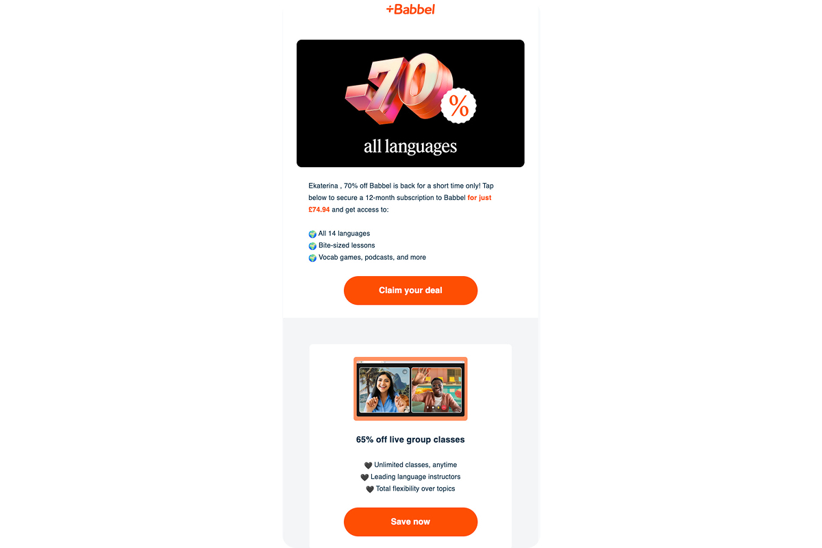
Why it works: Some people need one last reason. This is it.
Key takeaways from Babbel’s strategy
Babbel is offering different ways of language learning depending on how ready the user is:
- a discount for the impulsive
- trust for the hesitant
- free experience for the skeptical
- a format comparison for the rational
- hard deadline for the procrastinator
Each email is a small nudge toward a decision the user almost made, but hasn’t paid for yet.
Simple: Instant results, affordable entry, and a plan that fits real life
Simple retargeting emails promote the feeling of finally finding a way to feel good in your body without pressure or burnout. The strategy leans on gentle tone, simple rituals, and emotional relatability. It speaks to real women with real struggles and offers a plan that won’t overwhelm. The vibe is calm, confident, and quietly persuasive: we know it’s been hard, that’s why we made this easy.
1. Personalization as proof of value
The email builds on the quiz results and frames the outcome as a tailored plan built around user data:
- Assigns a unique plan ID (“P863-12”) to make it feel custom and specific.
- Lists what’s included: nutrition, workouts, trackers, updates — a complete system.
- Reinforces that everything is ready, all that’s left is to unlock it.
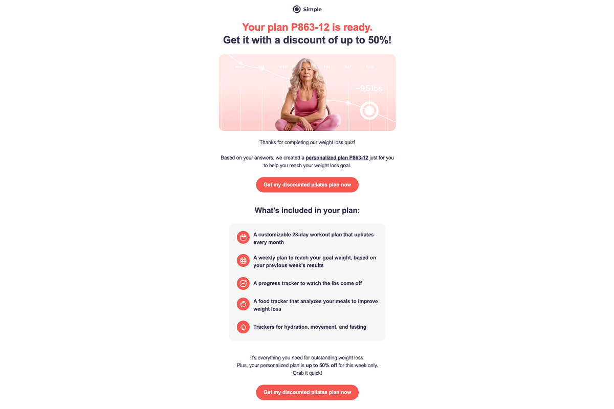
Why it works: The email signals that the product has done the work and created something uniquely yours.
2. Removing the “this isn’t for me” blocker
Simple gently voices the exact fears many women have at this stage and reassures them with calm, friendly confidence:
- Brings internal doubts straight into the headline: “What if it doesn’t work?”
- Builds trust through relatability — says the product was built by women who’ve gone through the same struggle.
- Makes the offer feel safe and achievable: 10 minutes a day, no pressure, no stress.
Why it works: Instead of promising results, the message offers support. It replaces “convince me” energy with “I see you”, which is exactly what anxious users need to take the next step.
3. Social proof through real stories
The email features four detailed transformations from real users. Stories come with names, before-and-after photos, and personal context, making the result feel grounded and achievable:
- Shows real women with names, ages, and before/after photos.
- Highlights different motivations, from health to confidence.
- Anchors the result in real life, not theory or abstraction.
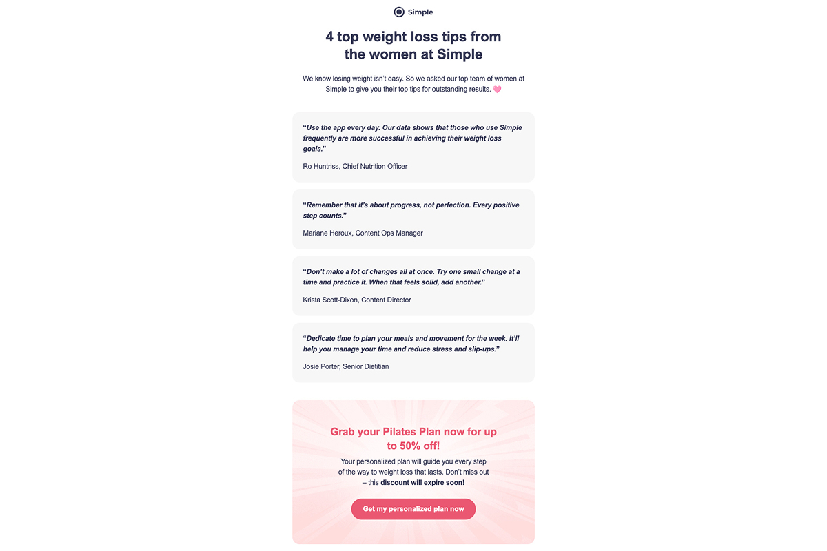
Why it works: When users see people like them succeed, the product feels more believable, and the goal more reachable.
4. Escalating the offer with a time limit
The classic urgency mechanic: 50% discount, 24-hour deadline, and a visual countdown. The email ties the offer to the idea that a custom plan has been built and will disappear if not activated in time:
- Shows a ticking clock: 24h until the offer ends.
- Emphasizes that the plan is ready and waiting.
- Connects urgency with personalization.
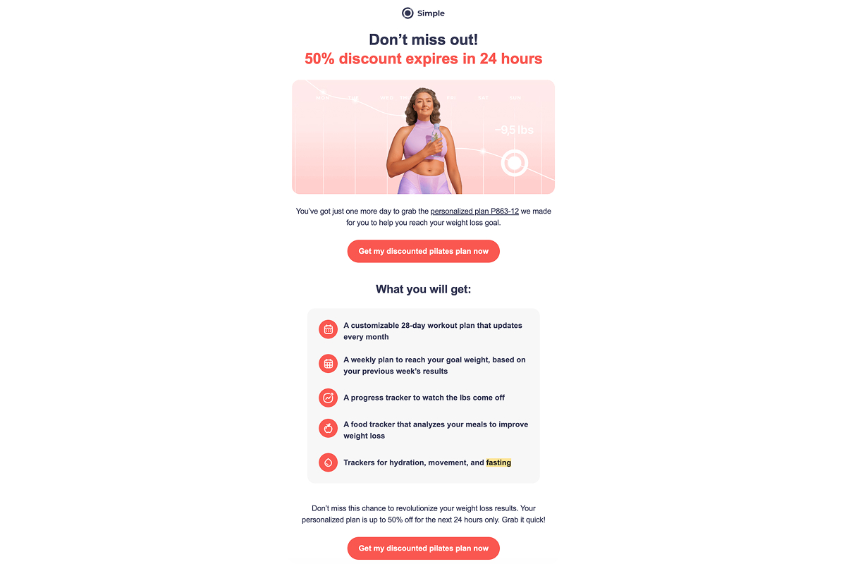
Why it works: A deadline pushes the user to act now, especially when it feels like the product is already theirs.
5. A rational case for a different path
Simple reframes past attempts. The email breaks down why harsh diets often backfire, backing it up with scientific links and a graph of the yo-yo effect. Instead of willpower and restriction, it offers something softer and more sustainable:
- Links to research on weight cycling and its effects.
- Visualizes past failures as a pattern, not a personal flaw.
- Introduces pilates as a safe, low-pressure way forward.
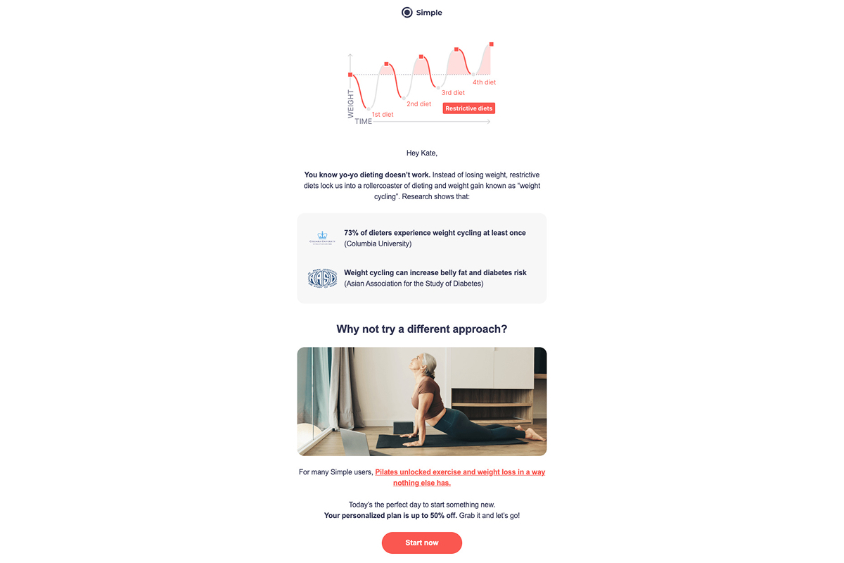
Why it works: For those who’ve failed before, this feels like validation. Instead of pushing users to try harder, the message encourages them to try something more realistic. That change in tone makes taking action feel possible again.
Key takeaways from Simple’s strategy
Simple sees the user. Their retargeting emails say: you’re tired, here’s a way that won’t break you. Every message lowers anxiety, normalizes doubt, and offers support. It’s an empathetic nudge toward action, delivered like a note from someone who gets it.
Wrap-up on app retargeting: What all top apps have in common
Across categories — from fitness to language learning — the strongest retargeting funnels rely on the same core tactics:
- They sell outcomes, not features. Nobody leads with 120 lessons or beautiful UI. They show what the product does: lose weight, speak fluently, and become your better self.
- They start with value, not discounts. The first emails are about the plan, the diagnosis, the feeling of “we get you.” The offer comes later, once the user is emotionally on board.
- They follow the sequence: value — proof — offer. First, they make it feel relevant. Then they show it works for people like you. Only then do they bring up price and urgency.
- Personalization drives engagement. Quiz results, named plans, age, goals, body type — all of it makes the message feel tailored. And tailored emails get opened.
- Urgency is always specific. Not “limited-time offer,” but “24 hours left,” “expires tonight,” or “your plan will be deleted.” Clear time pressure nudges action without causing annoyance.
- The tone is supportive, not pushy. Even when it’s about closing the sale, the emails feel like guidance without pressure. Like a friend reminding you of something you wanted to do anyway.
How these tactics translate into a checkout recovery sequence:
| Stage | Typical timing | What the message focuses on | Why it works |
|---|---|---|---|
| Resume intent | 1–3 hours | Reminder of the plan or result the user already unlocked | Brings the user back into a decision they were already making |
| Reinforce value | Day 1 | Personal relevance and outcome reframing | Shifts focus from product to “this is for me” |
| Build confidence | Day 2–3 | Social proof and early, believable results | Replaces uncertainty with evidence from similar users |
| Lower commitment | Day 4–5 | Risk reducers (trial, guarantee, cancel anytime) | Removes subscription anxiety and fear of commitment |
| Create urgency | Day 6–8 | Specific, time-bound offer or deadline | Forces a timing decision without over-pressuring |
| Close the loop | Day 10–14 | Final reminder or personalized last chance | Encourages a clear yes/no and ends the sequence cleanly |
Retargeting emails are your second chance to convert users who were almost ready to pay and simply needed a different entry point. Build campaigns like the best apps do: start with empathy, layer in value, and raise the stakes only when it makes sense. When done right, a “no” today can turn into revenue tomorrow.