


ARPU and ARPPU get treated like the headline monetization metrics. They’re simple and fast to calculate and make dashboards look good. They’re also easy to misread. You can push ARPU or ARPPU up and still damage your economics.
This piece shows how to use ARPU and ARPPU as diagnostic metrics to quickly understand what shifted in monetization, where it happened, and what to do next.
Quick refresher: what ARPU and ARPPU mean
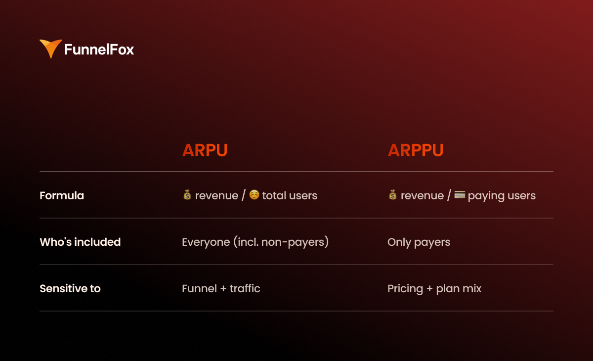
ARPU meaning: How well you monetize your entire user base
Formula: ARPU = total revenue / total users
ARPU shows how much revenue you generate per user over a given period, including non-paying users. This metric is sensitive to the top of the funnel and traffic quality. It moves when your paying rate shifts, when more users drop before checkout, or when your audience mix changes across channels and geos.
ARPPU meaning: Revenue quality among paying users
Formula: ARPPU = total revenue / paying users
ARPPU shows how much revenue you generate per paying user. It reacts faster to pricing, subscription plan mix, discounts, upgrades, and revenue recovery than it does to changes in acquisition.
If your goal is revenue growth, ARPU usually matters more as it reflects the overall monetization efficiency of your full base.
ARPPU becomes the main metric when you’re actively steering pricing, offers, subscription plan mix, and payment economics.
But without context, both metrics are just a very generic signal.
Segment ARPU/ARPPU to see what’s exactly driving revenue
Average product-level ARPU and ARPPU almost never lead to decisions you can act on. You see the line move on a dashboard, but you have no idea which segment is driving it.
If you want ARPU and ARPPU to produce actionable insights, you have to break them down into segments that explain revenue.
By acquisition channel
Start with the basics: where the user came from. Different channels bring different intent, payback periods, and revenue durability. Paid and organic almost always live in different worlds. Prospecting and retargeting are even further apart: one creates new demand, while the other captures interest that’s already been warmed up.
Without linking ARPU to acquisition cost of specific channels, you end up optimizing revenue in isolation disconnected from the channel’s profitability.
By geo
You can’t compare Tier 1 and Tier 2/3 markets because economics are different: purchasing power, pricing response, plan mix, and often even the UA channel setup.
That’s why ARPPU drop may be normal when you expand your geo or scale into cheaper markets. The real question isn’t whether ARPPU went down, but how the segment-level economics changed.
By product segments and intent
The same ARPU can hide two completely different realities:
- a high-intent audience that converts quickly and sticks around,
- a low-intent audience that clicks, browses, but never converts or churns fast.
If you have use case or JTBD segmentation, use it. If not, at least segment by behavioral signals: time to convert, early retention, and so on.
Product-level ARPU without intent segmentation often leads to the wrong moves: you start fixing monetization when the real issue is who you’re bringing in.
By offer and plan structure
ARPPU shifts aren’t always about better monetization. They can also stem from changes in purchase mix: monthly vs. annual plans, free vs. paid trials, promos, and discounts.
These changes often look like growth or decline in ARPPU, even when the product and paywall haven’t changed at all, so it’s important to track this seperately.
If you’re testing discounts or restructuring plans, you’re almost certainly impacting ARPPU, and that’s fine. What’s not fine is interpreting ARPPU trends without knowing which offer is currently dominating.
By cohorts
Period-based ARPU can be misleading because in subscriptions, revenue doesn’t land all at once. One month might show a strong Day 0 thanks to fresh purchases, while another dips because trial share changed or cancellations spiked.
Segmentation by cohorts solves this. Track ARPU by D0/D7/D30 (and beyond, if your cycle allows). That’s how you clearly see what’s going on: you improved monetization upfront, increased retention and renewals, or just shifted the plan mix and got a pretty snapshot in a short window.

Anchor ARPU/ARPPU to unit economics to avoid fake growth
ARPU and ARPPU tell you how much revenue you’re generating, but on their own, they don’t answer the bigger question: is your growth profitable, and can it scale without eroding your margins?
To answer that, you need to read ARPU/ARPPU through the lens of unit economics and net revenue.
ARPU vs. CAC by segment
You can’t evaluate ARPU in isolation from customer acquisition cost, especially at scale, where acquisition is your biggest expense and primary growth lever.
Golden rule: ARPU and CAC must be measured on the same slice, whether it’s by channel, geo, cohort, or segment. Never compare product-level ARPU to campaign-level CAC.
If ARPU goes up but CAC grows even faster, that’s a deterioration in your unit economics, not growth.
What counts toward real revenue
You should know how much money stays after unavoidable losses and fees. The minimum set to consider:
- Store/processor fees: App Store / Google Play commissions, web2app costs
- Refunds: returns, cancellations, disputed transactions
- Chargebacks: especially relevant if you’re actively scaling web payments or working with riskier segments
- Support/ops cost: not always critical, but sometimes a real margin hit — for example, if billing drives up support load or refund requests
Validate ARPU/ARPPU through LTV & retention to assess long-term performance
ARPU and ARPPU only make sense in the context of subscription dynamics. Look at them in isolation, and it’s easy to miss the key point: what’s actually happening to revenue over time. That’s why ARPU vs. LTV is a critical comparison when evaluating long-term monetization performance.
Here are three main reasons why ARPU and ARPPU can paint a distorted picture when viewed without subscription LTV and retention.

1. Time lag
Revenue and user behavior don’t always happen at the same time. A user might pay today and churn tomorrow. In a short window, ARPU can look stronger than the real revenue curve by D30 and beyond. This is especially common in subscriptions with trials, promos, or other setups where early revenue inflates the picture.
2. Mix effects
ARPPU can shift due to changes in audience or purchase structure, even if the product itself hasn’t changed. A slight tilt toward a different geo, channel, or pricing plan can move the average check on its own.
In this case, a change in ARPPU doesn’t meat that monetization got better or worse. It’s a signal that your audience or offer mix has changed.
3. Survivor bias
ARPPU only reflects users who made it to payment and ignores everyone who bounced before the paywall, didn’t see the value, or dropped off early.
ARPU, on the other hand, includes everyone, but it hides where the funnel is breaking. A dip could be caused by anything from low-quality traffic to early onboarding drop-off.
Without segmentation and cohorts, both metrics give you an incomplete picture.
How to get the full picture
For ARPU/ARPPU to work as a diagnostic tool, you need control checks:
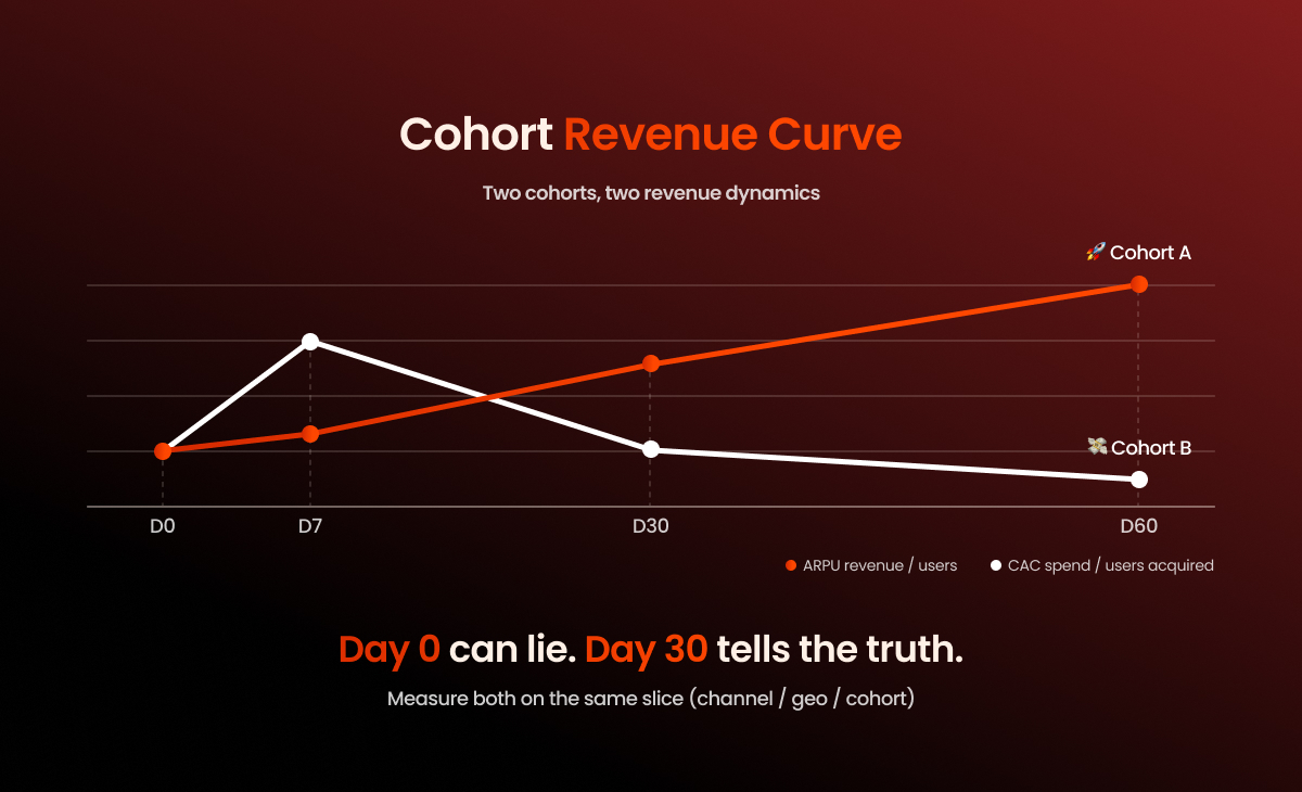
- Cohort revenue curve: early window vs. long-term (D0 → D30+)
- Renewal rate / churn by plan
- Refund + chargeback rate as a signal of revenue quality
- Net revenue (after fees) — especially when comparing web vs. store
- LTV:CAC and payback by acquisition segment
This data set is enough to separate early-day spikes from sustainable revenue.
How to calculate ARPU and ARPPU correctly
Here’s a quick checklist to make sure your ARPU and ARPPU calculations stay comparable and decision-ready.
TL;DR
- Don’t calculate overall ARPU first. Start with cohorts.
- Segment ARPU by acquisition. Include all revenue.
- Segment ARPPU by payment rail. Never mix web and store.
- Normalize geo before comparing.
- Aggregates are for reporting, not decision-making.
Start with cohorts, then zoom out
Always start with cohorts. In subscription models, ARPU and ARPPU only make sense over time, so the basic unit of analysis shouldn’t be “monthly by product,” but specific cohorts: install week, first seen, or first purchase.
Save aggregates for later as a reporting layer. If you start with overall ARPU, you lose the data structure: one number ends up blending channels, geos, and different payment scenarios.
Compare ARPU by channel and geo regardless of where the payment happened
To be meaningful, ARPU has to be tied to acquisition segments. That means measuring all revenue brought in by a cohort, no matter where the payment happened — in the store or on the web.
Geo comparisons need even more care as you’re comparing traffic quality and purchasing power. Here’s what to take into account when assessing ARPU between different locations:
- local pricing and price parity
- plan mix
- platform differences (iOS vs Android)
- traffic sources
If you’re using a single payment rail (store-only or web-only)
If all payments happen in one place, the math is simple:
- ARPU = total revenue / total users
- ARPPU = total revenue / paying users
Just make sure “users” and “paying users” are defined consistently within the same time window and segment. That’s what keeps your numbers clean and comparable.
If you monetize both in-app and on the web
In a hybrid model, you have two parallel revenue streams: store and web. ARPU should combine them at the acquisition-segment level, while ARPPU should be calculated separately for each stream.
ARPU calculation should be done by acquisition cuts and include all revenue generated by that segment:
ARPU(channel, geo, cohort) = (store revenue + web revenue) / users
This keeps ARPU comparable across channels and geos, and preserves its connection to CAC and payback.
Calculate ARPPU separately for each stream, because these are different economics:
- ARPPU(store) = store revenue / store payers
- ARPPU(web) = web revenue / web payers
If you need an overall ARPPU, it’s only useful for reporting and should be explicitly labeled as an aggregate. For decision-making, it’s almost always misleading.
💡 On the web, ARPU and ARPPU quickly become sensitive to funnel structure: traffic volume, conversion to purchase, and what happens after the first payment. That’s why it’s important to see not only how much revenue you generated, but also what it’s made of.
FunnelFox reflects this directly in Analytics: you can track Total Revenue, ARPU (Total Revenue / Total Unique Visitors), and ARPPU (Total Revenue / Paying Customers). Total Revenue is also broken down by billing reason (initial purchases, renewals, upgrades, one-time charges), so you can clearly see what’s driving revenue and separate entry growth from renewal-driven growth.
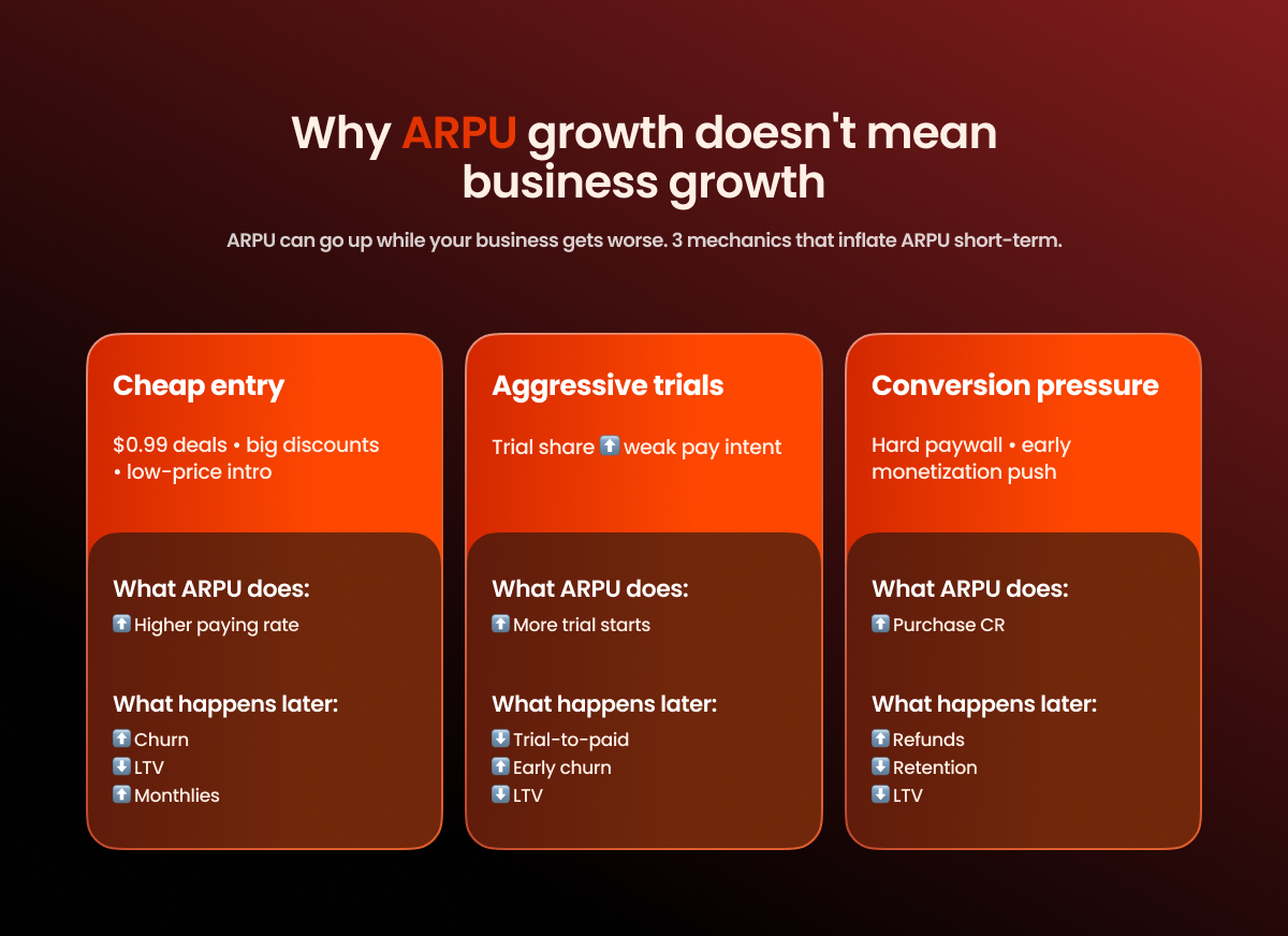
Why ARPU growth doesn’t always mean business growth
In subscription apps, ARPU can improve faster than the business does. You see a D0/D7 uplift, revenue goes up in the current window, and it looks like a clear win. The problem is that these gains often come from front-loading revenue and don’t hold over time.
Here are three mechanics that most commonly cause ARPU growth.
#1: Cheap entry
Big discounts, $0.99 deals, first-week offers, or any kind of cheap entry point almost always increases the paying rate. ARPU goes up because more users convert to a purchase. But the subscription structure often shifts next: the mix moves toward cheaper plans and away from long-term ones. That weakens subscription quality over time: churn increases, LTV drops, and ARPU stops growing once the short window effect wears off.
#2: Aggressive trial expansion
Trials create a fast uplift at the top of the funnel. More users start a trial, entry metrics look stronger, and early-window ARPU can increase because you’re generating more “payment-like” events. But trials often mask weak pay intent. If the product doesn’t sustain value after the first week, you’ll see trial-to-paid drop and early churn rise. The result: the front of the curve looks better, while the longer-term economics get worse.
#3: Conversion pressure
An aggressive paywall and heavy monetization pressure early on can increase purchase CR and temporarily lift ARPU. It works until you start paying for it with retention. If the pressure outweighs perceived value, retention and organic growth take a hit: users churn faster, frustration goes up, and refunds increase. ARPU may look better in the short window, but it gets worse over time.
How to tell it’s inflated ARPU, not a real uplift
There’s a simple set of signals that almost always shows you’ve “bought” ARPU growth by damaging future economics:
- trial-to-paid goes down
- refund rate goes up
- early churn goes up
- D30/D60 revenue doesn’t catch up to D0, the cohort curve doesn’t hold
- plan mix deteriorates: monthly share increases while yearly share drops, or you shift into “more expensive” plans but retention gets worse
You can lift ARPU quickly. The real question is what it costs you in renewals and LTV.
Diagnostic matrix: How to quickly find what to fix
Use it to localize the problem before you dig into segments.
| ARPPU ↓ | ARPPU ↑ | |
| ARPU ↑ | More payers, less revenue per payer Likely: cheap entry, discount penetration, mix shift to lower plans Check: plan mix, trial-to-paid, early churn, D30/D60 ARPU | More payers, more revenue per payer Likely: real uplift (pricing + conversion), or pressure-driven growth Check: retention/renewals, refunds/chargebacks, cohort curves (D30+) |
| ARPU ↓ | Fewer payers + lower revenue per payer Likely: funnel + offer degradation, traffic shift to low intent Check: channel mix, paywall drop-offs, pricing changes, refund rate | Fewer payers, higher revenue per payer Likely: lost volume, remaining payers are “survivors” Check: paying rate by segment, top-of-funnel volume, geo/channel shifts |
What should sit next to ARPU and ARPPU on your dashboard
1. Paying rate (purchase conversion / trial start / trial-to-paid)
This is your first fork. ARPU usually moves because the share of users who reach payment changes. If you have trials, split “trial start” and “trial-to-paid”. These are different problems with different fixes.
2. Plan mix (monthly/yearly, discounts)
ARPPU often moves because the monthly/yearly split shifts or discount share increases. A single mix shift can change revenue per payer without any product changes.
3. Gross vs net revenue
Gross helps you monitor volume. Net shows the actual economics. If you don’t separate them, you can improve ARPU while losing margin to fees and refunds.
4. Refund + chargeback rate
A direct signal of revenue quality and monetization risk. Refunds and chargebacks often spike before retention problems become obvious, so keep them next to ARPPU and cohort curves.
5. Renewal rate / churn by plans
In subscriptions, money live in renewals. Track subscription churn separately for monthly vs yearly. If renewals weaken, ARPU can still look fine in the short window while the economics are already sliding.
6. Revenue retention (if you have upgrades & upsells)
If you earn beyond the initial subscription (upgrades, expansions), track whether revenue is retained within the paying base. It shows whether you’re growing through value expansion or just through new inflow.
7. Cohort ARPU curve (D0/D7/D30/D90)
Your main anti-self-deception filter. D0 and D7 reflect entry monetization. D30+ shows whether it holds over time. Without a cohort curve, ARPU turns into a current window metric.
8. ARPU vs CAC by channel or geo
This connects monetization to growth. ARPU must be comparable in the same cuts where you calculate CAC, otherwise you can’t see payback and end up making decisions off averages.
9. Payment rail split (if you sell both in the store and on the web)
If some revenue goes through the store and some through the web, keep them split: approval/acceptance rates, fees, refunds, and net revenue differ. Without this, ARPPU becomes a blended metric across two economics and stops being diagnostic.
Wrap-up
ARPU and ARPPU are useful as fast diagnostic signals. They tell you the numbers moved, but they only become actionable once you break them down by segments (channel, geo, offer/plan mix, cohorts) and read them alongside paying rate, retention/renewals, refunds, and ARPU vs CAC. Otherwise, it’s easy to improve the metrics with discounts, trials, or payment pressure and end up with worse LTV, payback, and revenue quality over time.
If you run web2app funnels, it’s critical to see what’s really driving revenue growth: entry purchases vs retention, upgrades vs a one-time offer effect. In FunnelFox, this is easy to track in Analytics: ARPU/ARPPU and Total Revenue are shown together with a revenue breakdown (initial purchases, renewals, upgrades, one-time charges). That helps you pinpoint what’s moving your web revenue and avoid mistaking a short-term uplift for sustainable growth. If you want to see this on your funnel and find growth levers, book a FunnelFox demo.