When we talk about growing subscription apps, most of the attention goes toward acquiring users and converting them into paying customers. That makes sense — acquisition is fast-moving and easy to obsess over. But too often, what gets overlooked is what happens after someone subscribes, especially what happens when they try to leave.
Cancellation flow is one of the most underappreciated levers for improving retention. Get them right, and you can meaningfully reduce churn, extend customer lifetime value, and build long-term subscriber relationships. Get them wrong, and you risk losing trust and damaging your brand.
In this post, I’ll break down why the moment a user considers canceling is such a critical touchpoint, and how you can use it to drive better retention outcomes. We’ll look at:
- Why retention is the single most important metric that separates top consumer subscription apps from the rest.
- The do’s and don’ts of building cancellation flows that are honest and effective.
- Real-world cancellation flow examples from Headspace, Strava, Fitbod, and Matter.
- Answers to some of the most common questions we get about win-back emails, discounts, and what’s changing in this space.
Let’s get into it.
Why subscriber retention beats acquisition in the long run
This might sound familiar, but it’s worth repeating:
Retention is the single most important metric that separates the best consumer subscription apps from the rest.
Yes, growth teams obsess over KPIs like acquisition cost, conversion rates, and LTV/CAC ratios. But when you zoom out and look at what really powers venture-scale subscription businesses, retention is the common thread.
Let’s look at the data. Across a dataset of 30,000 consumer subscription apps, even apps in the top quartile (P75) are struggling to retain users: more than half of their annual subscribers churn within a year, and more than half of their monthly subscribers churn within just three months.
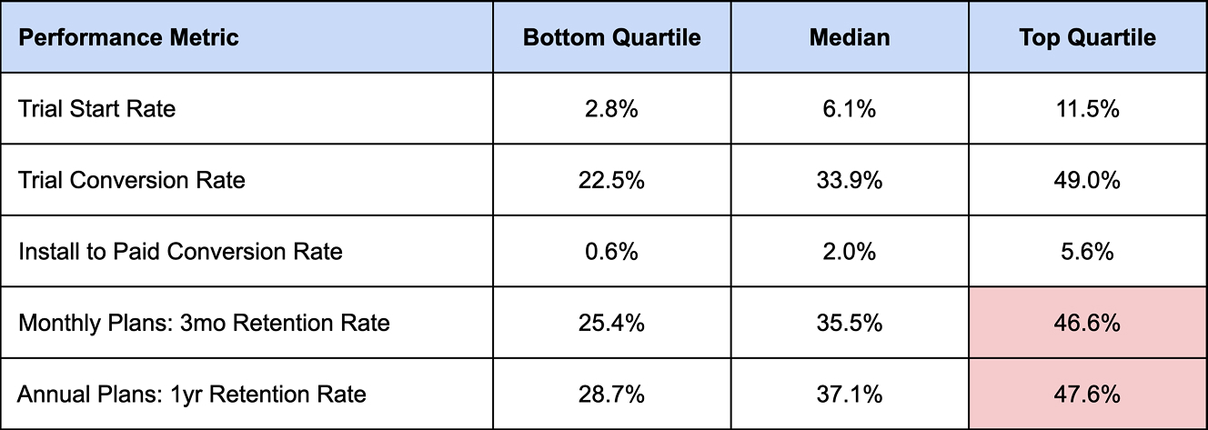
That’s a leaky bucket and a tough foundation to scale on. Now contrast that with the P95 apps — the top 5%. These companies are operating on a completely different level:
- Over 60% 3-month retention on monthly plans
- Over 60% 1-year retention on annual plans
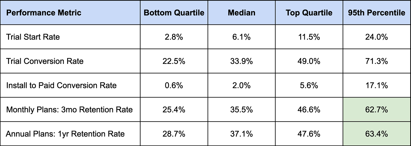
Those numbers compound in powerful ways. Retaining a subscriber for 2–3 years means multiple renewal cycles, lower re-acquisition costs, and more predictable cash flow.
Flo: A case study in compounding retention
A great real-world example is Flo, one of the leading apps in women’s health. CEO Dmitry Gurski frequently shares cohort-based revenue and MAU charts on LinkedIn, and what stands out is how much of Flo’s revenue is driven by long-term users.
Over 50% of Flo’s revenue comes from users who subscribed more than a year ago.
Older cohorts — 2, 3, even 4+ years in — are still contributing meaningfully to the bottom line.
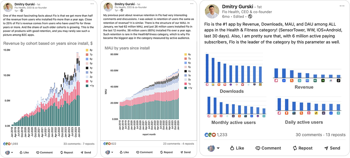
This is the power of retention in action. Acquisition might get the spotlight, but retention is what keeps the lights on.
And one of the most overlooked ways to improve it is cancellation flows. If you design a cancellation experience that’s transparent, respectful, and gently persuasive (reminding users of what they’re walking away from, maybe offering a targeted discount), you can win back a meaningful portion of users right at the edge of churn.
Why making it hard to cancel is a short-sighted (and risky) strategy
Before we get into the mechanics of what great cancellation flows look like, we need to talk about what not to do — and more importantly, why.
Too many companies have defaulted to making cancellations deliberately difficult. You’ve seen the playbook: bury the cancel button five layers deep in settings, hide it behind vague labels, or worse — force users to call support or dig through an obscure FAQ page.
This kind of experience might “save” short-term churn on a spreadsheet, but it comes at a steep cost:
- Increased support ticket volume
- Higher customer service load and costs
- Negative word of mouth and lower NPS
- Damaged brand reputation
- More refund and dispute requests
And when dispute rates spike, you’re in real trouble. During the pandemic, when financial stress was high, banks made it easier than ever to dispute charges. Some apps saw refund rates skyrocket, and that triggered warnings and even penalties from payment processors and card networks. If your dispute rate crosses 0.6%, you’re likely to be flagged. Let it go too far, and your payment processor might cut you off entirely.
Even if you weather the financial risk, consumers have other ways to get their frustration across: Trustpilot, app store reviews, Reddit, social media. People talk, and those stories stick.
So just don’t go there. Treat your customers fairly.
There are a few macro trends making all of this even more important:
- Subscription fatigue is real. Users are getting smarter and more defensive. Many now cancel auto-renew immediately after signing up, just to avoid surprise charges.
- Banks and credit cards have made disputing easier. Some now include a single-click “dispute charge” button in statements.
- Apple’s iOS updates favor transparency. Since iOS 16, users can manage and cancel all app subscriptions in one place. That means hiding behind UX tricks just doesn’t work anymore.
What great cancellation flows have in common: 5 key principles
So, what should your cancellation flow actually look like? The goal, at a high level, is to:
Make it easy to cancel, but hard to walk away.
You want the flow to be transparent and accessible, but also take that moment to remind the user of what they’ll lose, give them a chance to explain their reasoning, and maybe even offer a targeted incentive to stay. Here’s how that breaks down in practice:
1. Make it available across platforms
Ideally, you support cancellation on both web and mobile, but for smaller teams, that’s often not realistic. A common workaround is to redirect users from the mobile app to a mobile web view, so you only have to maintain one cancellation system. Many apps do this right from the “Manage Subscription” section in settings.
2. Place it where users expect
This is a big one. If your subscription cancellation flow isn’t under Settings > Account > Manage Subscription (or something very close), users will get confused or frustrated. That leads to negative reviews, refund requests, disputes… you know the rest. Don’t try to be clever here. Be obvious.
3. Ask why they’re leaving
Many users don’t cancel because they hate your product — they cancel because life changed. Finances got tight, a new job started, a baby arrived. But they still like the product.
And if you just offered them a lower-cost option or even just made them feel heard, they might stay. At the very least, you’ll learn how to improve.
4. Offer a targeted incentive
Especially when users cite cost as the reason. That’s a perfect moment to offer a targeted discount or extended trial. The marginal cost to serve them is often low, and that small gesture can keep them around longer.
5. Remind them what they’ll lose
Here’s where cognitive friction comes in. Often, users haven’t used premium features in weeks or months, so they forget the value they once saw. A short reminder can nudge them to reconsider.
Smart cancellation funnels, built in FunnelFox
If you don’t have the resources of a Headspace or Strava, that doesn’t mean you’re stuck with a bare-bones cancellation flow. FunnelFox now ships with Cancellation Funnels that let you put the 5 principles above into practice without heavy lifting.
Instead of a single “Cancel” button, you can design a path where users choose between:
- Pausing their subscription
- Switching to a cheaper plan
- Taking a free period to re-engage
- Or canceling gracefully
All options are customizable, connected to billing (currently Stripe and Paddle), and testable in preview mode before going live. That means even lean teams can launch a thoughtful, retention-focused cancellation experience in minutes — no code or black hat tricks required.

Real-life cancellation flow examples from top apps
Headspace: Calm and persuasive
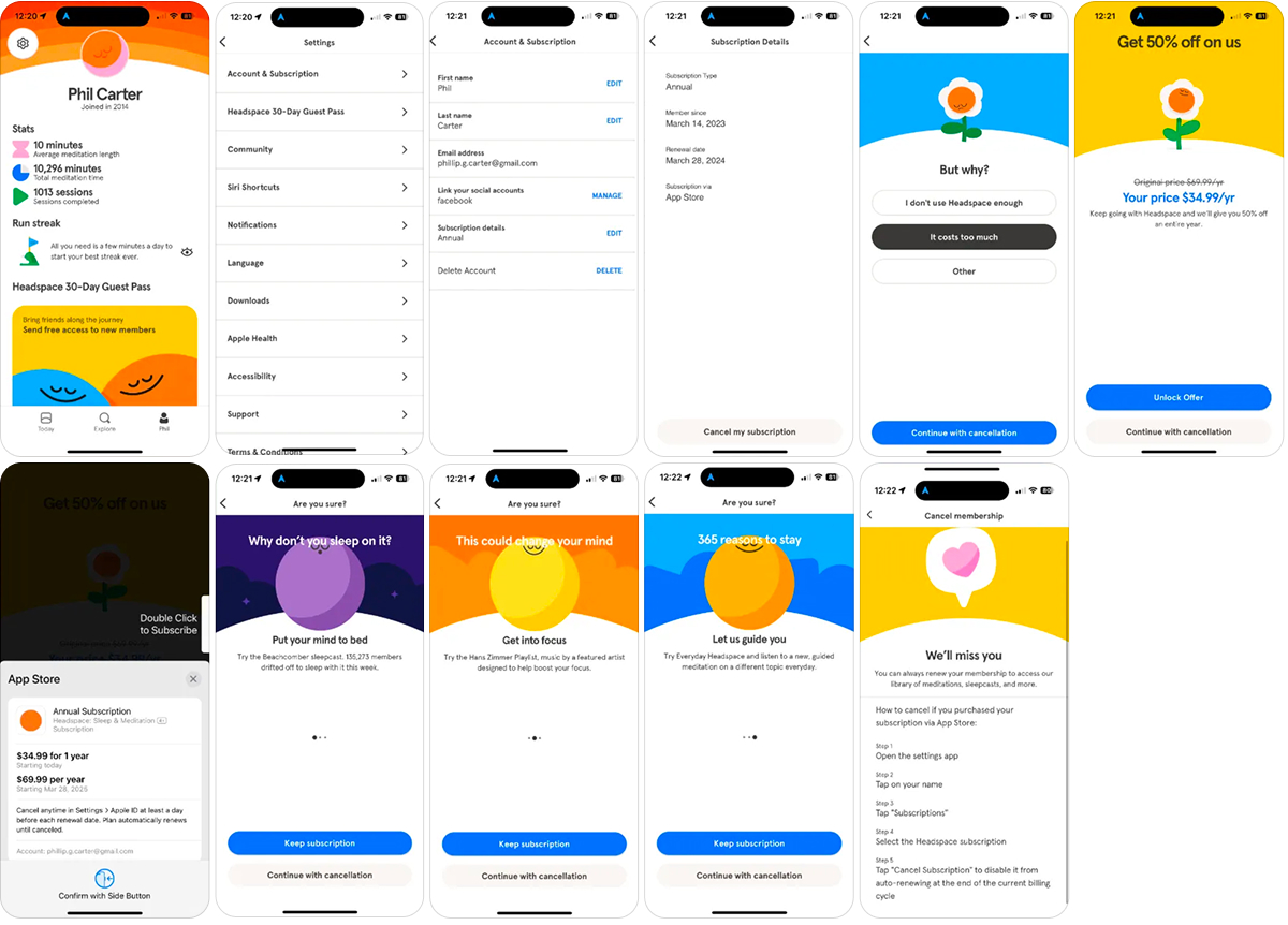
Headspace is one of my all-time favorite cancellation flow examples.
- The flow is easily discoverable: Settings → Account → Subscription
- First step: ask why you’re canceling. Simple answers: “Too expensive”, “Don’t use it”, “Other”
- If you select “cost,” they offer a 50% discount right away
- Then comes the emotional value nudge: a three-screen carousel highlighting the premium features you’ll lose — sleep content, meditation courses, and more
- But here’s the part I love most: they lead with “Why don’t you sleep on it?”, playing directly into their brand tone and positioning
- Finally, a soft, polite message: you can always come back
The brilliance here is that the tone is calm and kind. No pushy tone, no pressure, the overall flow projects confidence: “We know the product has value. Let us remind you. But we won’t stop you.” A smart combination of emotional nudge + economic offer + clear path back.
Strava: Turning cancellations into upgrades
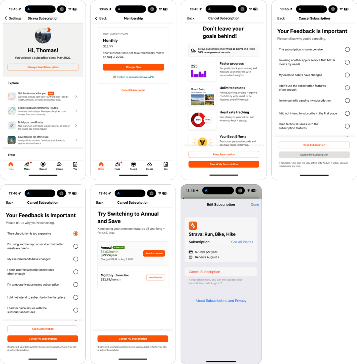
Strava does something unusual, and it’s a move I think more apps should test. Instead of only trying to save the user, they use cancellation as a chance to pitch a better deal.
- Same standard structure: cancellation under settings
- They ask for a cancellation reason
- Then they show what you’ll lose: faster progress tracking, unlimited routes, heart rate data, personal bests, etc.
- But then comes the twist: if you’re on a monthly plan, they prompt you to switch to annual — at a lower per-month cost
Now, at first glance this seems weird. The user wants to cancel — why are you pitching a bigger commitment?
But that’s the beauty of it. It shows strength. Instead of saying “Sorry! Was it something we did?”, they’re saying: “We know this product has long-term value. Why not go all in and save 40%?”
Not everyone will bite. But even if just a small percentage (1–2%) takes the annual upgrade, the math works:
- Higher LTV
- Lower churn (annual subs always perform better)
- And you’ve reframed cancellation into an optimization
Fitbod: Learn and improve from exit feedback
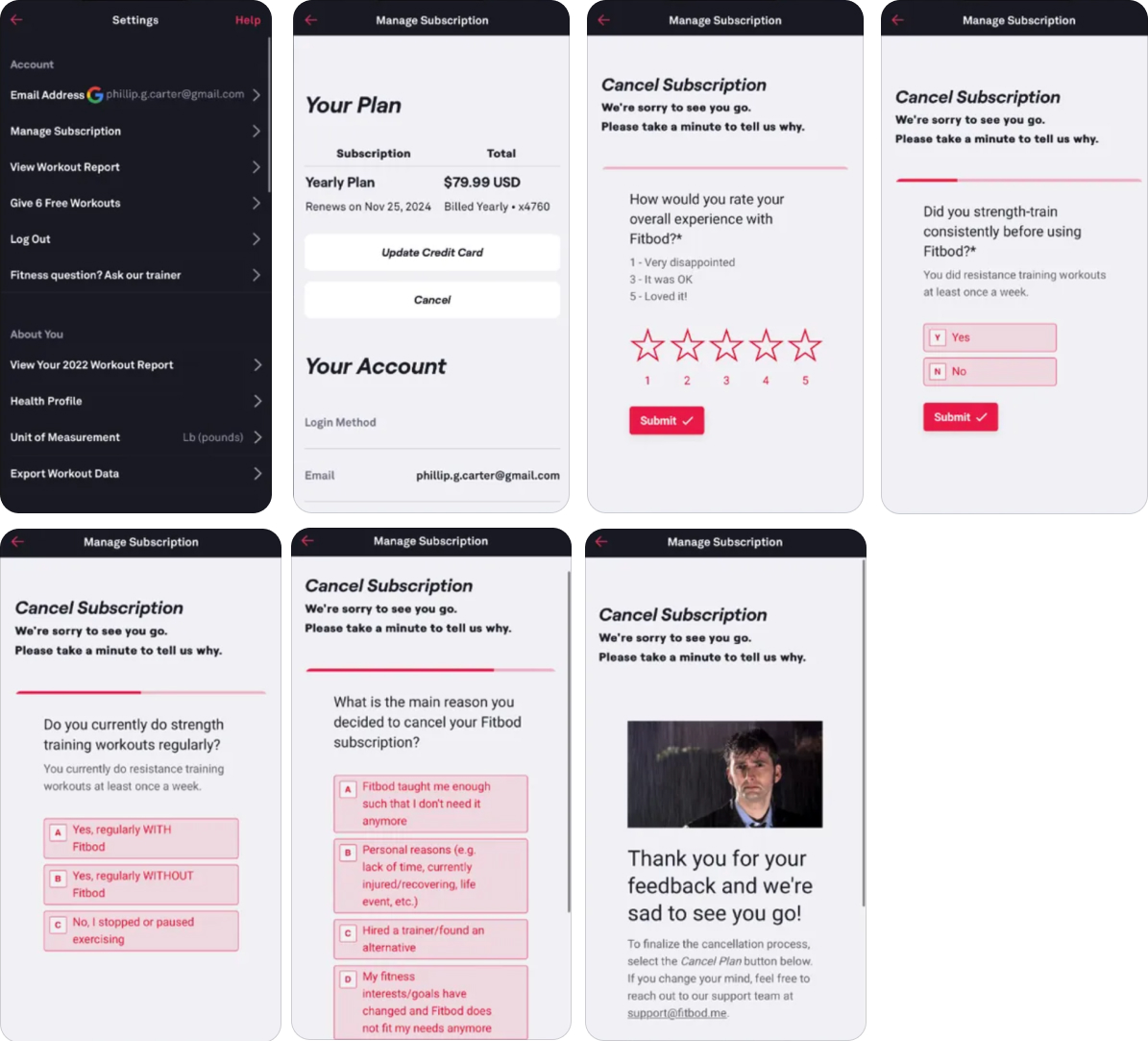
Fitbod is a strength training app that’s been around for 5–6 years. They’re not a massive team, and I believe they’ve been mostly bootstrapped, so they don’t have endless engineering or growth resources. But they’ve still managed to build one of the most strategically smart cancellation flows I’ve seen.
What makes it special is how they treat cancellation as a source of insight, not just a churn point.
Here’s what their flow includes:
- Easy access to “Manage Subscription” under settings
- A short user rating step (1–5 stars)
- And then three simple but revealing questions:
- Did you strength train consistently before using Fitbod?
- Do you currently do strength training workouts regularly?
- What is the main reason you decided to cancel your Fitbod subscription?
These might look like standard exit questions, but they’re actually designed to uncover something much deeper: are people canceling because the app didn’t live up to expectations, or because they never really got started in the first place?
If a large share of canceling users say they didn’t train before and still don’t, that’s likely a motivation and onboarding issue, especially common in health and fitness apps after New Year’s resolution season.
On the other hand, if users say they do train regularly, but no longer use Fitbod, that’s a completely different signal that points to unmet expectations, UI friction, or lack of advanced features.
This kind of structured exit feedback is gold for product and growth teams. It helps you understand your churn personas, not just your aggregate churn rate.
And Fitbod wraps it up in a great tone: they end the flow with a lighthearted message, a funny gif, and an open door — “Thanks for the feedback, we’ll be here if you decide to come back.”
Fitbod uses cancellation not just to manage churn, but to learn from it — and that’s a mindset every product team should adopt.
Matter: When in doubt, keep it simple
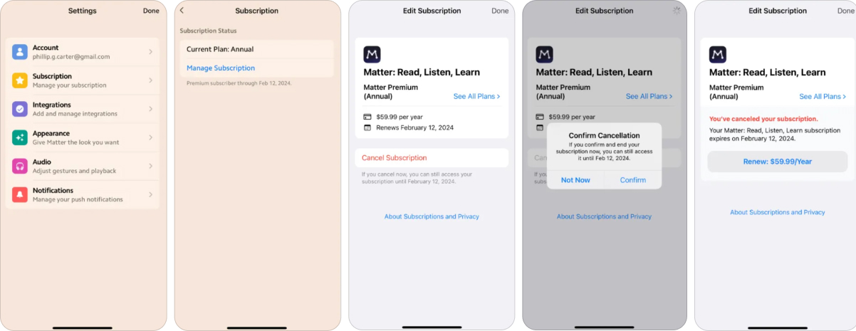
Matter is a tiny team, but they prove that doing something simple and user-friendly is way better than doing nothing at all.
- Cancellation flow is easy to find
- Five clicks from start to finish
- No long forms, no aggressive tactics, no delay
Could they add more? Sure. But while I love the layered flows we’ve seen from Headspace or Strava, not every team has the resources to build those, and not every product needs them either.
And let’s be real — cancellation is not the highest-volume funnel in most apps. So for lean teams, it makes sense to start here and iterate later.
What Matter gets right is clarity. It’s not hidden, not frustrating, there are no black hat tricks. Just a simple, respectful opt-out.
Better to offer a clean, honest exit than frustrate users with friction or hide your cancellation path.
Key takeaways
If you remember nothing else from this article, remember these three things:
1. Retention is what separates the best from the rest.
P95 subscription apps massively outperform P75, and that gap compounds over time. If you want to build a venture-scale business, retention has to be a top priority, and subscription cancellation flows are one of the simplest levers you can optimize.
2. Make cancellation easy to find, but thoughtfully designed.
The best flows are transparent, honest, and respectful, but still introduce just enough friction to remind users of what they’re walking away from. Don’t hide the exit. Just make it a moment that matters.
3. Learn from the leaders, but adapt to your stage.
Headspace, Strava, Fitbod, and Matter all take different approaches based on their size, brand, and goals. Use their example as inspiration, but calibrate based on your resources and audience.
Q&A on subscription cancellation flows
This article is based on a recent webinar Phil Carter hosted with Andrey Shakhtin, CEO at FunnelFox. Here you can watch the full recording.


