


In a subscription app, installs don’t mean much if users disappear after the trial. That’s the hard part: growth depends on what happens after acquisition, and traditional analytics barely scratch the surface.
That’s where cohort analysis comes in. Instead of looking at averages, it shows you how groups of users behave over time: when they convert, when they drop off, and what keeps them subscribed. It’s one of the clearest ways to link acquisition, activation, and revenue in one story.
In this guide, we’ll cut through the theory and show you how to use cohort analysis: what it is, why it matters for subscription apps, how to run it, how to read it, and the mistakes to avoid. By the end, you’ll know how to turn retention curves into growth decisions.
What is cohort analysis?
Cohort analysis is a way to understand how your users behave over time as real groups with shared traits. A user cohort is simply a group of people who did the same thing in the same period: for example, signed up in January, finished onboarding last week, made their first payment after a promo campaign, and so on.
Unlike static metrics, user cohort analysis lets you track how behavior changes: who sticks, who churns, and — most importantly — why.
Two main types of cohorts
There are two ways to slice your cohorts, and both are useful in different contexts:
- Acquisition cohorts: grouped by when users joined (install, signup, subscribe). This view is perfect for tracking user retention, churn, and revenue over time. For example, you can compare how users acquired in January behave vs. those from March campaigns.
- Behavioral cohorts: grouped by what users did inside your product — e.g., completed onboarding, saw a paywall, paused their subscription, etc. These cohorts help you see why churn happens.
In a nutshell, acquisition cohorts show when churn happens, and behavioral cohorts reveal what triggers it. Together, they give you a clear picture of what’s really happening inside your funnel.
A simple cohort analysis example
Say 100 people installed your app in August. One month later, 20 are still active — that’s a 20% user retention rate. Not great, right?
Now break it down by acquisition channel:
- Users from Facebook ads are retaining at 45%.
- Users from TikTok campaigns are retaining at just 5%.
Same cohort size, wildly different outcomes. You’ve just gone from “retention is low” to “TikTok is burning budget.”
That’s the power of cohorts: they reveal what’s working and what’s not, so you can make smarter product and marketing decisions.
Why is cohort analysis important?
If you’re running a subscription app, you know that growth comes from user retention, not installs. That’s exactly where user cohort analysis shines. It shows you how real product and marketing changes shape user behavior over time and whether they make things better or just look good in a dashboard.
Here’s what it’s useful for:
- Onboarding tests. You changed the signup flow. Did it improve retention, or just get more people to click “next”? Cohorts will show you the real long-term impact.
- Ad spend quality check. Two channels bring the same number of installs. One cohort converts, the other churns in a week — now you know where the budget belongs.
- Subscription model tuning. Monthly, quarterly, annual? Free trial vs. no trial? Cohort analysis reveals how different plans affect user retention and LTV.
- Discounts and promos validation. Do your first-month discounts keep people longer, or do they only attract those who churn as soon as the price goes up? Cohorts make the answer obvious.
- Cancellation flow improvements. You roll out a custom cancellation flow (pause, downgrade, or offer a free month). With cohorts, you can see whether that changed anything.
You can apply the same lens to pricing tests, feature launches, campaign experiments — anything that touches how people experience your product after they show up.
Funnel metrics alone can’t show this long-term impact. Funnels tell you where users drop inside a single session or flow. Cohorts reveal what happens to the same users after — whether they stay, churn, renew, or upgrade weeks and months later. That’s why cohort analysis is essential for subscription apps: it moves you from short-term conversion to long-term retention and LTV.
In FunnelFox, cohorts are built specifically around post-purchase and subscription behavior, so you can see how changes in onboarding, paywalls, pricing, or acquisition channels actually affect retention, revenue, and churn over time.
How to know if cohort analysis is worth your time
It’s not for everything. But if you’re dealing with any of this, cohorts are hard to ignore:
- You’re running A/B tests and want to measure impact beyond just day-one results.
- You offer a free trial or subscription and need to understand conversion and user retention patterns.
- You’re buying traffic from multiple sources and need to compare long-term performance.
- You’ve launched a new onboarding flow, paywall, or pricing model and want to measure impact.
- You want to reduce subscription churn and need to identify exactly when and why users drop off.
In other words: whenever growth, retention, or monetization are at stake, cohort analysis should be part of your toolkit.
How to do cohort analysis: step-by-step guide
User cohort analysis works best when it’s rooted in purpose. Start with a clear question or hypothesis — it’s the only way to get insight you can actually act on.
1. Define your cohort criteria
Start simple: group users by when they signed up, installed the app, or came through a campaign. This gives you a clean baseline to compare performance across different acquisition sources or launch periods.
From there, layer in behavioral (e.g., completed onboarding, used a key feature) or predictive traits (likely to churn, high LTV probability).
Just don’t get too granular too fast: cohorts should be large and comparable enough to reveal reliable patterns, especially if you’ll segment further later.
2. Choose metrics that match your goal
Pick metrics that prove or disprove your hypothesis.
- Retention: D1, D7, D30; active % by period
- Churn: cancellation rate, time to churn
- Monetization: LTV, ARPU, ARPPU
- Conversion: funnel steps CR, drop-off points, time to key action
Don’t measure everything — measure what matters to the decision you’re making.
3. Build the timeline and visualize it
Pick a consistent time unit — daily, weekly, or monthly — and stick to it. Label cohorts clearly so you’re comparing apples to apples.
For visuals:
- Heatmaps highlight sharp drop-offs
- Line/curve charts show how retention or revenue trends evolve
Whatever format you use, make it scannable and something your team will actually look at.
4. Find when churn happens
Once the timeline is in place, use acquisition cohorts to spot when churn hits hardest. That’s usually where the retention curve drops — the “cliff.”
Choose time intervals that match your product’s rhythm:
- Daily for trial conversion or onboarding
- Weekly/monthly for subscription cycles or longer retention
You can also break the timeline into early, mid, and late stages. Different problems usually show up at different points.
5. Identify sticky and risky behaviors
Once you know when users drop off, the next step is figuring out why.
Don’t stop at general engagement — go after specifics:
- “Do users who complete the onboarding checklist churn less by day 10?” is testable.
- “Does engagement correlate with churn?” is noise.
Focus on clear, user-level behaviors that can be influenced and measured.
6. Compare users who did X vs. those who didn’t
Group users by what they did or didn’t do.
Example: users who completed onboarding and tried feature X vs. those who skipped it.
You’re not looking for one magic answer. Usually, it’s a mix of small factors that add up.
7. Segment further and use what you learn
After the main cohorts, break things down: by platform, country, campaign, app version — whatever might shift behavior in a meaningful way.
Then act on what you find: adjust UA targeting, refine onboarding, localize messaging, etc.
The goal isn’t just to spot differences — it’s to act on them, then test and measure the impact.
8. Layer in predictive cohorting (optional but powerful)
If you have churn scores, LTV models, or conversion predictions — use them.
Group users not just by what they did, but by what they’re likely to do next.
From there, you can time actions more precisely:
- Send a nudge before a high-risk user goes cold
- Offer an upgrade right before a power user peaks
Predictive cohorts aren’t essential, but they help you act earlier, when it still makes a difference.
9. Use cohorts to measure experiments
When you run an A/B test — a new onboarding flow, new paywall, or different ad creative — treat each variant as its own cohort and compare it to the original version.
This shows you more than whether the change worked inside a single flow, as funnel metrics do. With cohorts — for example, the ones available in FunnelFox — you can track how long the impact of each variant lasts and which users actually benefit from the change over time.
10. Iterate, don’t overreact
Say you find that users who skip onboarding churn 67% by day 10. The fix isn’t to spam them with reminders.
Run a focused test, measure the result, then adjust. Keep a queue of hypotheses and keep shipping — real improvements often come from the second or third iteration, not the first.
💡 Don’t treat cohort analysis as a project you check off. It’s a loop: set intent → pick the right cohorts and metrics → spot the when → uncover the why → act → test → repeat.
How to read cohort analysis charts
A cohort analysis chart on its own is just a grid of numbers. The value comes from how you interpret it and what decisions you draw from it.
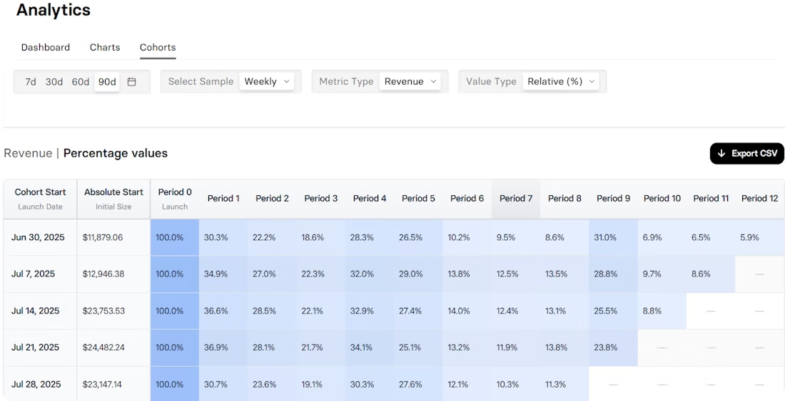
The vertical axis: who’s in each cohort
On the left, you’ll see the cohorts themselves — groups of users who started in the same period (a week, a month, a campaign).
Read down the column to compare them.
Did the post-update cohort retain better? Did TikTok users churn faster than Meta? This view shows how acquisition or product changes shaped outcomes.
The horizontal axis: what happens over time
Across the top are the time buckets — days, weeks, or months since the starting event (for example, install or signup).
Reading across a row shows how one cohort changes with time: where retention drops, when it stabilizes, and whether it levels into a healthy plateau.
In many subscription apps, retention curves tend to show: an early steep drop (D7), a second cliff (Month 3 or 6), and then a gradual leveling. But your app may behave differently — use these as starting hypotheses, not rules.
The cells in the middle: performance
Each cell shows the metric you’re tracking — usually retention or revenue. Color shading (darker = higher) makes it easy to spot patterns: strong start, sudden drops, gradual decay.
The real value comes when you can drill down to the user-level data behind a cell — who those users are, what they did, and what led them to stay or churn. That’s where you find patterns worth testing.
The downward path
Follow a column downward to compare cohorts at the same point in time. For example, by Month 3, most cohorts lose ~50% of subscribers.
If one cohort does much better (or worse), that’s a signal worth investigating.
The “ladders”
Sometimes you’ll see diagonal improvements — a later cohort suddenly performing better in Month 2, another in Month 3, and so on. That often means an external factor kicked in: maybe a feature launch, a pricing change, or even seasonality. These “ladders” point to experiments or market shifts that had a lasting effect on user behavior.
What insights can I get from a cohort analysis report?
In subscription apps, two of the most common are:
- The “wow moment”. On most retention curves, there’s a point where the line flattens — churn slows, and the rest of the users stick. That’s the wow moment: when people have found enough value to stay. In subscription apps, it could be after onboarding, the first use of a core feature, or surviving the first billing cycle.
- Early red flags. Pay close attention to the first 2–3 time periods (D1, D7, Month 1). Sharp drop-offs here usually point to issues in onboarding, your paywall, or trial-to-paid flow. If most of your cohorts are losing half of users by day 3, it’s a sign of friction you can fix.
💡 Compare charts for deeper insights. One chart shows one dimension, but a side-by-side comparison reveals more. For example:
• Compare cohorts from two acquisition channels to see which source drives stickier subscribers.
• Compare cohorts before and after a change to measure long-term impact.
• Compare trial vs. no-trial signups to see which model delivers stronger use retention and LTV.
7 Common mistakes in cohort analysis (and how to avoid them)
Cohort analysis is a powerful way to understand your users, but it’s easy to get misleading results if you approach it the wrong way. Here are the most common mistakes product teams and marketers make — and how to avoid them.
1. Tracking without a clear question
Pulling up a cohort chart “just to see what’s happening” usually leads to vanity insights. Always start with a hypothesis or a decision you want to inform: Will a new paywall improve trial-to-paid conversion? Did TikTok ads bring stickier users than Facebook?
2. Bad attribution
If your event tracking is messy or attribution is off, your cohorts won’t tell you anything useful. Make sure conversions, signups, installs, and cancellations are tracked cleanly and consistently.
3. Wrong cohort size
Tiny cohorts → unreliable patterns; oversized cohorts → details get lost, everything looks the same. Match granularity to the goal: monthly install cohorts for long-term trends, weekly cohorts for onboarding or pricing tests.
4. Picking the wrong time buckets
Match your timeframes to product cadence: daily for high-frequency apps (like fitness trackers), weekly for moderate use cases, monthly for billing cycles.
5. Focusing only on averages
“Average retention” is a dangerous simplification — it hides channel differences, product changes, or pricing effects. Compare across acquisition sources, campaigns, or user behaviors. Cohorts are meant to reveal those differences.
6. Overreacting to one insight
One sharp drop doesn’t mean you should rebuild the funnel. Form a hypothesis, run a controlled test, and validate. Small, measured changes beat sweeping overhauls.
7. Treating it as a one-time exercise
Cohort analysis isn’t something you tick off and forget. Use it as a continuous feedback loop — every onboarding tweak, pricing change, or campaign should be checked through cohorts to see if the impact lasts.
Wrap-up on cohort analysis
Cohort analysis is a way of seeing your users in context — who sticks around, who churns, and why. For subscription apps, that perspective is gold: it connects marketing, product, and monetization in one story.
When you run cohorts consistently, you stop guessing and start learning. You can see which experiments move retention, which campaigns bring real LTV, and which parts of the experience create loyal subscribers. In other words, it turns raw numbers into growth decisions.
If growth and retention matter to you — and if you’re running a subscription app, they always do — cohort analysis deserves a spot in your toolkit.
Finally, cohort analysis made for subscription apps
Everything you’ve just read is now available out of the box. The new Cohorts feature in FunnelFox lets you track how each user group behaves after their first transaction — whether it’s a subscription, trial, or one-time payment. See how retention, revenue, and churn evolve over time, compare trial vs. paid flows, and measure the impact of pricing, funnel, or onboarding changes with clarity. No SQL, no spreadsheets — just cohort insights built for subscription growth.
FunnelFox is a no-code platform that helps mobile apps grow revenue outside App Store and Google Play. From web2app funnels to billing and analytics, it’s built to maximize conversion, retention, and LTV.