


Ad reporting covers the click. What happens after it—the landing screen, the quiz, the paywall, the checkout—is a different layer of measurement entirely, and one most teams don’t have full visibility into. That’s the problem post-click analytics solves.
According to the FunnelFox State of Web2App Report 2026, only 13% of users reach the paywall, and just 3% complete a purchase. The other 97% dropped somewhere in between—and without post-click data, you can’t see where or why.
This guide explains what post-click analytics includes, which metrics matter at each funnel stage, how to diagnose drop-offs, and why web2app makes all of it significantly more measurable.
What is post-click analytics?
Post-click analytics tracks user behavior after an ad click and before a purchase or drop-off. It covers every step a user takes inside the funnel: the landing screen, the onboarding flow or quiz, the paywall, the checkout, and the final payment. For subscription apps, the actual purchase decision happens gradually, across all of these screens.
This is fundamentally different from what ad platforms report. Google, Meta, and TikTok tell you about impressions, clicks, and cost per click. That’s useful for evaluating creative and audience quality. But it stops at the moment the user arrives. Whether they start the quiz, reach the paywall, or abandon at checkout sits entirely outside that reporting.
Ad reporting vs. post-click analytics
| Ad reporting | Post-click analytics | |
| What it measures | Clicks, impressions, CTR, CPC | Every step from landing to purchase |
| Where it stops | At the click | At the purchase or drop-off |
| What it reveals | Traffic quality and ad efficiency | Funnel friction and decision-making patterns |
| Key question answered | Did people click? | Why did people buy—or not? |
| Optimization lever | Creative, targeting, bid strategy | Onboarding, paywall, checkout, pricing |
The distinction matters because it changes what you can optimize. Ad-level data tells you how to spend your budget more efficiently. Post-click data tells you what to fix inside the funnel once users are already there. Both are necessary. But for subscription apps, the second layer is where most of the revenue upside actually lives.
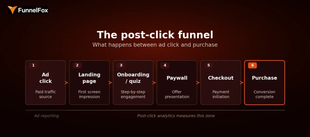
The post-click funnel: from ad click to purchase
What the post-click funnel includes
The post-click journey for a subscription app typically spans five layers, each with its own conversion signal:
- Landing page to start rate—does the first screen hold attention and move users into the flow?
- Onboarding or quiz completion—do users engage step by step, or drop off before reaching the offer?
- Paywall view and exit rate—how many users see the offer, and how many leave without acting?
- Checkout start and completion—do users who show purchase intent actually follow through?
- Purchase conversion by funnel step—what’s the conversion rate at each stage, relative to the start of the funnel?
Together, these layers give you a complete picture of where users are moving forward and where they’re leaving—and enough resolution to do something about it.
Why subscription apps need post-click analytics
Subscription decisions aren’t made in a single instant. A user might start the quiz, reach the paywall, and close the tab—only to return the next day and convert. Each screen they interact with shapes their decision. That means every step in the funnel is part of the sales process, not just the paywall.
A top-line conversion rate doesn’t capture this. Two funnels with the same purchase rate can have completely different drop-off patterns: one loses users early in onboarding, the other loses them at checkout. The fixes are entirely different, but you can’t tell the difference from a single percentage.
Benchmarks alone make this worse. The same funnel structure can produce wildly different results depending on creative, audience, and source. Take this example: two ad creatives for the same product had a 10x difference in conversion rate—0.6% vs. 6.8%—but near-identical cost per purchase. Someone looking only at conversion rate would have killed a perfectly healthy funnel.
The same logic applies to drop-off patterns. Say two funnels both convert at 3%. Funnel A loses 70% of users at the paywall and converts the remaining 30% at checkout efficiently. Funnel B has solid paywall engagement but loses 60% of users mid-onboarding before they even reach the offer. Same outcome, completely different problem. Funnel A needs a better offer or pricing. Funnel B needs a stronger quiz. You can’t see that from a single 3% number.
📈 Success story: A personalized content app tracked click-through rate from the second screen to checkout hitting 75%—and used that signal to double down on the funnel that was working. Read how they did it.
Which post-click metrics matter most for subscription apps
Not every metric in the funnel is equally useful. The ones worth tracking are the ones that point to a specific decision point: where users either moved forward or stopped. Here’s how they break down by stage.
Post-click metrics by funnel stage
| Funnel stage | Key metrics | What a drop-off here signals |
| Landing / entry | Landing-to-start rate, bounce rate, CTA progression | Creative-to-landing mismatch or weak first-screen message |
| Onboarding / quiz | Step-to-step CR, completion rate, time per step, abandonment points | Weak storytelling, irrelevant questions, loss of momentum |
| Paywall | Paywall view rate, paywall-to-checkout rate, plan split, exit rate | Weak offer framing, no value visualization, poor CTA |
| Checkout | Checkout start rate, completion rate, payment success rate | Payment friction, form complexity, trust issues |
| Revenue quality | ARPU, plan mix, cohort revenue, renewal rate | Plan distribution skewed to lower tiers, high early churn |
Entry and engagement metrics
The landing-to-start rate is the share of users who move from the first screen into the funnel. It’s the clearest proxy for how well your landing page aligns with the ad that brought users there. A large drop at this stage usually signals a creative-to-landing mismatch, not a problem with the quiz or paywall.
That said, some drop-off here is structurally expected. Around 50% of users who click an ad won’t progress past the first screen—they had low intent from the start. This is comparable to App Store page abandonment in an app funnel. Obsessing over this number tends to produce diminishing returns. The more meaningful signal is further down.
Onboarding and quiz completion metrics
Step-to-step conversion, completion rate, time per step, and abandonment points collectively tell you what’s happening inside your quiz. Of these, abandonment points are often the most actionable: when you know which specific screen is losing the most users, you have a clear hypothesis to test.
The quiz also deserves more optimization attention than most teams give it. It’s the layer that builds user intent. A weak onboarding storytelling arc undermines everything that comes after it—even a well-designed paywall can’t rescue users who never felt a compelling reason to subscribe.
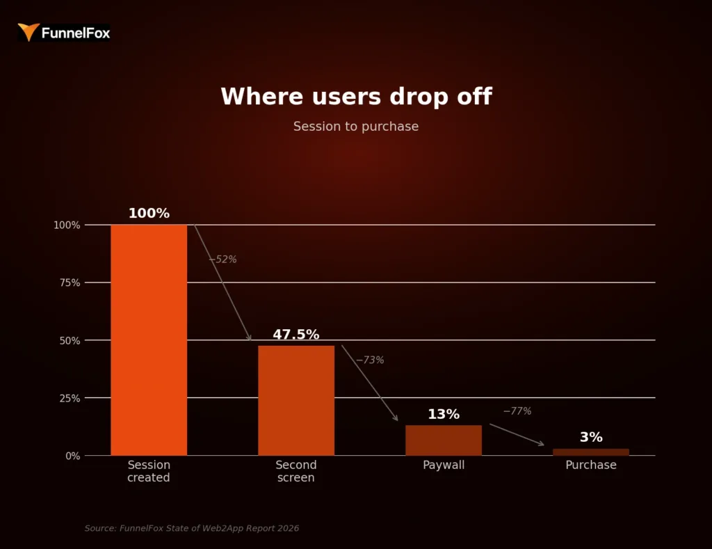
Where users drop off: session to purchase. Source: FunnelFox State of Web2App Report 2026
Paywall conversion metrics
The paywall view rate is the share of funnel starts that actually reach the paywall, and it’s a direct measure of onboarding effectiveness. If this number is low, no amount of paywall optimization will fix the underlying problem.
Paywall-to-checkout rate is the primary signal for offer quality. A high exit rate with no interaction usually points to one of four failure patterns: an offer that doesn’t match the value communicated in the quiz, weak value visualization, insufficient warm-up before the ask, or a call-to-action that doesn’t stand out visually.
Checkout and revenue-quality metrics
Checkout friction is different from intent-based drop-off. A user who starts checkout has already decided to buy. Losses here are not a messaging issue. They’re technical or UX problems: payment form complexity, trust signals, or slow load times. A well-designed checkout can add up to 30% to conversion rate compared to a poor one.
Beyond the immediate conversion, revenue-quality metrics like ARPU, plan mix, cohort revenue, and renewal rate tell the full story. Conversion rate alone is not enough. A test can increase purchases while shifting users toward cheaper plans, resulting in lower ARPU overall. Revenue per user is the right primary metric for evaluating what’s actually working, not conversion rate.
Here’s a concrete version of that trap. You run a paywall test: variant B converts at 5.2% vs. variant A’s 4.1%—a clear win on conversion. But variant B’s plan mix skews heavily toward the monthly plan at $9.99, while variant A drove more annual subscriptions at $59.99. Variant A’s ARPU was $18.40. Variant B’s is $12.10. The “winning” variant is actually generating 34% less revenue per user. Without post-click revenue data, you’d have shipped the losing version.
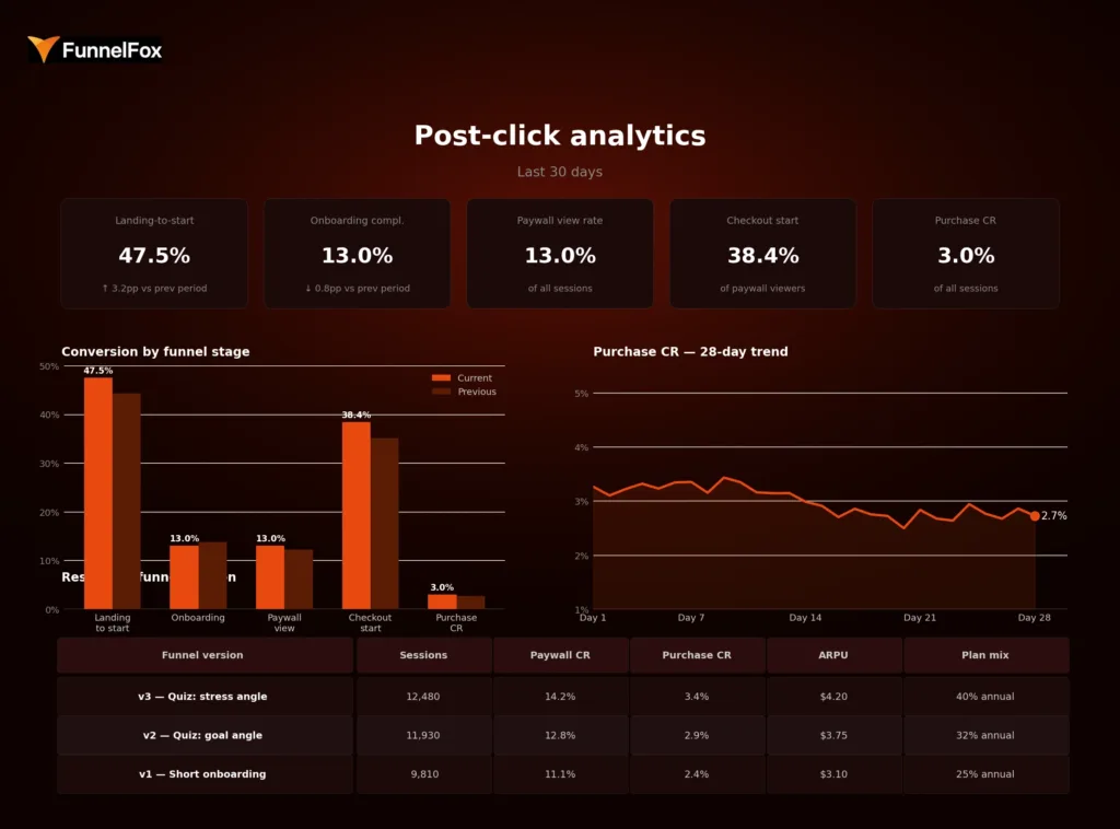
Example post-click analytics dashboard: KPIs, funnel stage breakdown, purchase CR trend, and results by funnel version
How to analyze funnel drop-offs between click and purchase
Drop-off analysis isn’t about finding a single broken element. It’s about reading a pattern: where does momentum slow, and what’s the most likely explanation?
Step 1: find the first meaningful drop
Start by looking for the earliest screen where a disproportionately large share of users exits. The first screen is not it—that drop is expected and normal. The meaningful signal is usually one or two steps deeper, where users who showed enough intent to engage with the quiz suddenly stopped progressing.
Step 2: separate friction from intent
Once you’ve identified the drop, the next question is: is this a persuasion problem or a friction problem? The two require different fixes. The most common causes fall into four categories:
- Weak messaging—the promise in the ad doesn’t match what users see inside the funnel
- Confusing flow—steps are unclear, too long, or not sequenced around user logic
- Weak pricing or packaging—the offer isn’t compelling, or the price-to-value ratio doesn’t land
- Payment friction—technical or UX barriers at checkout that prevent completion despite intent
A useful diagnostic sequence: check the payment layer first, then the paywall, then the onboarding. Issues at the bottom of the funnel tend to be easier to fix and have the highest immediate impact on revenue.
Step 3: segment before drawing conclusions
The same drop-off number can mean completely different things depending on the source. Two campaigns can show near-identical cost per purchase while having a 10x difference in conversion rate, simply because the creative and audience composition differ. Before making changes, segment the data by campaign angle, geography, funnel version, and plan structure.
For example: your overall onboarding completion rate is 14%. Looks fine against benchmark. But broken down by source, Campaign A completes at 22% while Campaign B completes at 6%. Campaign B is sending users who drop out by screen three—likely because the ad angle doesn’t match the quiz content. You’d never see that in the aggregate. Fixing Campaign B’s onboarding entry alone could add meaningful conversion volume without touching anything else in the funnel.
Aggregate metrics hide variance. Segmentation reveals it—and that’s usually where the actionable insight is.
Step 4: turn the insight into a test
Once a drop-off point is identified and a likely cause diagnosed, the next step is a focused hypothesis and a test. The direction depends on where the problem sits: shorten or lengthen onboarding, rewrite the first-screen promise, simplify the paywall layout, change plan order, or reduce checkout steps. One hypothesis, one change, one measurable outcome.
Why post-click analytics matters more in web2app
Web2app funnels don’t just enable post-click analytics—they make it significantly more complete and actionable than the app-side equivalent.
Web2app vs. in-app funnel: analytics comparison
| In-app funnel | Web2app funnel | |
| Attribution clarity | Fragmented—MMP-dependent, view-through gaps | Near 100%—every step tracked as a discrete event |
| Funnel control | Limited by App Store / Google Play constraints | Full control over paywall, checkout, pricing |
| Testing speed | Slow—changes require app review cycles | Fast—deploy and measure in hours |
| Revenue measurement | Post-install; harder to connect message to outcome | Pre-install; ad angle tied directly to revenue |
| Commission | 30% App Store / Google Play fee | 8–15% payment processing only |
On the app side, the journey from click to purchase is split across multiple systems: the ad platform, the App Store page, the app itself, and the payment infrastructure. Attribution is fragmented by design. You might track installs and in-app events, but connecting the specific ad angle to a revenue outcome requires stitching together data from several sources—with gaps at every join.
Web2app changes this. The entire funnel, from the landing screen to the checkout, sits in one environment that you control and can instrument completely. Marcus Burke, web-to-app growth expert, has noted that web funnels allow teams to attribute close to 100% of the conversion effect, in contrast to the fragmented picture on the app side.
There are three additional advantages that compound over time. First, testing speed: changes to onboarding, paywalls, or checkout can be deployed and measured in hours, not weeks. No app review cycle. No waiting. Second, funnel control: you can build any paywall layout, pricing structure, or checkout flow you want and measure exactly how it performs. Third, message-to-revenue traceability: because the ad angle, quiz content, and paywall offer all live in the same flow, you can draw a direct line from what you told users in the ad to whether they converted.
📖 Post-click data tells you where users dropped. Cohort analysis tells you whether the ones who converted actually stayed. Learn how to use cohort analysis to grow your subscription app.
How FunnelFox helps teams measure post-click behavior
FunnelFox tracks the complete post-click journey from first screen to purchase and beyond. You can see landing-to-start progression, step-by-step onboarding conversion and abandonment, paywall view rate and exit behavior, checkout start and completion, and final purchase conversion relative to each upstream funnel step. Every metric is breakable by funnel version, experiment, product, and payment outcome, so you’re comparing variants rather than just tracking totals.
For teams that want to connect funnel performance to long-term revenue, FunnelFox also includes cohort analysis built specifically for subscription behavior. This lets you see how onboarding changes, paywall experiments, or pricing decisions affect renewal rates, churn, and LTV over time, going well beyond first-payment conversion. It’s the difference between knowing you improved your purchase rate and knowing whether that improvement actually held.
Want to see how it works for your funnel? Book a demo with FunnelFox.
Conclusion
Conversion rate is an outcome. Post-click analytics is how you understand what produced it and what’s standing in the way of improving it.
For subscription apps, where the purchase decision unfolds across multiple screens and depends on the quality of every step between the ad and the payment, top-line metrics are not enough. They tell you what happened. Post-click analytics tells you why it happened and where to look next.
Teams that instrument this layer can diagnose friction precisely, test changes with a clear hypothesis, and connect funnel decisions directly to revenue. Teams that don’t are optimizing blind.
FAQ
What is post-click analytics?
Post-click analytics tracks user behavior between an ad click and a purchase or drop-off. It covers every step inside the funnel, from the landing screen through onboarding, paywall, and checkout, showing where users convert and where they leave.
What is the difference between post-click analytics and app analytics?
App analytics measures in-app behavior after a user installs and opens an app. Post-click analytics focuses on the pre-install, web-based funnel: the decision-making journey that determines whether a user reaches the app at all and whether they pay. The two cover different parts of the user journey and require different tooling.
Why is conversion rate not enough for funnel optimization?
Conversion rate shows how many users purchased. It doesn’t show where the others dropped, why they left, or which specific step caused the loss. Two funnels can produce the same purchase rate with entirely different drop-off patterns, which means entirely different fixes are needed. Without step-level data, you’re guessing.
How does web2app improve post-click analytics?
Web2app funnels put every step of the pre-purchase journey in one environment you control and can measure precisely. App store flows fragment attribution across platforms, whereas web funnels give you clean, step-level data from click to payment. This makes it possible to see exactly where users drop, test changes quickly, and connect specific funnel decisions to revenue outcomes.