


The end of the first month of 2026 is the perfect moment to check how top subscription apps kicked off the new year: what they’re pushing in onboarding, how they warm users up before the paywall, and which mechanics feel “must-have” right now.
We picked 5 apps that are some of the strongest (and most recognizable) players in their categories and broke their funnels down step by step: entry, quiz onboarding, warm-up mechanics, final push, and checkout. Inside, you’ll find concrete patterns you can borrow for your own web2app flows.
Apps covered:
- Diet & weight loss — Fastic
- Health & Fitness — Lasta Fit
- Dating / AI messaging assistant — Flirtist
- Astrology & spiritual self-discovery — Nebula
- Language learning — Babbel
If your category isn’t here, no worries: check out Part 2.
TL;DR
From what we’ve seen, apps rely on a few recurring patterns adapted to their category and audience:
- They clarify the user’s goal early. Goal and context come first, so the user instantly feels “this is for me.”
- Long onboarding is used to build commitment. 20–60 screens aren’t just data collection — they also help increase involvement and reduce the chance of dropping before the result.
- Personalization is shown step by step. Apps keep reinforcing that something is being tailored in real time: unit previews, profile summaries, habit inputs, progress bars, “building your plan,” or additional signals like scans/photos.
- They mix quiz steps with micro-rewards to prevent fatigue. Instead of asking questions nonstop, apps insert examples, reassurance, social proof, and mini-insights to keep the pace steady.
- They turn vague intent into a daily routine. Time-per-day choices, streaks, reminders, and schedules translate motivation into a realistic habit.
- The paywall is framed as access to a ready result. Pricing appears after the user sees a plan preview or a clear outcome in progress, so payment reads like unlocking what’s already built.
- Urgency is usually paired with risk reduction. Timers and discounts are combined with money-back guarantees and clear billing terms to reduce hesitation.
- Trust blocks show up right before payment. Ratings, reviews, big user numbers, security badges, and FAQs remove the final friction.
If you’re building web2app in 2026, these are the mechanics that look basically non-negotiable.
Language learning: Babbel
Babbel sells a long-term skill, so their web2app funnel is optimized for user quality and future consistency rather than immediate payment. The funnel includes 20+ screens, and each one serves a specific purpose: segmentation, reducing uncertainty, establishing a learning rhythm, transitioning the user into the app, and building trust around web payments.
Babbel locks in the goal and the starting level in the first 30 seconds
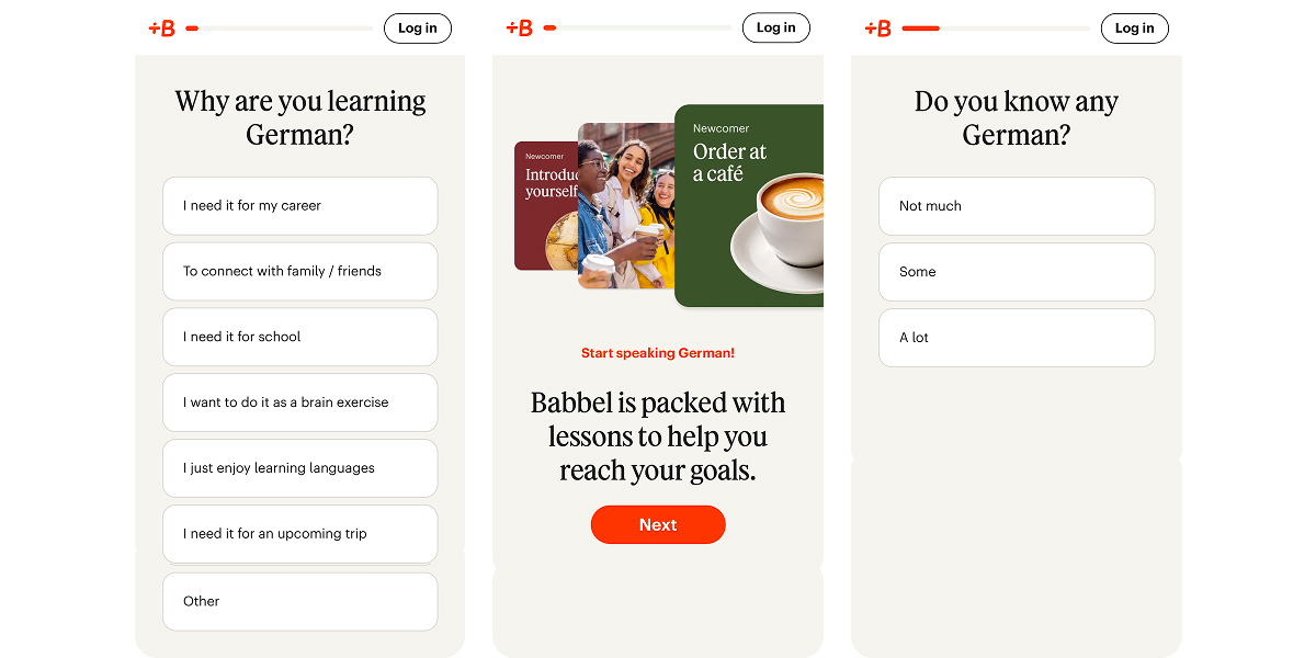
Babbel starts with motivation (“Why are you learning German?”) and skill level (“Do you already know the language?”). Between those steps, it shows real-life lesson examples (“Introduce yourself”, “Order at a café”). This quickly communicates what outcome the product delivers and where the user is starting from.
They show the starting point and learning structure upfront
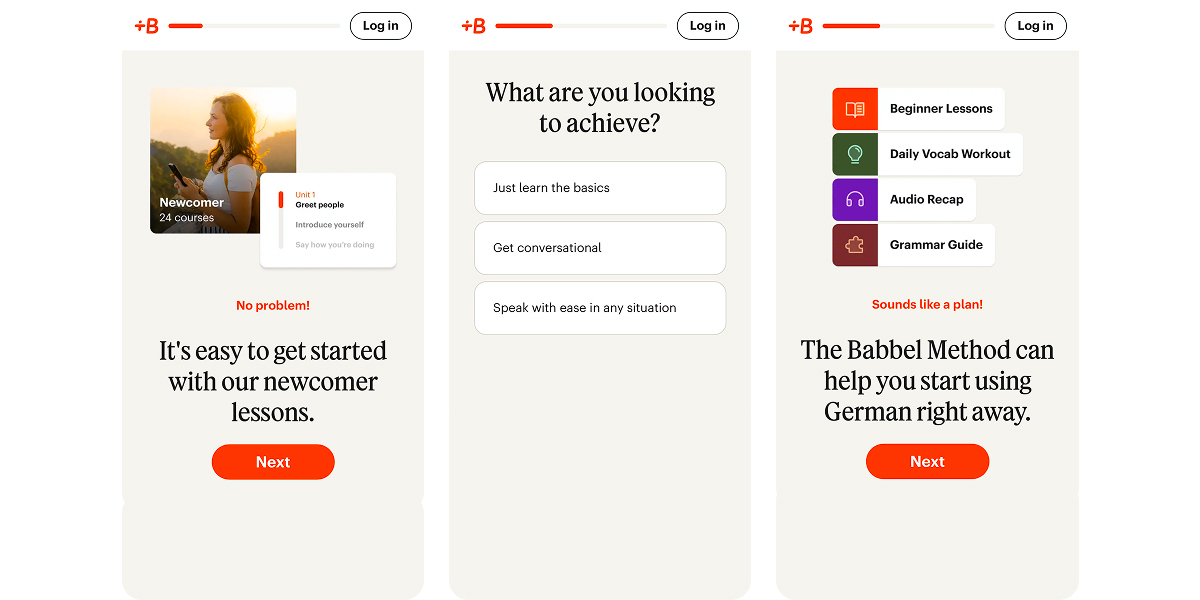
Next, Babbel previews the first unit for beginners and refines the goal (basics / conversational / speak with ease).
Then it breaks down the method into formats: lessons, daily vocabulary, audio review, and a grammar guide. Early in the flow, the user already understands what they will be doing.
Habit commitment and turning the goal into a daily rhythm
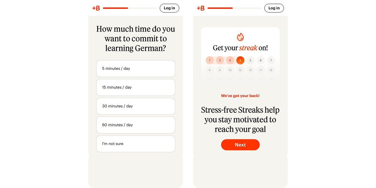
The question about 5/15/30/60 minutes per day turns “I want to learn a language” into a particular routine. The streaks screen reinforces consistency and explains how Babbel supports habit formation.
Segmentation and social proof mid-onboarding
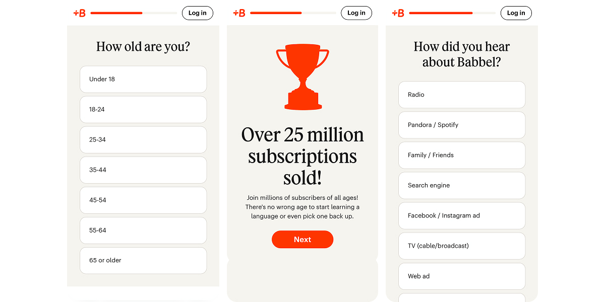
Age and install source (“How did you hear about Babbel?”) provide useful segmentation and a channel signal. Social proof (“25M subscriptions sold”) appears after several steps, once the user has already invested effort and reads the number as validation.
Sign-up comes before pricing, and that’s a deliberate bet on quality
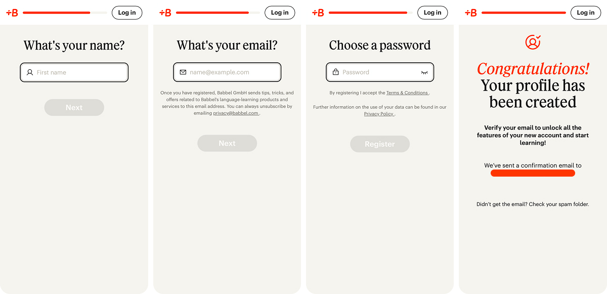
Babbel asks for name, email, and password, then immediately pushes email confirmation. This anchors the user in an account, connects web and app, and turns email into a reliable return channel.
The downside is friction: verification forces the user to leave the funnel before seeing prices. This works for a strong brand, but for faster products it can become a major drop-off point.
Babbel explains why to download the app before driving to payment
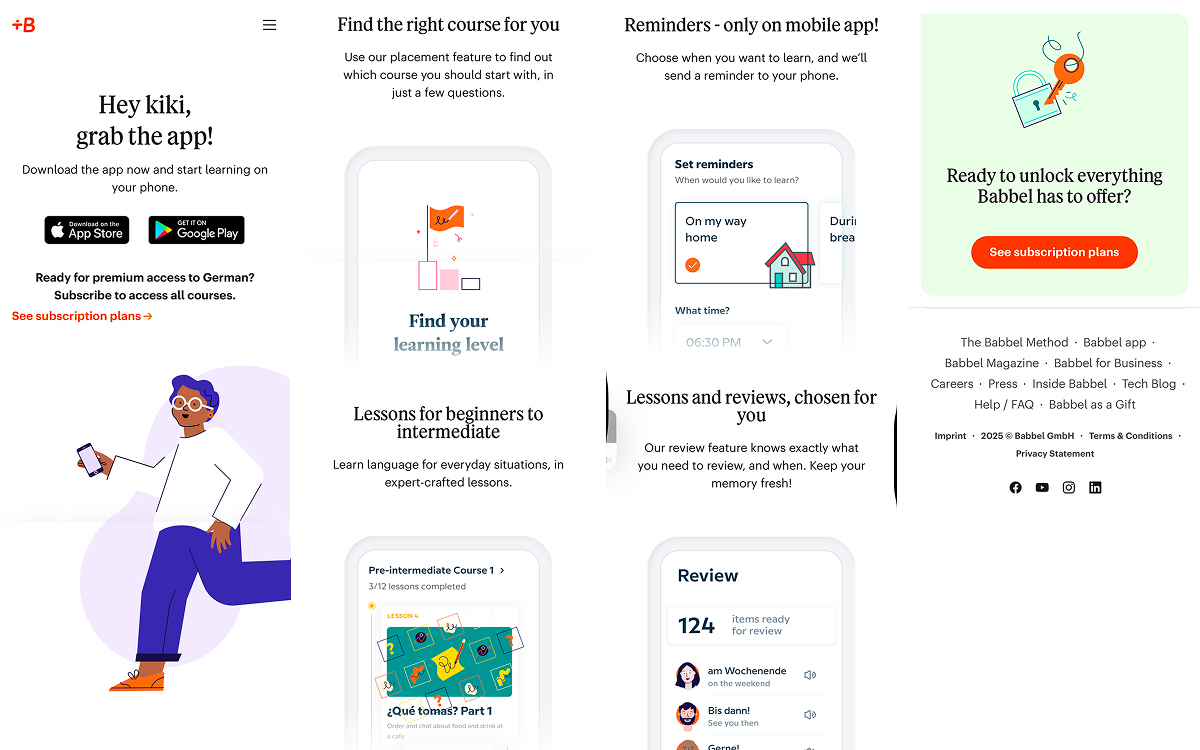
After profile creation, Babbel prompts the user to install the app (“grab the app”) and keeps the subscription path available below. Then it gives two concrete reasons for the app experience: placement to match the right course and reminders that are only available in the mobile app.
These screens connect the web2app logic: the web moves the user to a decision, and the app supports daily usage.
Paywall and trust blocks for web checkout
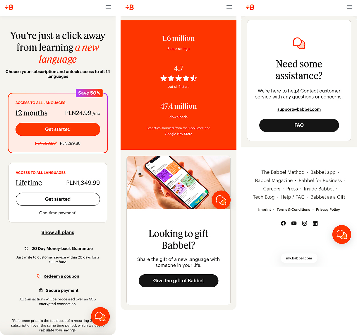
Babbel offers 12 months and a lifetime. The annual plan is highlighted with a discount and a “per month” price, while lifetime is positioned as a one-time payment. For language learning, this structure fits the use case: value unfolds over time, and long access feels like a natural purchase format.
Then Babbel closes the usual web payment concerns: a 20-day money-back guarantee, secure payment, a large block of ratings and downloads, and support/FAQ. This reduces hesitation, especially for users who are used to paying through the App Store.
What to borrow from Babbel’s web2app funnel:
- Start with the goal and level so the user quickly understands whether this path fits.
- Show a specific starting point (e.g., Unit 1) before the paywall to reduce uncertainty.
- Ask for a daily rhythm to lock in a realistic commitment.
- Explain the role of the app through specific functions (reminders, placement).
- Consider annual + lifetime plans if the product implies a long usage cycle.
- Add a refund guarantee and trust blocks on web checkout.
Dating: Flirtist (AI messaging assistant)
Flirtist doesn’t operate like a classic dating app where the value is “match and chat.” The product is an AI assistant for messaging that helps users write better, flirt, keep the conversation alive, and avoid losing the connection. Their funnel is built around two priorities:
- quickly lock in the user’s pain and context,
- and sell the feeling of “now I have a system and guidance.”
View the full Flirtist funnel.
Intent segmentation and context setup
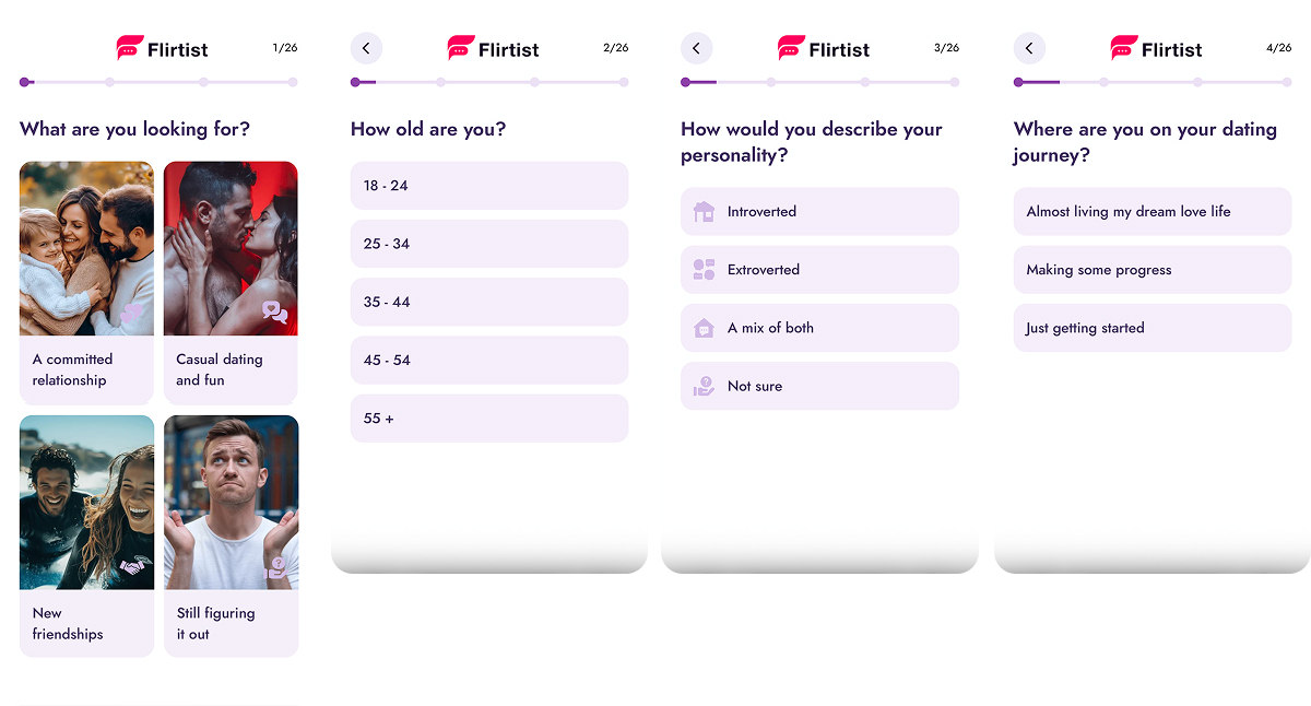
The funnel starts with scenario selection (relationship / casual / friendship / not sure yet), then clarifies age, personality type, and current stage.
These questions define what kind of plan Flirtist will generate: communication style, confidence level, and expectations around dating.
Trust and outcome preview
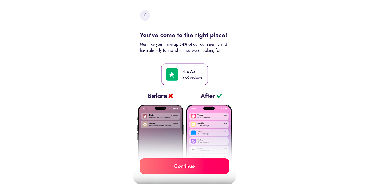
One screen handles two jobs at once:
- trust (rating + reviews),
- a clear “before/after” outcome through notifications and an increase in incoming messages.
Selecting the skills the user is willing to pay for
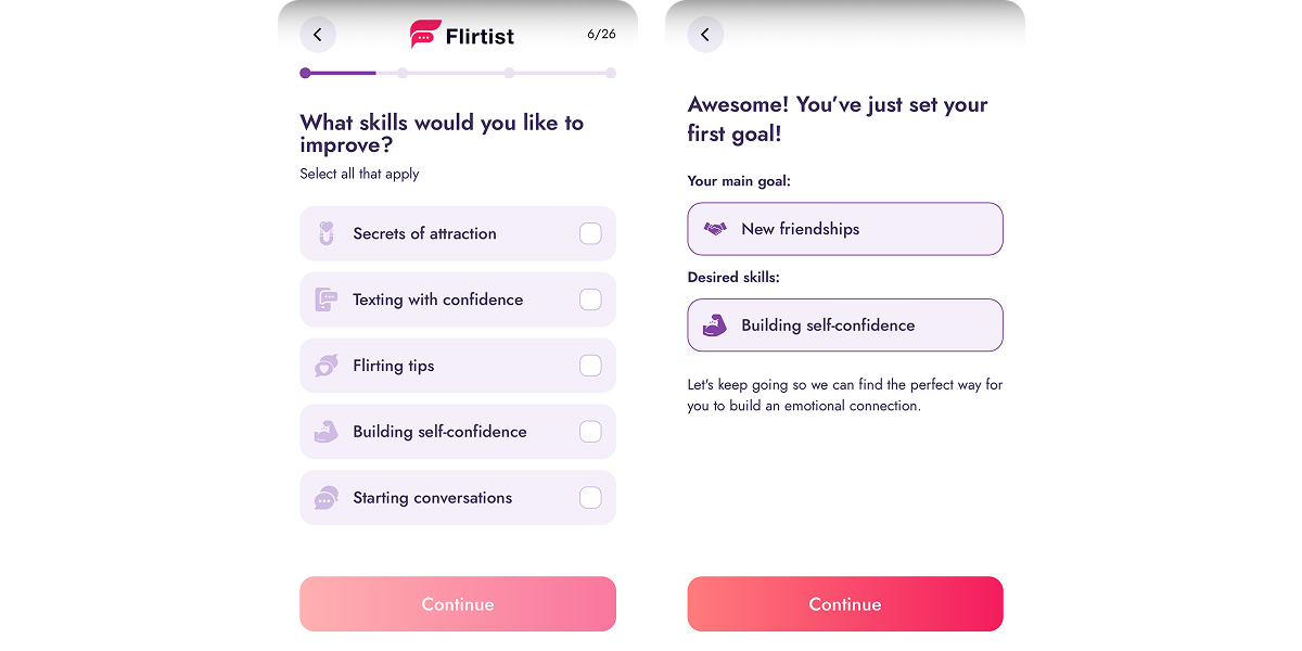
The user chooses what they want to improve: attraction, texting confidence, flirting tips, self-confidence, or starting conversations. Flirtist then frames that choice as the “first goal,” so it feels like a personal route rather than a random survey.
A long self-assessment and trigger block (and it’s long on purpose)
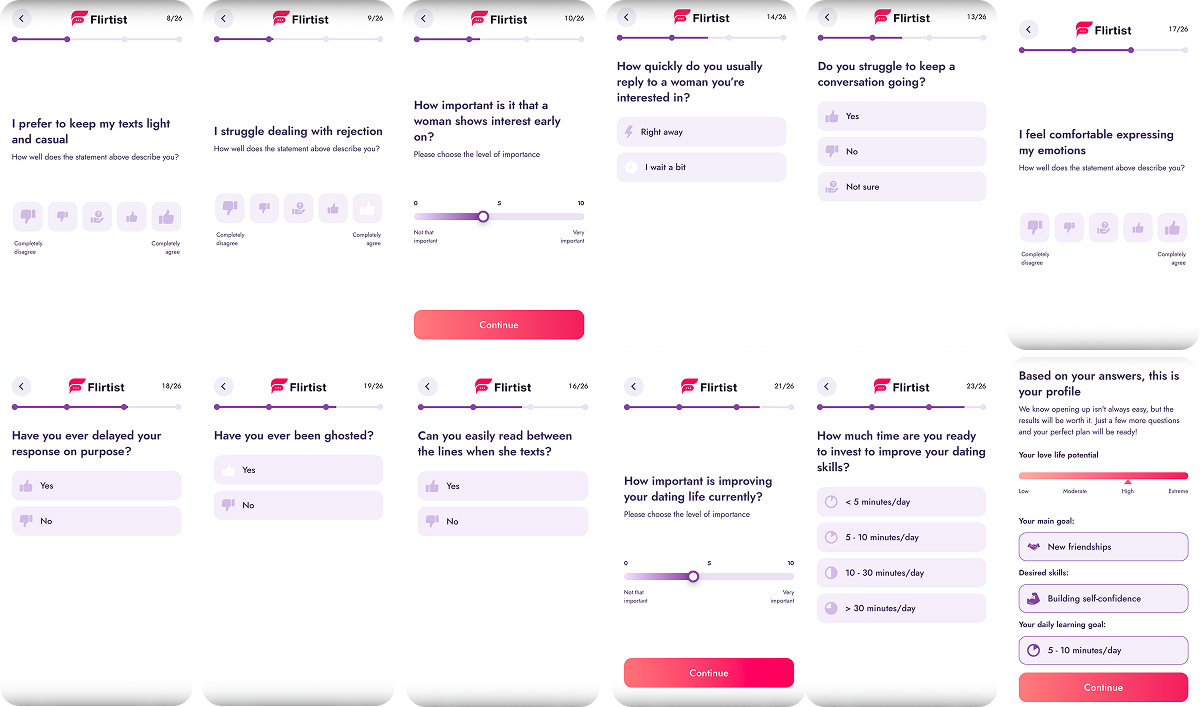
They rotate formats so the user doesn’t get stuck in one repetitive question type: agreement scales, simple Yes/No, behavioral questions, value preferences, and goal importance.
Why this works:
- it creates the perception of deep personalization (even if only 3–5 answers that drive the logic),
- it increases the perceived value of the plan shown before payment,
- it forces attention investment (after 15–20 clicks, continuing feels easier than quitting).
The pacing stays stable because formats change (scales, yes/no, sliders), so the funnel doesn’t turn into a boring questionnaire.
Warming the user up between questions
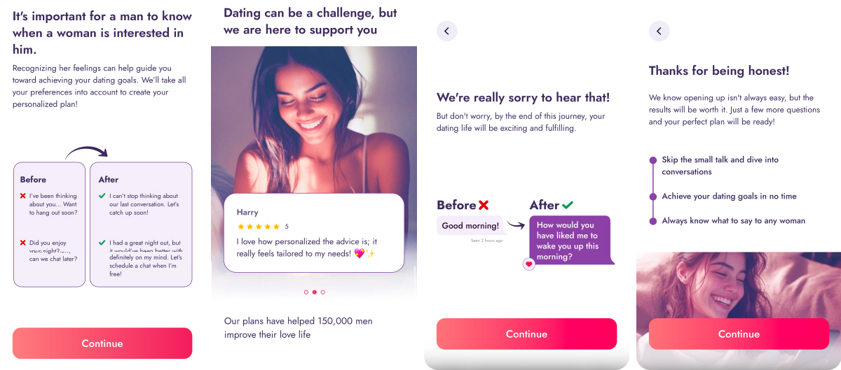
To prevent fatigue mid-flow, Flirtist inserts “useful pauses”:
- “Before/After” chat examples
- skill-like framing that feels practical (“know when she’s interested”, “keep conversation going”)
- reviews and numbers (“150,000 men…”)
This keeps the user feeling like progress is already happening, not just endless tapping.
Framing the outcome into a personal plan
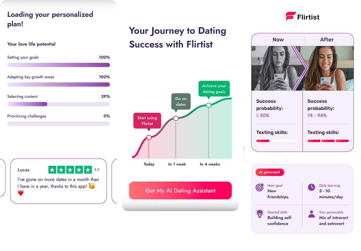
This is the key transition: from questions to a tangible result: time commitment; potential score + selected goals/skills; plan assembly (goal, desired skills, and daily learning target); and “Loading your personalized plan” with progress bars.
It creates the sense that the system is already configured and only one step remains: unlocking access.
Moving into payment: roadmap → forecast → paywall → FAQ
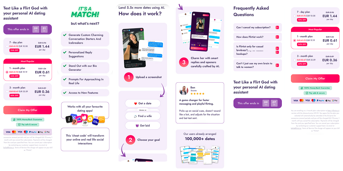
The final block is built as a single conversion chain:
- Outcome roadmap (today → in 1 week → in 4 weeks) with CTA “Get My AI Dating Assistant”.
- “Now vs After” comparison with increased success odds and texting skills.
- Paywall with a timer, discounts, and a price per day anchor, plus money-back and payment badges.
- Post-paywall value screen (“what’s next?”) listing features and the promise “works with all your favourite dating apps”.
- FAQ directly on the paywall, closing questions about cancellation, mechanics, and the “why do I need this” hesitation without leaving the page.
What to borrow from Flirtist’s web2app funnel:
- Start with intent segmentation, not profile details. It sets the scenario and the offer.
- Let the user choose skills (and reflect them in the summary) so the “plan” feels personal.
- In a long questionnaire, rotate questions + micro-examples + proof to prevent fatigue drop-off.
- Show the assembled outcome (“profile + plan + roadmap”) before the paywall so the CTA feels like the next step.
- Keep the paywall focused on one message: discount + timer + guarantee, and add FAQ without forcing a page exit.
Astrology / spiritual self-discovery: Nebula
Nebula sells a personalized answer to a disturbing question: Who am I, and what’s happening to me? The funnel is built around the feeling of being figured out step by step, and the paywall appears only after the user has already invested time, answers, and expectation.
Entry: Nebula promises a personal reading
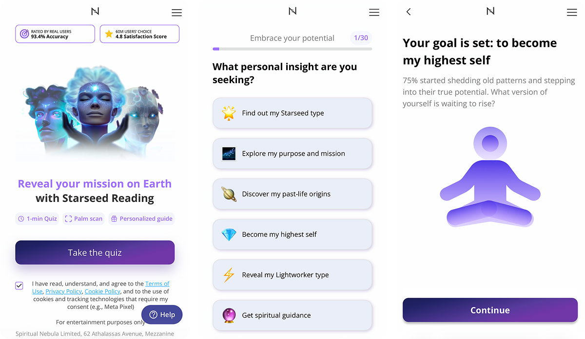
The first screens define the format: this is not a feed and not a content library. It’s a reading tailored to the user.
The tone matters here: “Embrace your potential,” soft confidence, no aggression. In this category, pressure hurts conversion because the user comes in not to buy a subscription, but to get support and to be taken care of.
A long quiz onboarding as a commitment mechanism
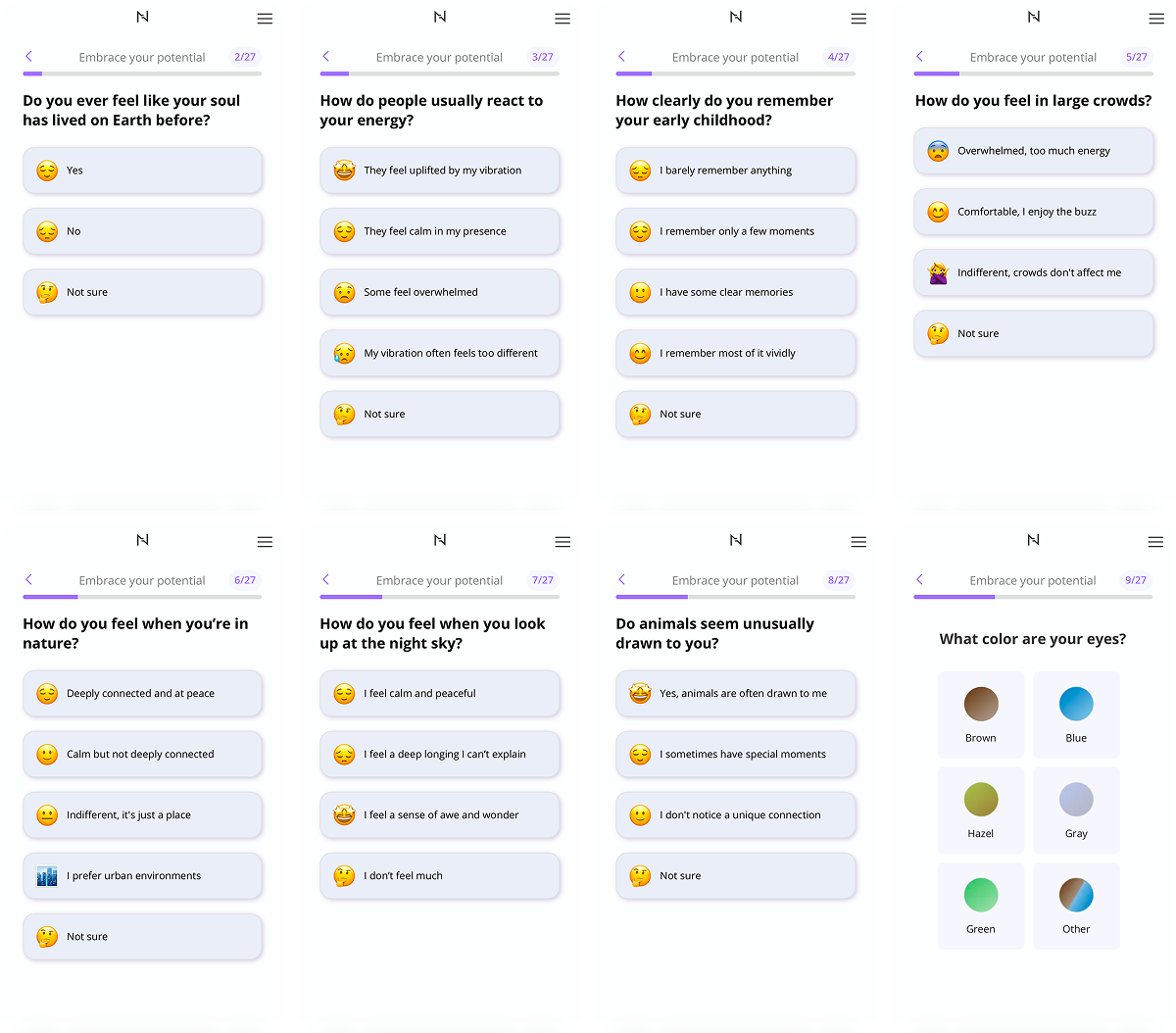
Next comes a large block of questions (almost 30), and it’s not just data collection for segmentation. This detailed quiz onboarding is designed to:
- pull the user into a dialogue (easy answers, emojis, light scrolling),
- create progress momentum (progress bar + 27 steps),
- build a sense of accuracy (“this actually feels like me”).
Some questions look unconventional (eye color, what you see in an image, metaphysics, higher purpose, death, etc.). This is intentional. It expands the interpretation space, so almost any answer can be turned into a personalized insight.
Micro-rewards to prevent drop-off
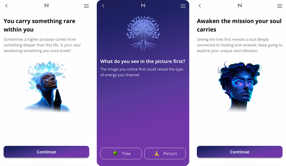
Inside the quiz, Nebula inserts user-centric screens saying “You carry something rare within you”, “Awaken the mission your soul carries”.
This prevents the experience from feeling like an interrogation. The user feels they are already receiving something way before the final result.
Birth date and palm scan (positive friction) as personalization
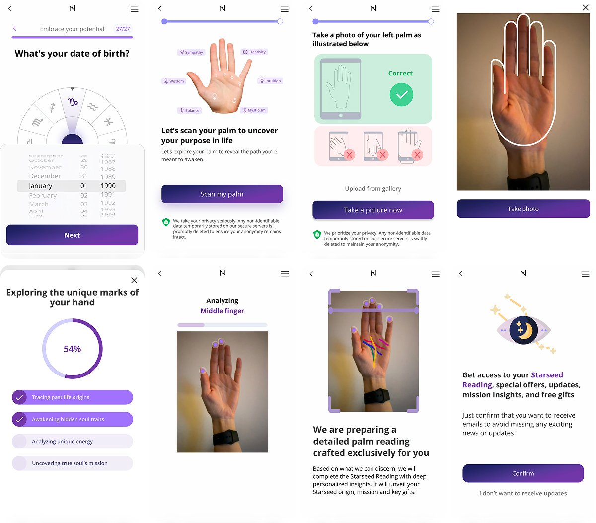
Near the end of the quiz, Nebula asks for a birth date and then offers a palm scan.
Why this works:
- it looks like a real signal,
- it increases trust in personalization,
- it raises user investment sharply (taking a photo of your hand is a meaningful action that’s hard to mentally undo).
Highlighting “uniqueness” and the paywall as access to the interpretation
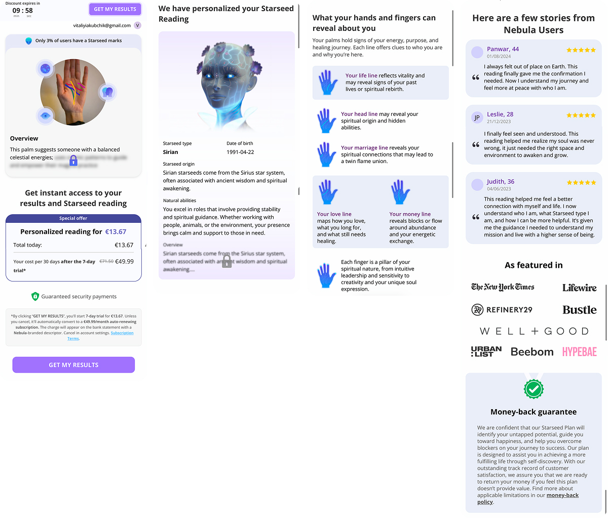
After collecting answers, Nebula increases perceived value through rarity: “Only 3% of users have Starseed marks”. This is a key moment. The funnel shifts the user from “I’m just taking a test” into “something about me is different.”
They show a preview of the result, then lock the key parts. This doesn’t feel annoying because it happens at the right moment: the user already believes the result exists and wants the continuation.
On the paywall, there are multiple persuasion layers:
- a discount timer (urgency),
- a clear purchase object (“Personalized reading”),
- transparent trial mechanics → then auto-renewal,
- safety reassurance.
“Choose your price” and a “secret discount” to push to the payment
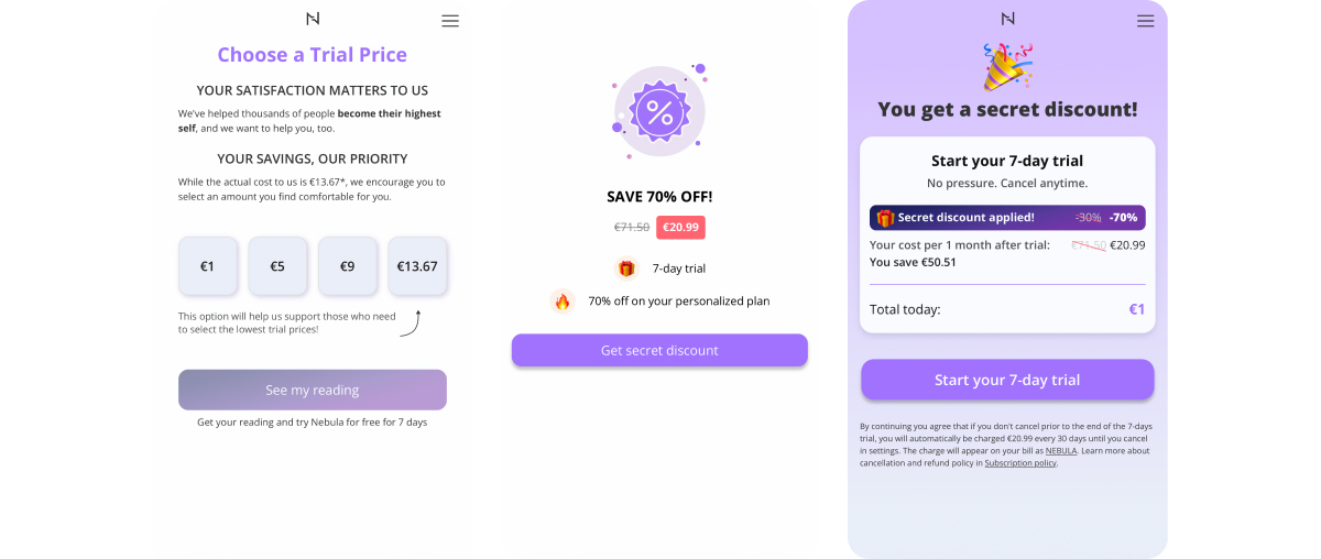
The most interesting part here is how Nebula offers multiple entry points into payment, using them as a willingness-to-pay filter:
- “Choose a trial price”. The user picks the trial price (€1 / €5 / €9 / €13.67). This reduces friction: the user doesn’t argue with the price, they choose a comfortable entry point.
- Value reinforcement. “Get instant access to your results”, “personalized reading”, reviews, media logos, money-back guarantee.
- Exit catch with a hidden €1 trial. If the user still tries to leave, Nebula offers “start trial for €1” through a secret discount. This is a tradeoff: €1 is better than €0, but discounts this aggressive can make the full renewal price harder to accept psychologically.
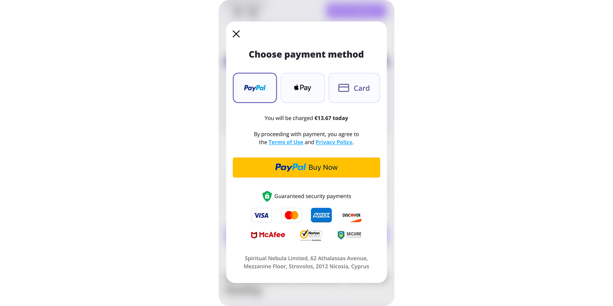
Nebula also has one of the best checkouts out there — clear, simple, and high-converting.
What to borrow from Nebula’s web2app funnel:
- A long quiz works when it includes micro-rewards and a strong sense of progress.
- Personal input (birth date, photo, any signal) increases the feeling that the product is doing real work for the user.
- Paywalls convert better after a result preview, not before it.
- “Choose your trial price” reduces resistance, especially in impulse-driven categories.
- A discount screen after the paywall can convert users who are close, but need a final reason.
Health & Fitness: Lasta Fit
Tai Chi has been gaining momentum lately. It’s a Chinese martial art that’s increasingly positioned as a wellness practice, combining slow, meditative movement with breath control and mental focus. Many fitness apps are adding it as a new direction, and Lasta Fit is no exception.
Lasta Fit plays in the low-impact fitness category: a gentle practice that targets back pain, stress, sleep, and weight loss. The funnel is built around a safe starting point and a personalized plan, with monetization following a familiar structure: long quiz → results → timer + discount + plan selection.
View the full Lasta Fit funnel.
Effortless entry point: Tai Chi as safe fitness without forcing intensity
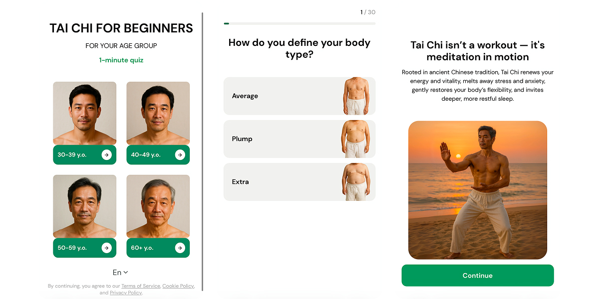
Lasta Fit starts with soft positioning: Tai Chi, low-impact, joint-friendly, built for tension relief and flexibility. This reduces anxiety and expands the audience, especially for users who dislike workouts, fear injuries, or have burned out on fitness before.
A long quiz captures habits, routine, and context in addition to classic height and weight
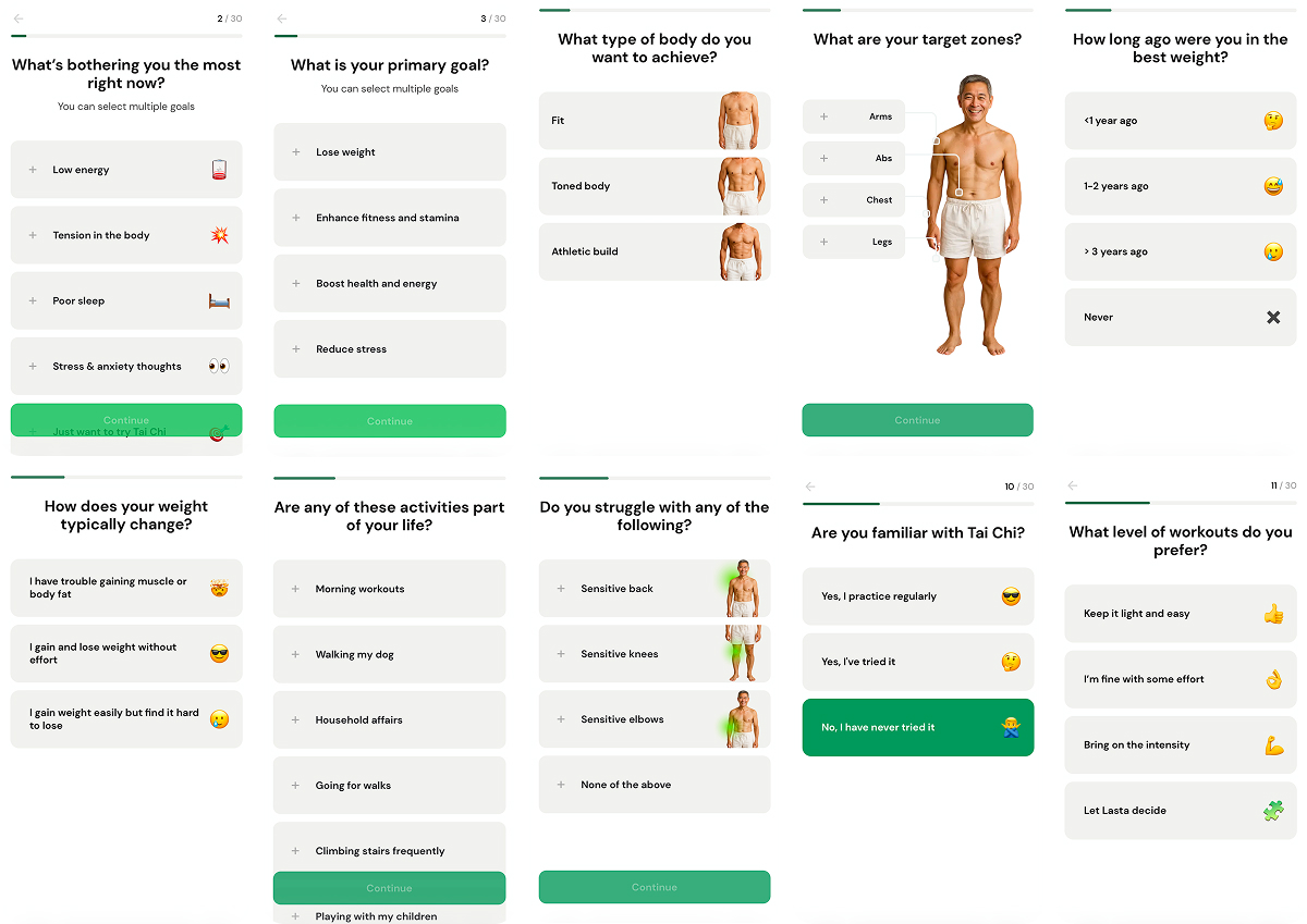
Next comes a standard wellness intake: experience, intensity, training frequency, session length, height/weight, goal, sleep, energy, water intake, lifestyle, limitations (e.g., sensitive back, knees, elbows). The key is that this isn’t only data collection but also commitment building: the more the user answers, the harder it becomes to simply close the flow.
This is a very strong quiz onboarding (and a long one — 30+ screens) because it:
- signals care and medical caution,
- justifies personalization later (“we accounted for your constraints”),
- reduces the “this isn’t for me” reaction.
Education layer and soft pressure through research
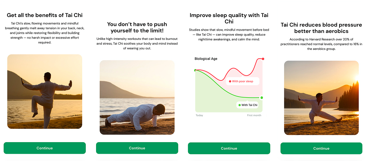
Inside the quiz, Lasta Fit inserts “science” cards: Tai Chi improves sleep, lowers blood pressure, and helps avoid burnout from high-intensity training. These screens work as an explanation of why this method, rationalization for the choice, and trust-building before payment.
Personalization proof
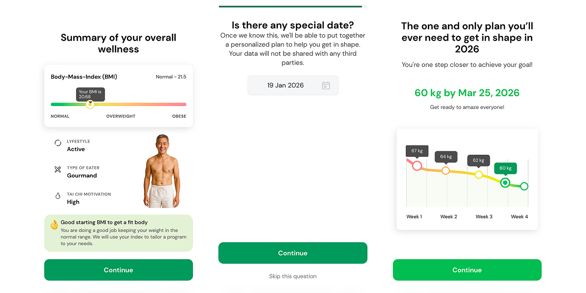
After the quiz, the funnel shows a profile summary: BMI, lifestyle, eating type, motivation, and goals. There’s also a vivid visualization of the upcoming progress, highlighting the timeline and the goal to be achieved.
Lead capture through email
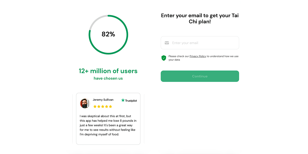
Before showing the full “ready plan,” Lasta asks for an email. This is a classic protection layer:
- if the user doesn’t buy, the product can re-engage them later,
- the user already feels like the result is within reach.
But before that, they add some social proof — like “12 million users are already with us” — plus a quick review from one of their users. It helps people feel more comfortable about leaving their email.
Paywall with a ready-made plan, timer, discount, and a classic 3-options layout
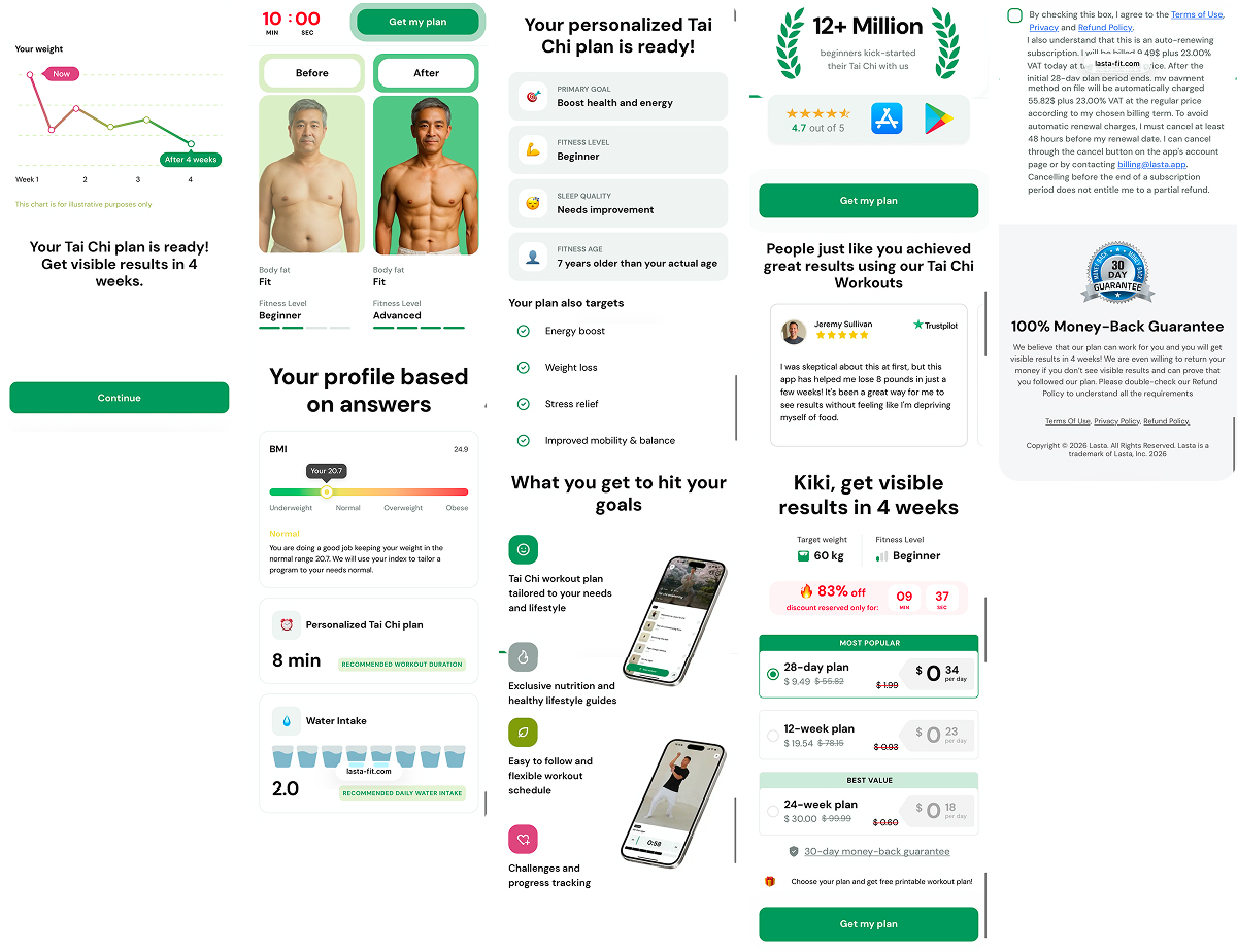
The final paywall is split across multiple screens, but it functions as a single block with clear logic:
- “your plan is ready” + 4-week results framing,
- social proof (12M+ users, rating),
- name-based personalization,
- timer and discount reserved,
- three plans with anchoring (28 days as most popular),
- legal trial/auto-renewal terms + cancellation policy,
- money-back guarantee as reassurance.
What to borrow from Lasta Fit’s web2app funnel:
- Lead with “safe and gentle” to make users less resistant to start.
- Collect physical constraints first, then lifestyle context. Ask about limitations, experience, and training format before moving into habits.
- Add micro-proof inside the quiz to keep users engaged. Science-style cards (sleep, blood pressure, “Harvard research”) act as trust anchors in a long questionnaire.
- A profile summary based on the quiz results makes it feel like the work is already done.
- Email before the paywall works well in long funnels. It protects conversion by enabling follow-up when the user doesn’t buy immediately.
- In wellness, a clear routine and a predictable path sell better than motivation.
Weight loss: Fastic
Fastic operates in one of the most competitive health & fitness categories — users here come for a clear plan that feels doable, delivers results, and doesn’t trigger a rebound. Their funnel is built around two goals: a strong sense of personalization (“this is built for me”) and anxiety reduction (“I can handle this, and I’m not getting played”).
Positioning: Not a diet, but a real-life plan that works
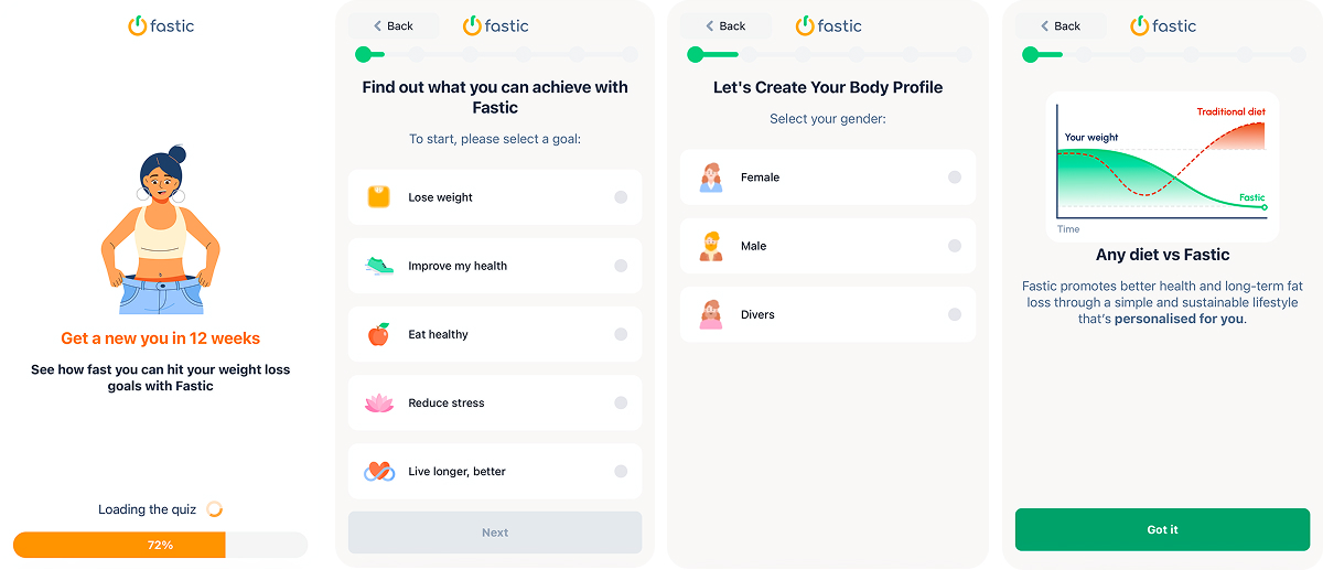
Fastic does one important thing immediately: it dissociates itself from the restricted diet association, where everything feels painful and boring. Instead, it frames the product as a meal plan built for long-term results, without forcing the user to live like a monk. The expectation becomes simple: no suffering, just following a system.
The long quiz building commitment
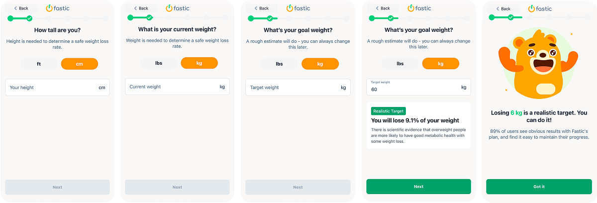
Despite of the length (almost 60 screens), the quiz onboarding doesn’t feel boring. It rather feels like “we’re trying to understand you,” which creates a soft commitment: once the user has shared this much, finishing and seeing the result becomes the natural next step.
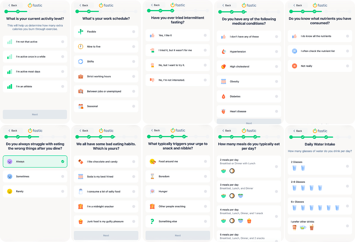
Within the quiz, Fastic collects a highly practical data layer: number of meals, water intake, diet preferences like keto/vegan, and restrictions (gluten-free / lactose-free / sugar-free, etc.).
Fastic also asks beyond food preferences and digs into behavior: what triggers snacking, what matters in habits. That is psychologically stronger than asking about weight.
All these questions matter not just because Fastic needs answers (even though it does), but because it makes the user think: “oh wow, they’re actually gonna tailor this to me.” Personalization starts feeling real.
Value demo before the sale
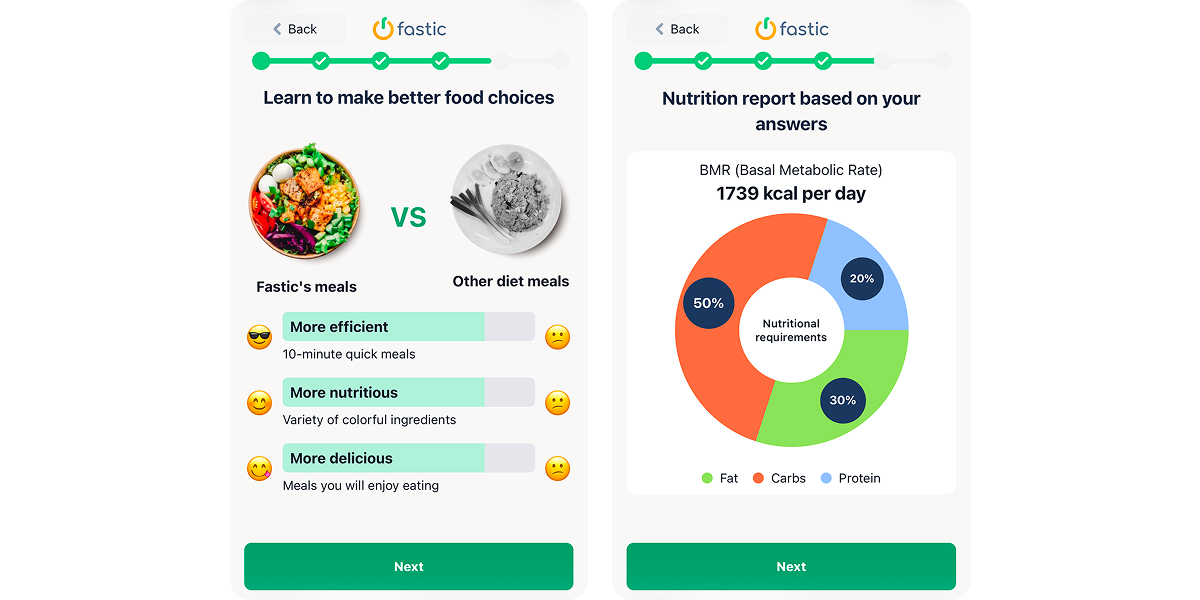
Before showing the plan, Fastic does a quick warm-up with a simple visual: two meals with the same calories, but one looks normal and appetizing, and the other looks like a sad diet plate. It lowers resistance, and the user stops expecting a life of chicken and regret.
Then comes a personal nutrition report — one of the most persuasive screens — with BMR (Basal Metabolic Rate) in kcal/day and macro split (fat / carbs / protein). Even if the user doesn’t know how to use it, they see numbers and conclude that a tailored plan was calculated.
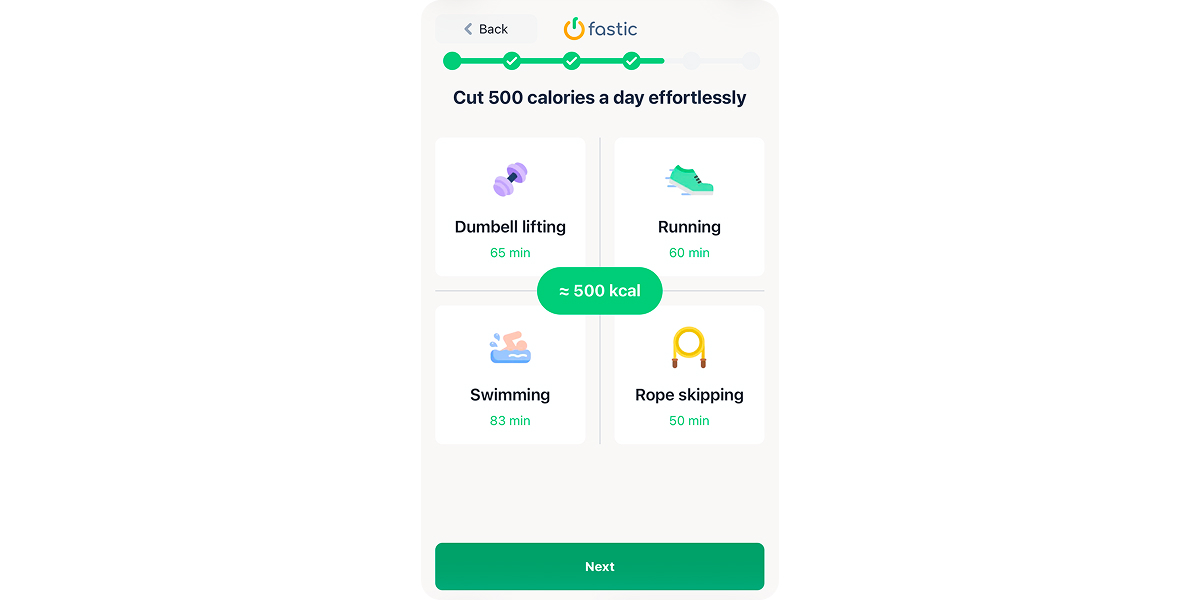
A classic diet funnel promise — minus 500 calories a day — is presented as a clear, manageable target. Fastic shows activity equivalents (how many minutes of exercise = 500 kcal), which creates a sense of control.
Emotional layer
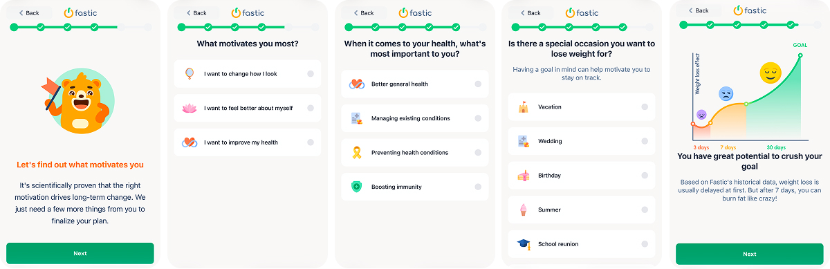
After the rational layer, the funnel moves into emotion. The user is guided through motivation (how I want to look / feel / my health), values (what matters in health), and event anchoring (vacation, wedding, summer).
This makes the goal specific and personal, while reinforcing that the plan will be relevant to the user’s life.
Surfacing the pain point and getting the user to recognize themselves in it
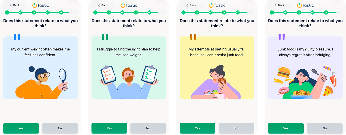
Next comes the hardest section: a sequence of statements where the user must agree or disagree:
- “My current weight often makes me feel less confident.”
- “I struggle to find the right plan to help me lose weight.”
- “My attempts at dieting usually fail because I can’t resist junk food.”
- “Junk food is my guilty pleasure. I always regret it after indulging.”
This works like a psychological tunnel. After multiple “Yes” taps, the user has already admitted the problem, and accepting help becomes consistent.
Final push: Social proof → results without workouts → paywall
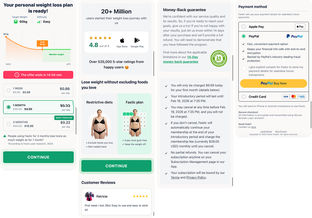
Fastic finally shows a personalized plan (schedule + goal), lets the user pick an option right away, and frames the price as $0.22–$0.86 per day. A countdown timer (“offer ends in…”) adds urgency and nudges to decide faster. The overall paywall design makes the purchase feel less like paying for a subscription and more like a small step to unlock your plan.
Then they handle the usual checkout doubts: strong social proof (20M+ users, 4.8 rating, reviews), reassurance that it’s not a harsh, restrictive diet, a money-back guarantee, and clear billing terms. The finish is simple: easy payment options (Apple Pay / PayPal / card) with minimal friction.
What to borrow from Fastic’s web2app funnel:
- Sell the outcome, not the path to it.
- Make the quiz long, but make it feel like care.
- Use self-identification to strengthen motivation. The “this is me” statement sequence pushes the user to acknowledge the problem and want a ready-made plan.
- Place social proof right before monetization. Millions of users, ratings, and reviews work best close to the paywall, when the user is already close to converting.
- Build the paywall as a stack: urgency → plan mix → risk reversal → checkout. A timer and plan anchoring increase pressure, the guarantee reduces fear, and convenient payment methods (Apple Pay / PayPal / card) remove the final friction.
- If you claim “your plan is ready,” preview it before payment, even briefly.
Wrap-up
Web2app funnels in 2026 are less about “getting to the paywall fast” and more about making the user feel understood, guided, and already halfway to a result. The strongest apps don’t just collect inputs — they build commitment, show personalization in the process, and pace long onboarding with micro-rewards so users stay engaged. By the time pricing appears, it’s framed as the final unlock: the plan is ready, the outcome is clear, and the last step is simply access.
If you want to build similar high-converting funnels for your category, you can assemble these patterns in FunnelFox. Book a demo, and we’ll show you how to turn them into a working flow.