


The year’s still unfolding, but a few patterns are already consistent: top products are doubling down on certain mechanics, adding friction where it increases commitment, and cutting steps where it slows down payment.
This article looks at how those patterns show up across four categories through real apps:
- Meal prep — Homemade Method
- Mental health — Calm
- Women’s health — Flo
- Running & coaching — Runna
For more examples from education, astrology, dating, and fitness, see Part 1.
TL;DR
Across categories, the same funnel patterns keep showing up:
- The problem is explained before the product is sold. Apps like Flo, Calm, and Homemade Method start by grounding the issue in biology, nervous system responses, or habits. This removes guilt and frames the product as a practical tool the user can rely on.
- Long onboarding helps users feel safe and supported. Thirty to sixty screens are acceptable in health and vulnerability-driven categories. The length signals care and seriousness, especially when paired with progress cues and reassurance.
- Personalization is made visible early and repeatedly to reduce doubt. “Building your plan” states, previews, summaries, taste or preference checks, lifestyle questions, and processing screens build confidence that the experience is tailored to the individual.
- Intent is translated into a realistic routine. Schedules, frequency choices, habit limits, and lifestyle constraints turn abstract motivation into something concrete and believable, particularly in fitness and nutrition funnels.
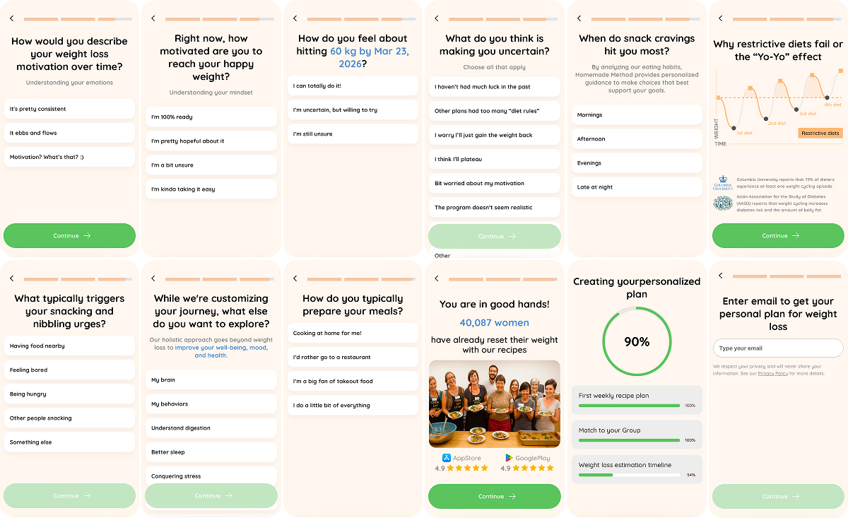
Meal prep: Homemade Method
The funnel is built around three core moves: explaining the cause of excess weight(GLP-1 and hormones), making the plan feel deeply personal through taste and preferences, and closing payment with group support and time-limited pricing.
View the full Homemade Method funnel.
Entry: Locking onto pain and positioning the app as a health solution
The funnel directly targets the audience’s core pain right from the first screen: losing weight without medication and avoiding rebound weight gain.
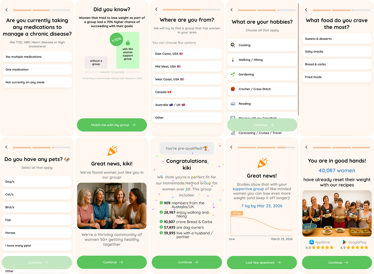
Authority layer early to remove doubt: Stanford references, 50+ positioning, and GLP-1 framing establish credibility and separate the product from other diet apps.
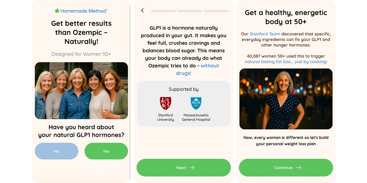
Health questions shift how the product is perceived. Once diabetes risk, blood pressure, cholesterol, and energy levels enter the picture, the app starts reading as a health solution.
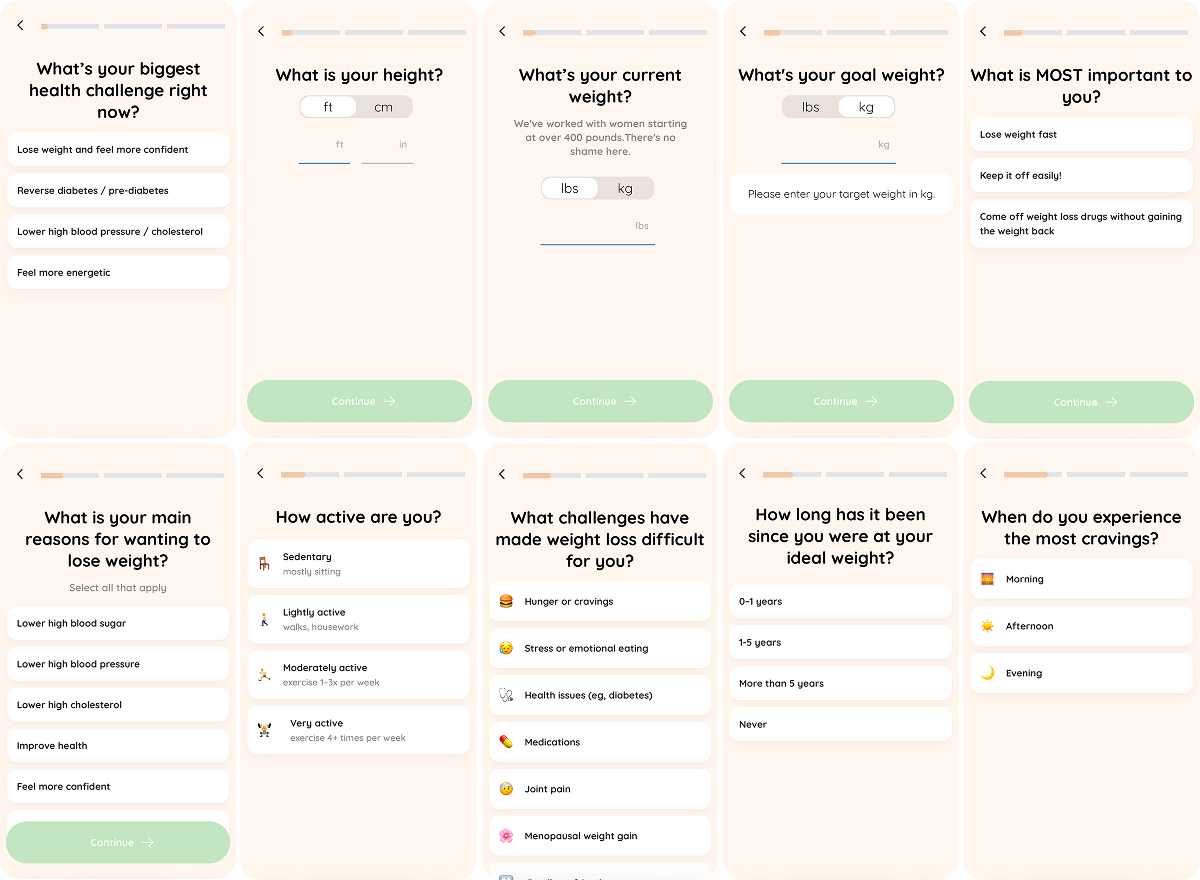
Next comes the basics (goal weight, current weight, height), followed by a few questions (when they last felt good, what’s in the way now, etc.) — this sequence surfaces resistance, deepens personalization, and sets up the promise that constraints and limitations are already accounted for.
Then Homemade Method creates alignment by pushing the user to recognize themselves in a series of statements.
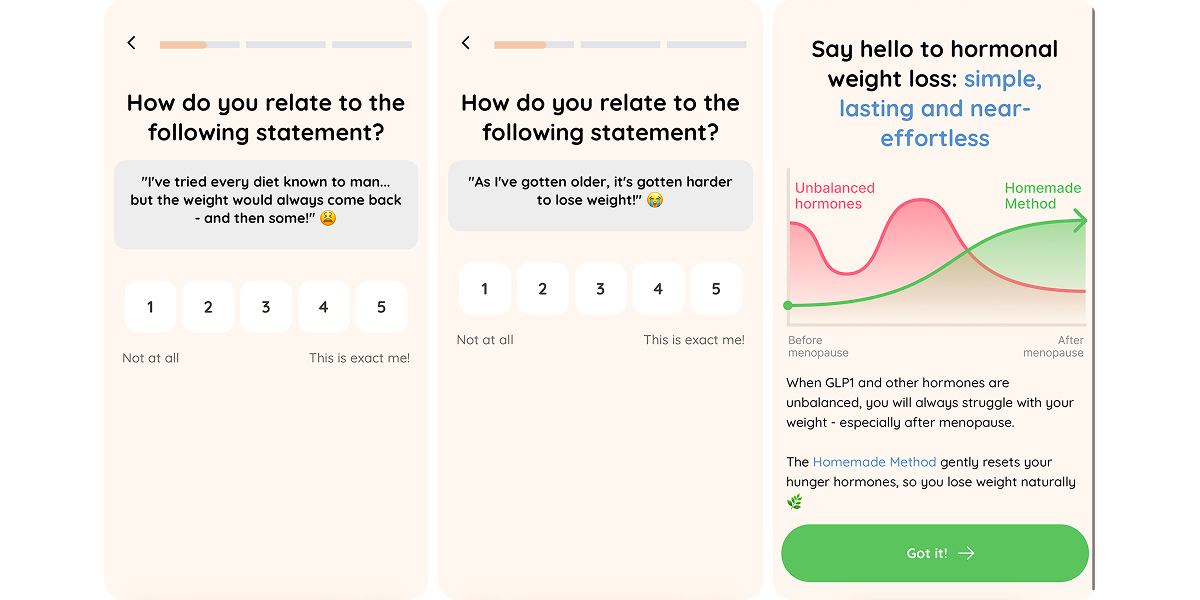
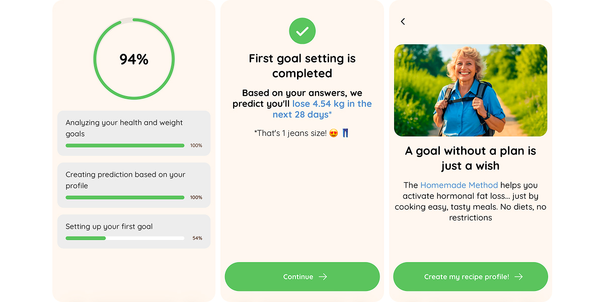
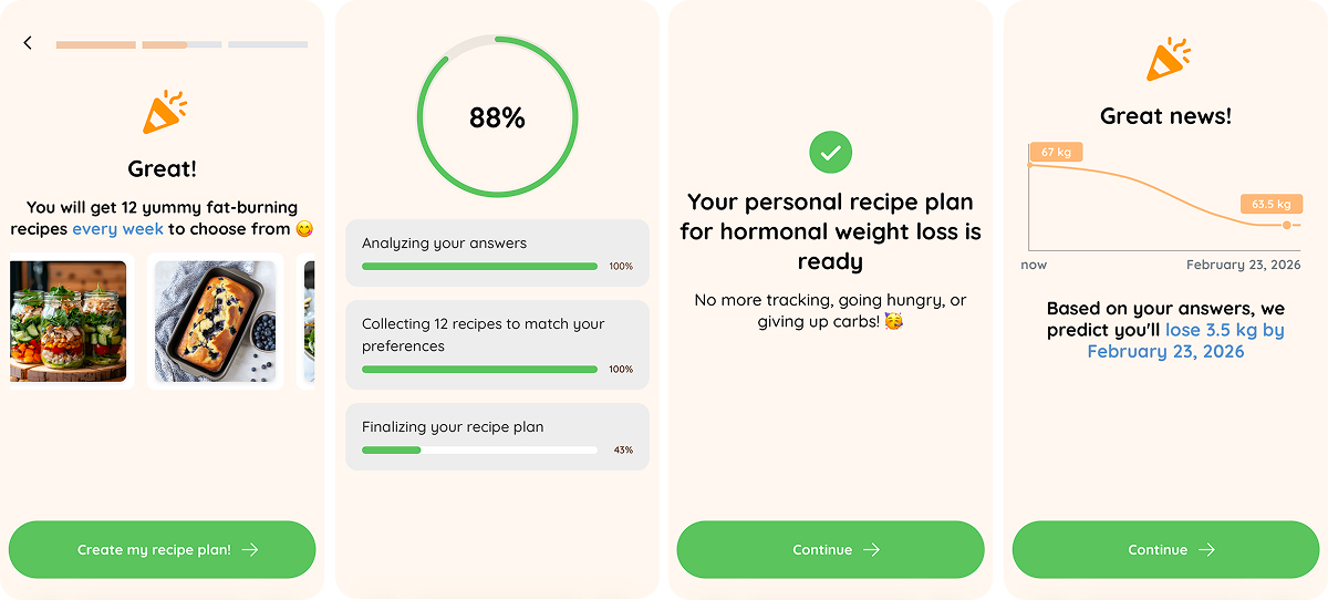
A micro-result follows — a specific number, a tangible change, like a jeans size down. Enough progress to feel real before the plan is revealed, and enough momentum to carry the user forward.
Personalization through taste: Food-first framing
One of the strongest funnel experiences is the run of simple food choices — like or not for me.
That interaction does the heavy lifting. It makes the plan feel realistic and comfortable, grounded in everyday food. By this point, users stop thinking in terms of dieting and start seeing something that fits how they already eat.
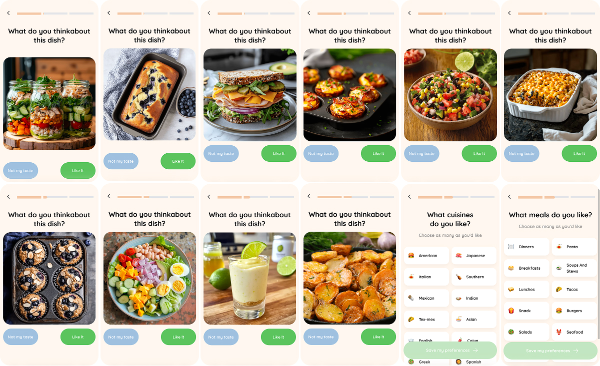
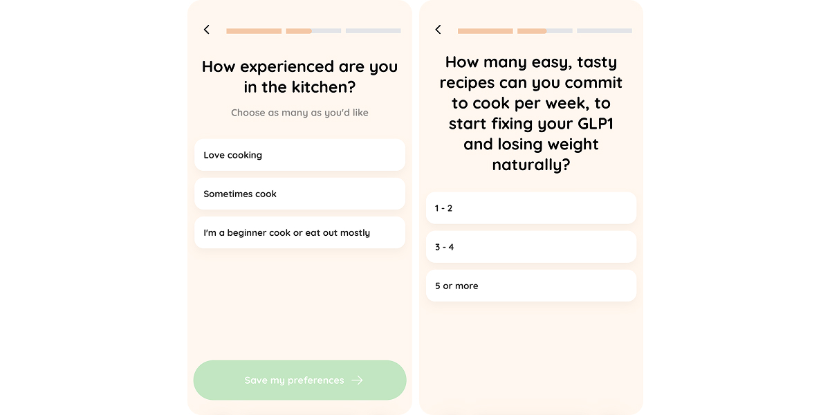
To keep things even more realistic, the funnel adds a small commitment step — how many recipes per week feel doable, and how confident the user is in the kitchen. That choice turns weight loss into a workload the user defines themselves, which lowers resistance and increases follow-through.
To prevent quiz fatigue, the funnel surfaces value early. It shows what the user will get (12 recipes), signals that their answers are actively processed to shape a tailored plan, and visualizes the expected progress. This breaks the question loop and keeps engagement high while the result is still being assembled.
And reinforcing the core message — “No tracking, no hunger, no giving up carbs” — directly addresses the category’s biggest fear.
Lifestyle questions as a belonging signal
By asking about pets, routines, hobbies, cravings, and everyday details, the funnel increases engagement and places the user inside a familiar, relatable peer group.
That sense of belonging is reinforced by reframing the product from recipes into an ongoing service. Group support, coaches, and “women like you” shift the value from content to shared experience, with a light research cue explaining why group-based programs work.
The funnel then adds status: the user is “pre-qualified” and shown alongside others with similar habits and lifestyles. Once it feels like a specific group is already formed and waiting, dropping off becomes much harder than leaving a typical quiz.
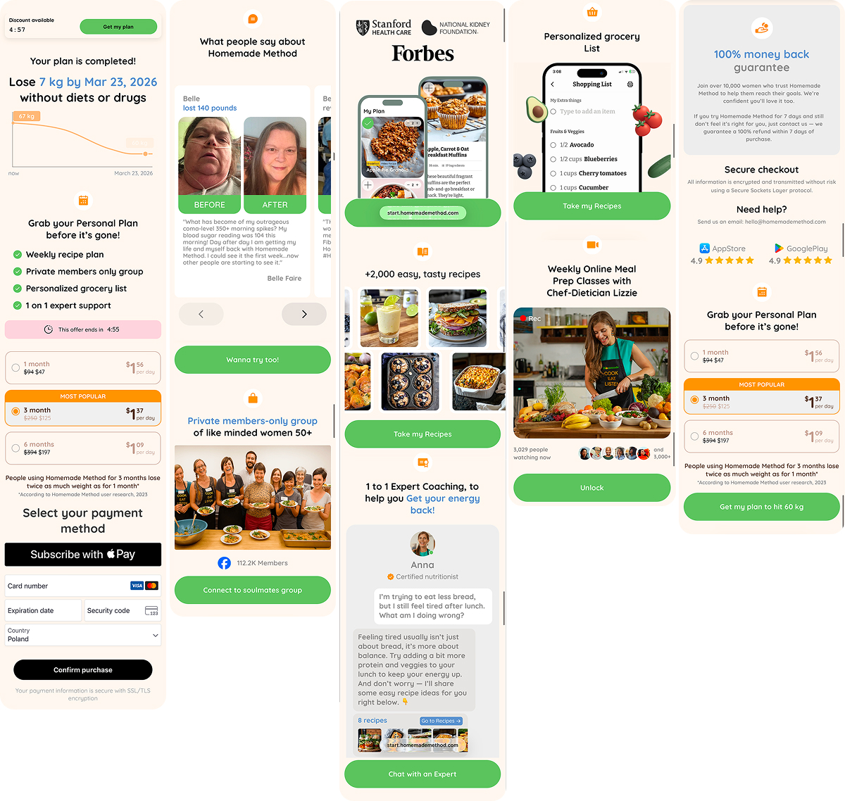
Pre-paywall bridge: Resolving doubt and reinforcing value
This block does two things:
- normalizes doubt and past failures, showing the user that their struggles are typical and already accounted for,
- reinforces value, personalization, and group fit.
This is also a good moment for email capture: by the end of the quiz, the value is clear, and the user already feels part of a defined group, which makes leaving an email feel easy.
Paywall: Outcome-first framing, urgency, plan anchoring, fast checkout
The paywall leads with the outcome. The result is already laid out on a timeline, the plan looks finished, and urgency reads as a nudge to move forward.
The pricing structure guides choice without overloading it:
- a short plan lowers commitment,
- a long plan anchors value through daily cost,
- and the mid-tier option is framed as the most reasonable default.
Then comes a simple checkout — a strong default for a web2app funnel.
For users who don’t convert right away, Homemade Method follows up by reinforcing value (before–and–after results, recognizable names like Forbes and Stanford, experts, reviews) and safety (money-back guarantee, secure checkout).
What to borrow from Homemade Method’s funnel:
- Use a biological frame, like hormones or GLP-1, to remove shame and make the problem feel solvable.
- Let food do the selling first through visuals and simple preference taps.
- Introduce a small, concrete result early, such as a weight prediction or a jeans-size shift.
- Use progress bars to show the plan taking shape in real time.
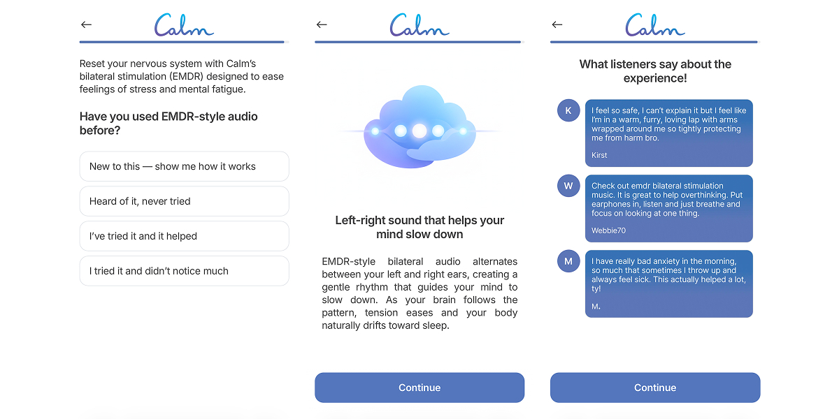
Mental health: Calm
Calm funnel’s strength is in the order: self-recognition comes first, followed by a clear explanation of what’s happening, then a path forward. By the time the subscription appears, the user’s state feels understood and manageable, and Calm is positioned as the structure that resolves it.
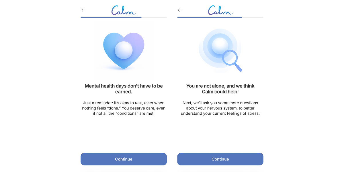
Entry: Gentle self-recognition and safety
Calm opens by creating psychological safety. Early self-recognition lowers resistance, while immediate social proof reduces anxiety around self-disclosure. The product quickly comes across as trusted, familiar, and non-judgmental, setting up a state where the user feels understood rather than analyzed.
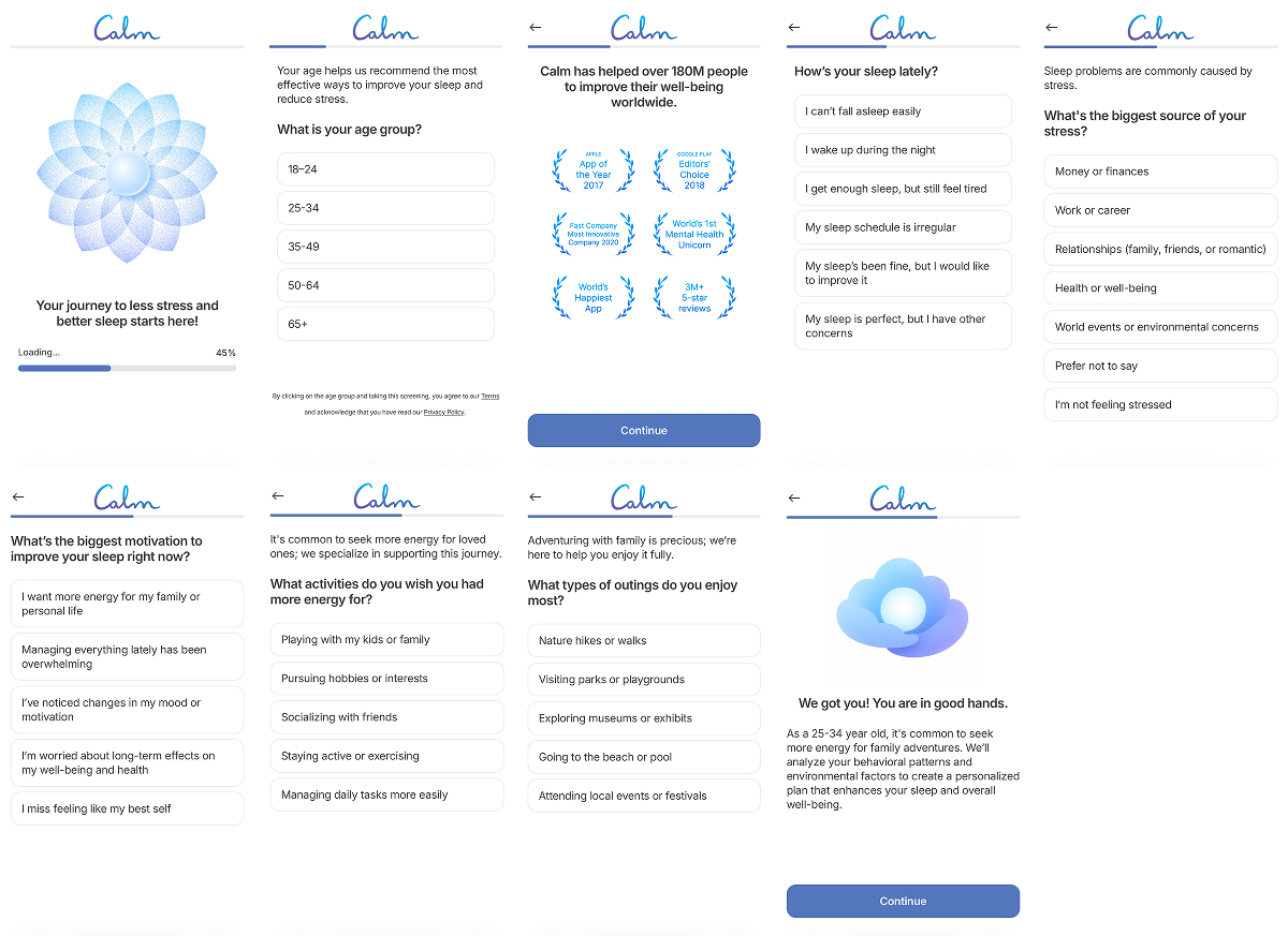
Recognition as engagement
From that foundation, recognition becomes the main engagement driver. As questions turn more personal, the flow shifts from onboarding into self-assessment. The longer sequence increases involvement, adds perceived value, and naturally filters for intent, carrying the most motivated users forward.
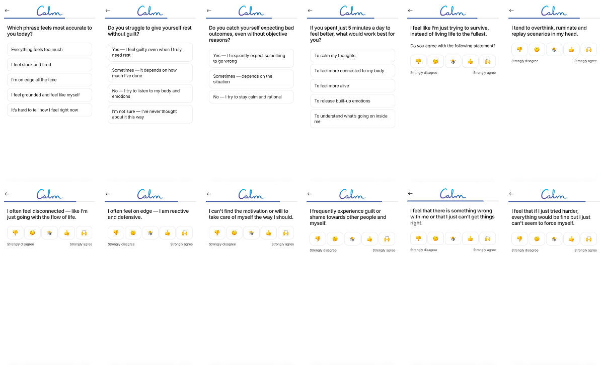
Calm weaves heavier questions with supportive statements to keep users from getting tired of the flow and create a supportive atmosphere. These screens also clarify what comes next, adding predictability — a critical signal in a mental health product.
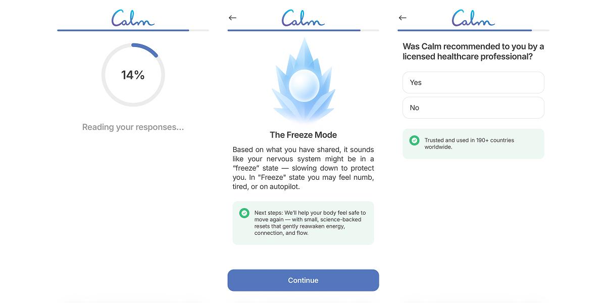
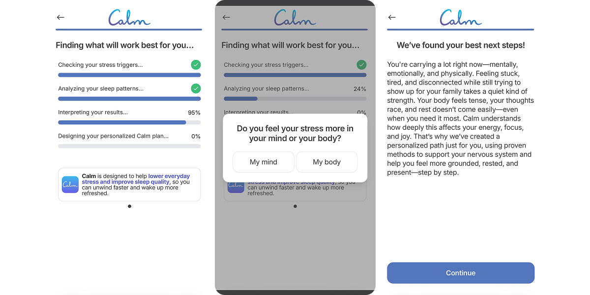
Intermediate result & authority cues
Midway through the funnel, Calm “rewards” users for answering quiz questions by delivering a small result: naming the user’s state and linking it to the nervous system. This micro-result motivates users to continue through the quiz.
A subtle shift happens next. Calm asks whether the app was recommended by a licensed healthcare professional. The question itself creates the impression that this is a product a professional could reasonably suggest, shifting Calm from “just an app” to a trusted tool.
Why the long quiz works well for Calm
Calm’s quiz onboarding spans around 40 screens. In this category, that depth makes personalization feel credible and increases emotional investment, making it harder to drop the flow halfway through.
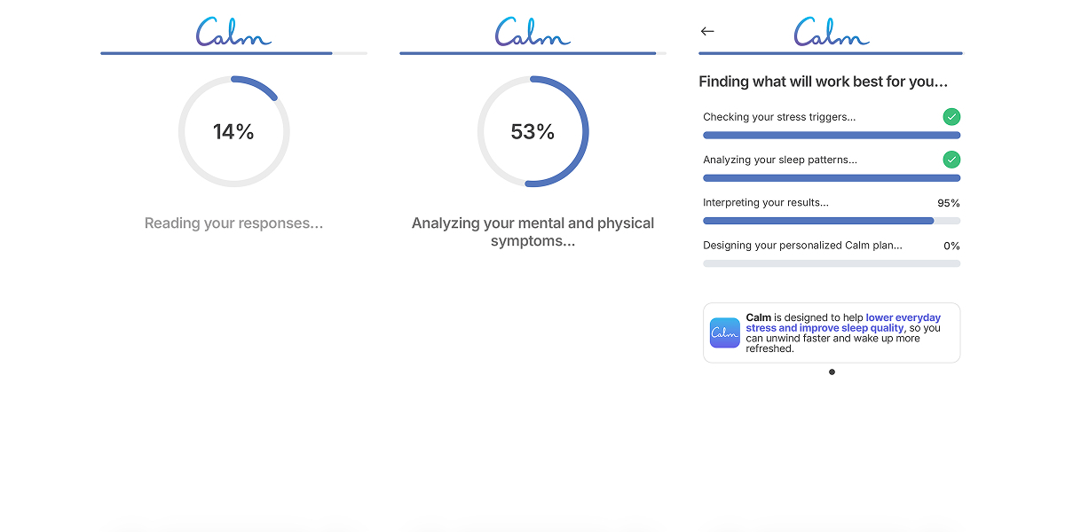
To keep engagement, Calm periodically resets attention. Progress moments break repetition, reduce irritation, and signal that the input is being processed into something meaningful, even if the logic itself is simple.
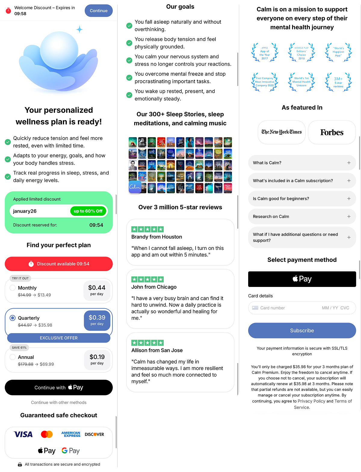
Value formation before the paywall
Before pricing appears, Calm pulls the experience into a single, coherent frame.
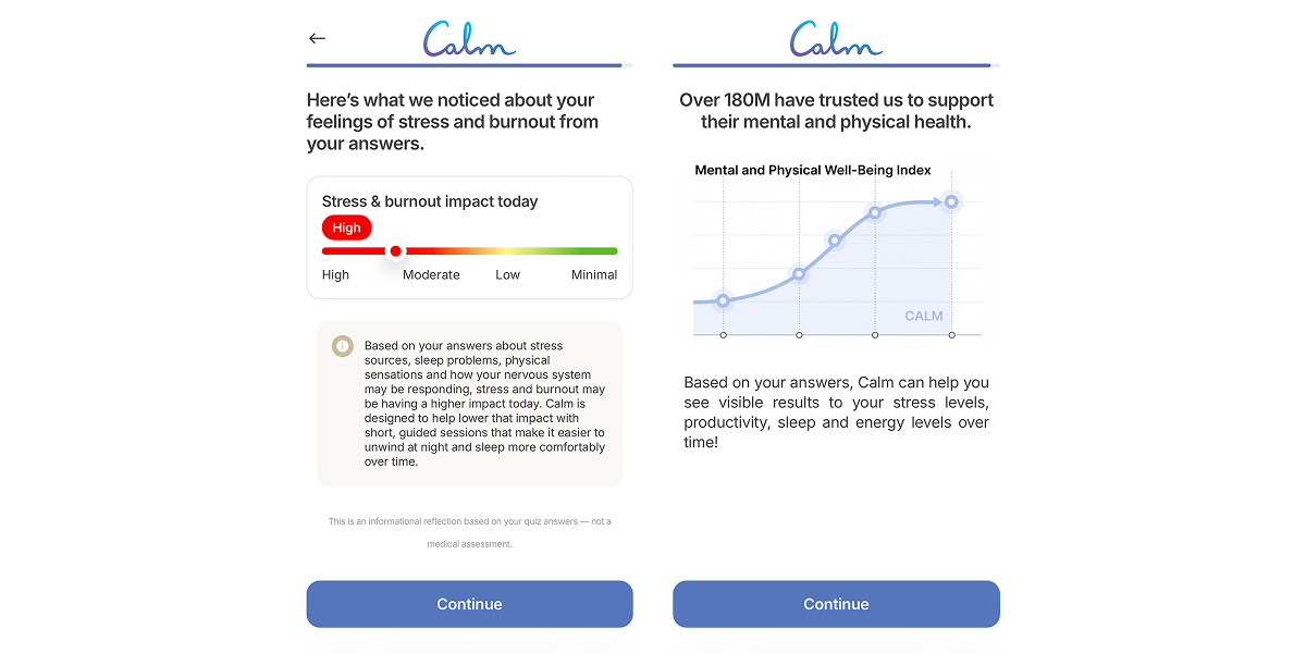
Then the user is introduced to the solution which is presented as a concrete method with a clear mechanism, not another abstract meditation. This is the moment where Calm stops looking interchangeable with other apps.
After that, Calm “analyzes” the quiz results and layers in messaging around a personalized path, ongoing support, and state-based content. At this stage, they do two things at once:
- Confirms that the user is dealing with a real, recognizable issue.
- Shows that a solution has already been assembled around their state.
Closing the funnel without breaking the emotional flow
The “Your personalized wellness plan is ready” message shifts the focus from purchasing a subscription to finishing something the user has already started, which naturally reduces hesitation.
The pricing grid reduces choice friction, with the quarterly plan positioned as the most reasonable balance.
As for the checkout, Calm keeps it as simple as possible, with Apple Pay traditionally coming first to minimize the gap between decision and action.
Urgency is present but restrained: a discount and timer create momentum without pushing hard FOMO, which matters in a mental wellness context.
And the trust cues like awards, media mentions, and an FAQ clear the last doubts.
What to borrow from Calm’s funnel:
- Open onboarding with self-recognition so users immediately see themselves in the problem.
- Use a long quiz to build commitment and naturally filter for higher intent before the paywall.
- Introduce a clear state label, like “freeze mode,” to give vague feelings a shared reference point.
- Add progress cues such as “analyzing responses” or “building your plan” to support funnel length and keep momentum.
Period tracker: Flo
Flo runs a deliberately extended funnel. Screens are dense, the quiz is long, and explanations are thorough because the category carries anxiety and real health concerns. The goal isn’t to rush the user to the paywall, but to make the situation feel describable, structured, and manageable.
That tradeoff makes sense here. For a product tied to health decisions, reassurance earns more than urgency ever could.
Detailed quiz onboarding as the main engine
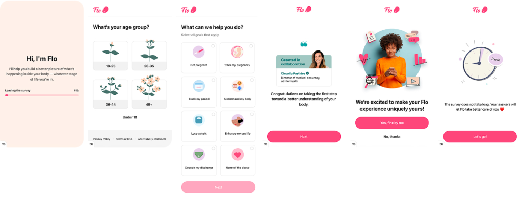
Inside Flo’s quiz, close to 40 screens, several key mechanics work together:
- Progress visibility and a predictable path. From the first screens, it’s clear that the journey is long but manageable. This reduces anxiety and increases willingness to continue.
- The questions deepen gradually. What begins with cycle basics moves through symptoms, sex, mood, sleep, weight, and mental state. Options like “I don’t know” or “Prefer not to answer” keep the user in control and prevent pressure.
A sense of deep personalization. Flo collects signals that look excessive on the surface (coffee, chocolate, information sources, habits) to make the user feel the system is paying attention rather than applying a generic template.
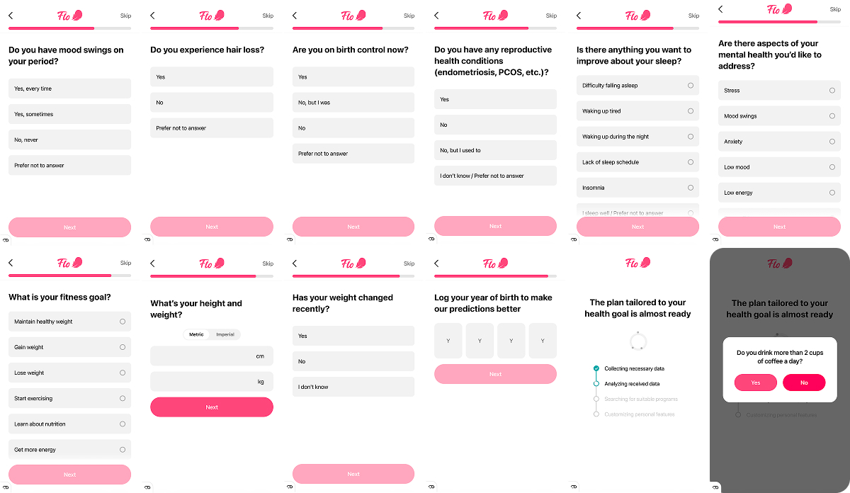
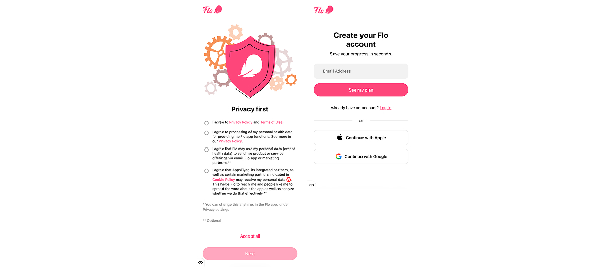
The privacy and consent screen appears after the quiz because by that point, the user has already invested time, received value, and is psychologically ready to agree. Account creation follows immediately, framed as a way to save the plan that’s already been built and protect progress.
Positive friction and “choose-a-price” trial mechanic
Flo inserts a brief interaction before: the user has to tap a gift box to see what’s inside. The reveal is a “gifted” trial: 14 days, instantly extended to 30.
Pricing comes next, but it’s framed as choice, not access. €1 or €34.99 unlock the same product. What changes is the role the user steps into: trying cautiously versus actively supporting the mission.
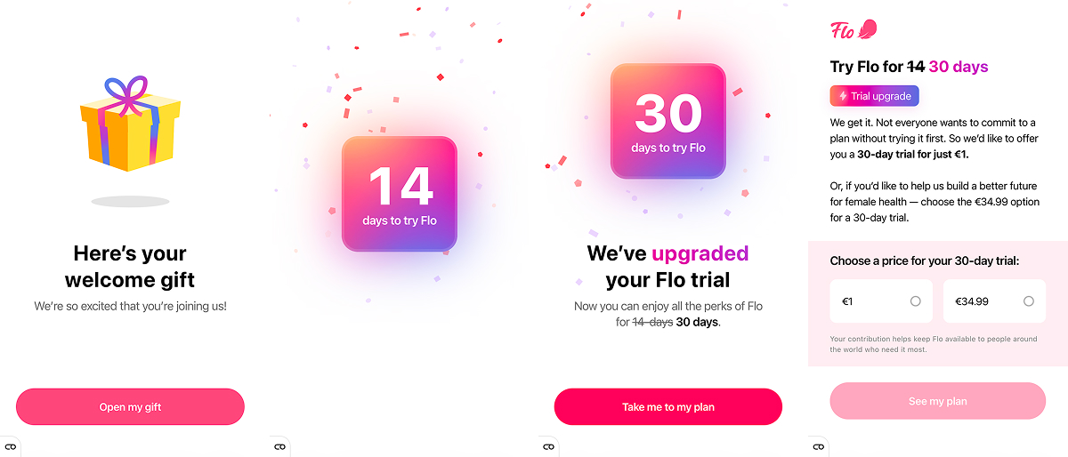
Copy around contributing to women’s health shifts the decision away from cost and toward values and creates a stronger commitment without forcing a hard upsell. The €1 option lowers the barrier and improves funnel completion.
Paywall keeps the user in execution mode
Flo’s paywall is fairly standard, but well executed. Some apps open with trust blocks first: ratings, user counts, and reviews. Flo does the opposite on purpose. Plans and the primary CTA come first because by this point, the decision has already been made. The quiz has done the selling.
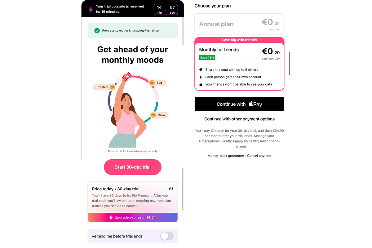
If Flo started re-explaining credibility here, it would push the user back into evaluation mode: “Is this really worth it?” Instead, they lead with action and keep the user in execution mode, not analysis.
There’s also a small but important detail under the plans: a “remind me before trial ends” toggle. It directly addresses the quiet fear of forgetting to cancel and losing money, which removes a common last-second hesitation.
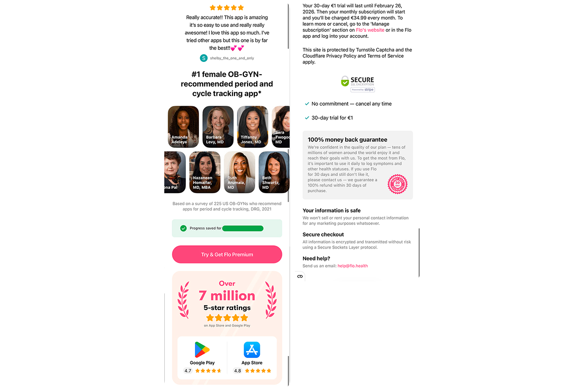
Only after that does the trust block appear (reviews, doctors’ names and photos, user volume, etc.). It clears remaining friction and reinforces that the decision is safe, reversible, and fully under the user’s control.
What to borrow from Flo’s funnel:
- Use a flexible trial as quiet self-segmentation. Letting users choose between a symbolic price and supporting the mission increases commitment without extra questions.
- Put action before trust on the paywall. Lead with plans, the primary CTA, and a sense that access is already reserved. Use ratings, guarantees, and safety signals to reassure, not persuade.
Running coach: Runna
Runna’s funnel is clean and neutral. There are no big promises or emotional hooks, everything is built around clarity: who you are as a runner, what your routine looks like, which plan fits that reality, and what it costs.
The core risks are addressed early, and once those are resolved, the funnel moves straight to a straightforward paywall and an even simpler checkout.
Coach positioning, runners community, and borrowed trust
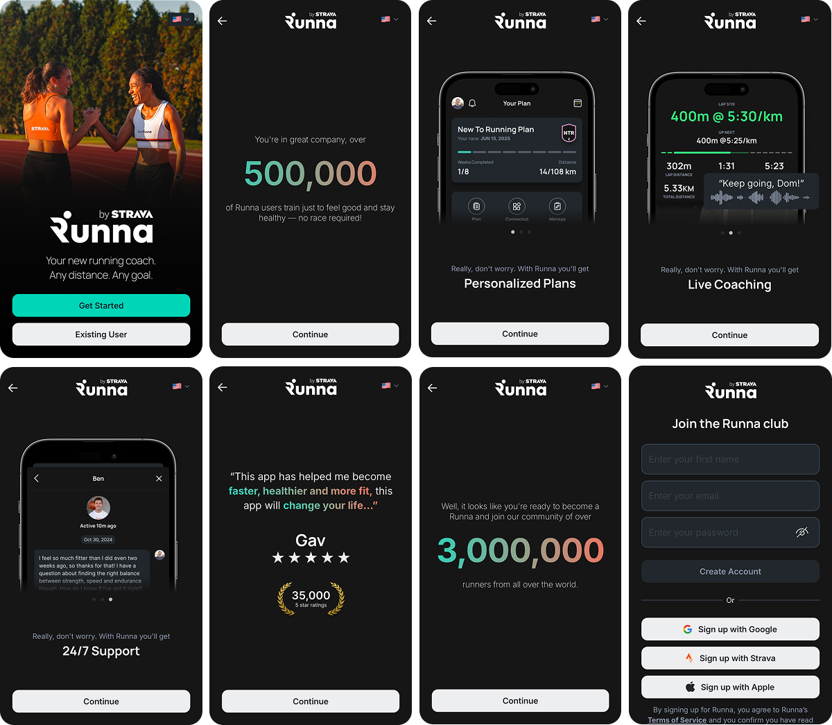
From the first screens, Runna positions itself as a personal running coach, not a tracker or a library of plans. This immediately removes the expectation that the user has to figure things out alone and places the product in a role of guidance and responsibility.
The message about 500,000 runners who train just to feel good widens the entry point. Runna isn’t only about races or performance goals, it’s built for everyday running as well.
Creating an account feels closer to joining than signing up, and take a look at that “Sign up with Strava” button. It looks like a convenience feature, but it also inherits trust: Strava already sits close to a runner’s identity and habits. Because that trust is borrowed upfront, Runna doesn’t need to over-explain itself. The funnel can stay restrained and clean, without leaning on persuasion or reassurance.
Overall, the product doesn’t need to convince you. It behaves like a coach who expects you to show up.
Addressing concerns while building commitment
Runna’s quiz sits in the middle range at 19 screens, and it’s doing emotional work as much as informational. Each question maps to a familiar runner concern — fitness level, injury risk, pace confusion, and whether training will actually fit into real life. The language keeps every answer legitimate, and nothing suggests the user is behind or not ready yet.
Once that baseline is set, the quiz narrows into specifics: run days, long runs, start date, terrain, pace, and so on. By answering these, the user starts rehearsing the routine in their head and committing to it well before the plan is shown.
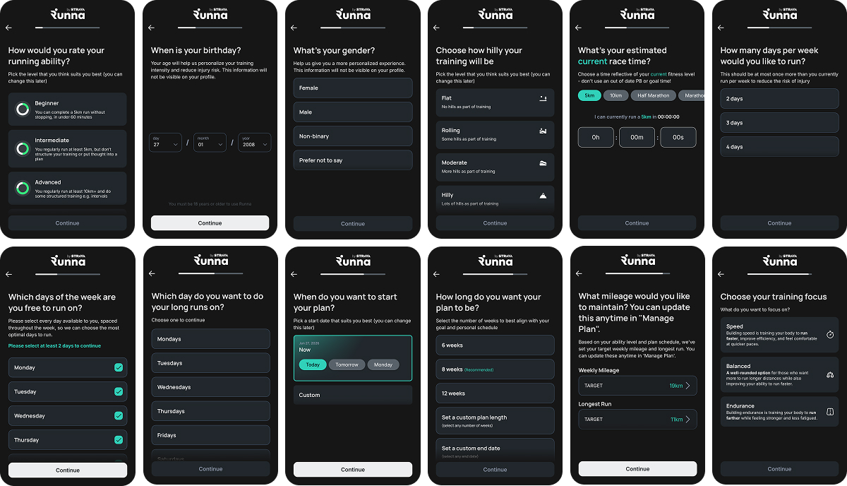
By the time the user reaches the “Your plan is nearly ready” screen, they’ve already made enough decisions for the plan to feel personal and logically built around their life.
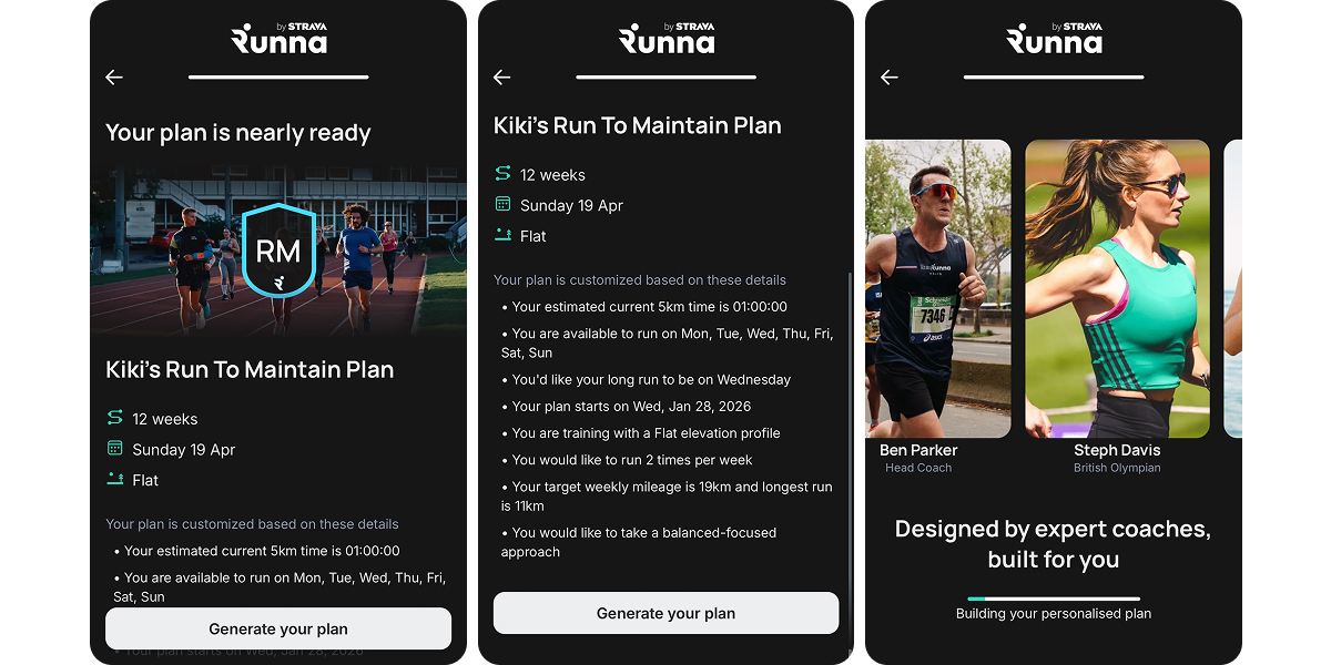
At the end of the quiz, Runna reinforces personalization by summarizing the answers and restating the product’s value. The core message is clear: designed by expert coaches, built for you.
A short, confident, and calm payment block
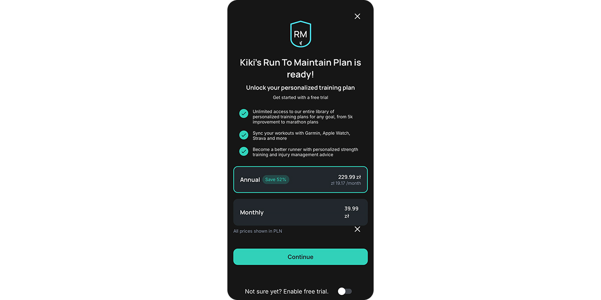
Runna’s paywall stays notably simple:
- Annual is set as the default, with savings clearly visible. Monthly remains available but understated.
- The free trial is a toggle, not the main hook.
- Pricing is shown upfront for the selected period, without per-day math.
There’s no pressure here because the pressure already did its work earlier, through the quiz and personalization.
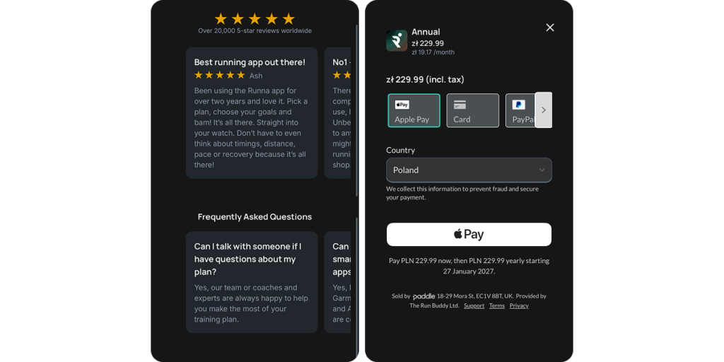
After the paywall, Runna inserts a short trust corridor to absorb hesitation before payment. Reviews and FAQs answer the obvious “what if” questions, so the user reaches checkout already reassured.
The checkout is utilitarian: price is fixed and repeated, tax is included, the country and provider are visible, and billing terms are spelled out in plain language. That clarity removes doubts about changing amounts and who the payment goes to, and it reduces the kind of uncertainty that often leads to chargebacks.
What to borrow from Runna’s funnel:
- Let users mentally try the routine early — training days, volume, pace, and focus help them picture the plan before it exists.
- Keep checkout minimally emotional. Familiar payment methods, clear terms, and zero extra triggers at the moment of transaction.
Wrap-up
Funnels that work in 2026 slow down, explain what’s going on, help users recognize themselves, sets expectations, and show personalization before money enters the flow. For health, wellness, and coaching products, this is now the baseline.
And if you want to build flows like these, book a demo, and we’ll show you how to apply these patterns to your product with FunnelFox.