


Most teams treat cancellation flows as a dead end: click here, confirm, goodbye. But done right, it’s more than that — it’s another chance to build trust, surface feedback, and even drive upsell.
We broke down 10 real cancellation flow examples — the good, the bad, the surprisingly effective — and what they teach us about reducing churn. Let’s take a look.
1. Nibble: Friendly UX, clean goodbye, and a save offer that fits
Nibble is a bite-sized learning app with a soft, playful brand. And their cancellation flow checks nearly every box for reducing voluntary churn.
At every step, the experience feels kind, quick, and human. It’s not just easy to cancel — it’s clear they’ve thought through how to part ways gracefully, and maybe even change your mind along the way.
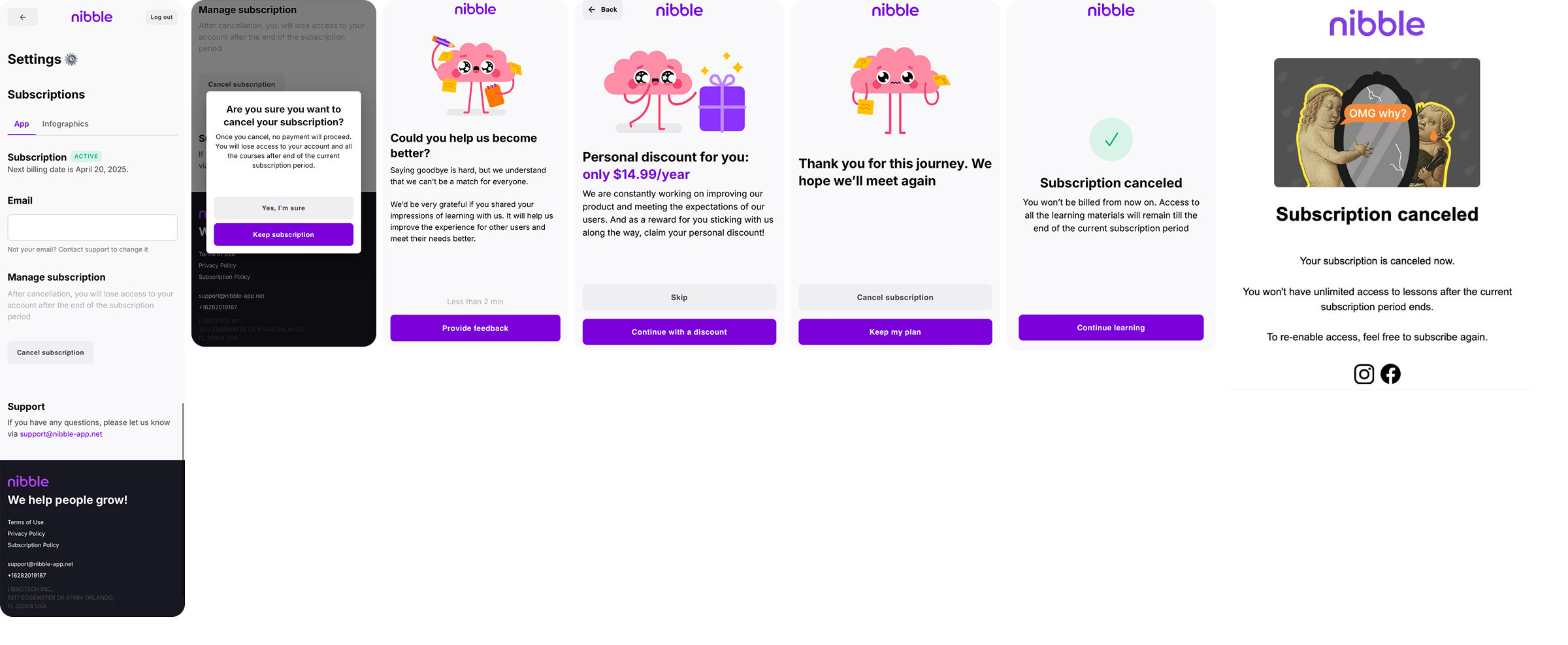
What they do right:
- Easy access to cancel: The “Cancel subscription” button is visible in account settings, no dark patterns or endless menus.
- One-tap confirmation: A clean modal asks if you’re sure, with a calm fallback: “Keep subscription.”
- Optional feedback: You can leave a reason, or not — there’s no guilt trip.
- Targeted (but gentle) offer: A $14.99/year plan appears with the framing of “thanks for being here,” not desperation.
- Polite, positive tone: “Thank you for this journey. We hope we’ll meet again.” It’s soft, sincere, and completely on brand.
- Immediate confirmation: Users see exactly what happens next: access continues until the end of the current billing period.
- Brand personality intact: Their friendly mascot lightens the tone and keeps the UX feeling human.
What could be better:
- No structured exit insights: Without an exit survey, it’s hard to know why users leave, which makes retention harder to improve.
- Generic save offer: A one-size-fits-all discount is better than nothing, but personalization would raise the odds of conversion.
- No soft alternatives: There’s no pause or downgrade path — which could save price-sensitive users without cutting revenue too deeply.
For an app built on positivity and habit-building, the cancellation experience mirrors the product — helpful, not pushy, and respectful of your time. It doesn’t try to trick users into staying, but it does give them a moment to reconsider. And sometimes, that’s all you need.
2. YAZIO: Thoughtful UX within platform limits
YAZIO is a global nutrition tracker with a strong product experience, but when it comes to cancellation flows, they’re playing on a slightly constrained field.
Because their subscriptions are processed through the App Store, they have to follow Apple’s standard cancellation flow and can’t go as far with offers or pricing tweaks. That said, this may soon change as Apple recently introduced its Retention Messaging API.
Meanwhile, YAZIO manages to make the offboarding experience smooth, respectful, and informative.
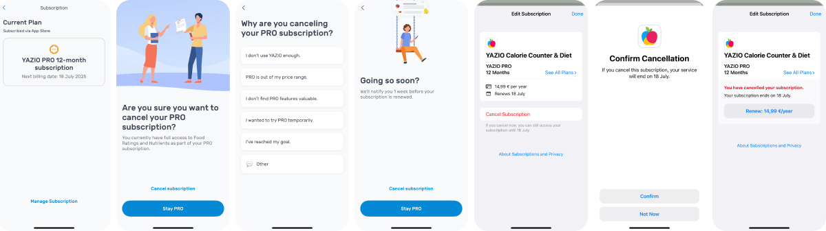
What they do right:
- Clean UI: The UI is lightweight and consistent, with friendly copy that doesn’t feel transactional.
- Confirmation step: Before canceling, users get a soft push to stay, with a clear “Cancel subscription” vs. “Stay PRO” choice.
- Exit survey with depth: Users select from reasons like “Too expensive,” “Reached my goal,” or “Not enough value.” A useful feedback loop for product and growth.
- Gentle nudge: YAZIO offers to notify users before their subscription renews.
- Transparent billing info: The App Store provides clarity on what users are paying and when it ends — a big trust factor.
What could be better:
- No personalized retention hook: There’s no discount or alternative plan to match the user’s reason for leaving.
- No pause or downgrade option: This is often a side effect of using in-app billing only — there’s just no room for flexibility.
YAZIO does the most with what they can control, and in many ways, that’s the mark of a mature team. They keep things simple, avoid confusion, and leave the user with a clean break. Could it be more persuasive? Sure. But even without save tactics, the flow respects the user and the moment.
3. Simple: High-effort flow cancellation flow example that pays off with personalized save logic
Simple is a nutrition and intermittent fasting app, and their cancellation experience makes one thing very clear: they’re not just trying to prevent churn, but to understand it, segment it, and respond in real time.
From the first screen, the flow is structured, data-driven, and designed to steer users away from canceling without feeling pushy.
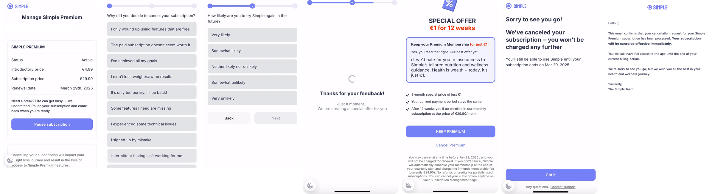
What they do right:
- Pause before parting: Before you even reach “Cancel,” Simple nudges you toward a pause. It’s a softer off-ramp (and a smart one).
- Detailed exit survey: Simple asks why you’re canceling and how likely you are to return. These two data points make their CRM way more useful.
- Retention offer: They generate a special offer: 3 months for just €1. It’s clear, well explained, and tied to the user’s reason for leaving.
- Transparent billing: They show exactly when billing resumes and what you’ll pay afterward.
- Respectful confirmation: Once canceled, you get a clean message in-app and via email, with a sincere goodbye and access info.
What could be improved:
- Slight friction buildup: The multi-screen flow is logical but feels a bit long.
- Value reminder is missing: There’s no visual cue for what you’ll lose — no screenshot, no stats, no content nudge.
- Tone is matter-of-fact: It’s purely informative — it works, but might not inspire second thoughts.
Simple’s flow is less about warmth and more about precision. Every step serves a purpose, and nothing is random. That makes it incredibly effective for a product where reasons for leaving vary widely. If you want a model of strategic cancellation design with real-time logic, this is it.
4. Noom: One of many cancellation flow examples that turn exits into upgrades
Noom, one of the top names in weight loss and behavioral health, runs a cancellation flow that’s less of an off-ramp and more of a decision tree.
Every screen is doing something: segmenting users, pitching new value, or offering an easier path forward. It’s long and dense, but it’s built for outcomes.
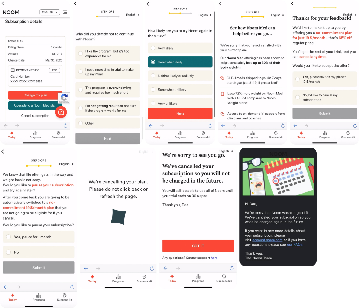
What they do right:
- Layered exit logic: First, you choose why you’re leaving. Then, how likely you are to return. That combo fuels everything downstream — targeting, offers, even follow-ups.
- Product-led win-back: Before the user leaves, Noom pitches their premium GLP-1 Med program with specific benefits and pricing. This turns cancellation into an upgrade opportunity.
- Retention offer: If you still want to cancel, they offer a no-commitment $19/month plan — 65% off. You can accept, pause, or leave.
- Pause option with tradeoff: Prefer a break? You can pause instead, but the $19 offer disappears if you skip it. That’s subtle urgency, done right.
- Clear confirmation: Once canceled, you get clear messaging, access timelines, and a polite follow-up email.
What could be better:
- Long journey: Five or more steps before subscription cancellation can feel like too much, especially for users who already made up their mind.
- Cluttered UI: Some screens are text-heavy with bold fonts and mixed layouts. Visually tiring.
- No value reminder: A quick value recap could reinforce retention.
Despite not having the sleekest UX, this cancellation flow example is purposeful and effective. For Noom’s high-touch product, the extended flow is justified. They go beyond churn prevention to reposition value, provide alternatives, and convert cancellations into higher-revenue segments.
5. Mimika: Big discounts, light tone, and a graceful save attempt
Mimika, a facial yoga and self-care app, leans hard into charm and generosity. Their cancellation process is warm, friendly, and knows its strengths: light UX, strong offers, and a smile at every step.
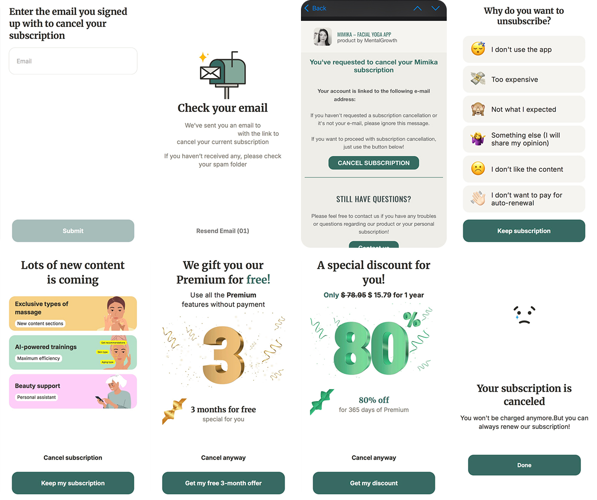
What they do right:
- Exit survey with reason tagging: Multiple-choice reasons like “Too expensive”, “Didn’t like the content”, or “Don’t want to pay for auto-renewal” help personalize the next step.
- Escalating user save offers: Users first get 3 months for free, then an 80% discount on an annual plan if they keep heading toward cancel.
- Value nudge: Before final confirmation, Mimika highlights AI trainings, beauty support, and new content — a soft FOMO push.
- Clear, kind closure: The cancel confirmation is friendly and immediate, with a “come back anytime” vibe.
What could be better:
- Email friction at the start: Users are asked to enter their email to begin, and if they don’t remember which one they signed up with, that’s frustrating. It’s an unnecessary speed bump in an otherwise smooth flow.
For a wellness app with a visual, feel-good brand, Mimika’s cancellation process does what it should: it keeps things light, reminds you of the value, and gives you real reasons to stay. A little cleanup up front, and this flow would be hard to beat.
6. Muscle Booster: Pausing, clarity, and a delayed save offer
Muscle Booster is a fitness app with structured plans and a strong subscription model. Their cancellation flow hits a few key notes well, but also misses a major opportunity for timing.
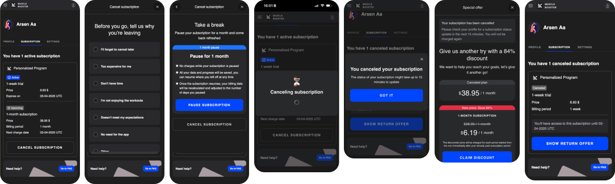
What they do right:
- Clear subscription details: The cancel button is clearly labeled and paired with your next billing date — transparency always builds trust.
- Tight exit survey: Before canceling, users select from a list of reasons like “too expensive,” “don’t have time,” or “not enjoying the workouts.” No clutter.
- Pause option: They offer a 1-month pause with saved progress and a clear explanation of how billing will be adjusted. Great way to save users who are just overwhelmed or busy.
- Clean confirmation: After canceling, a helpful “Got it” screen confirms the action and explains when changes will take effect.
What could be better:
- Late save offer: The retention discount (84% off) only appears after the cancellation is complete. At that point, it’s a recovery play, not a save.
- Questionable price anchor: The 84% discount is generous, but that deep of a discount might make users question the full price altogether. It works in the short term but risks long-term trust if overused.
- No open feedback loop: There’s no free-text field to understand unmet expectations or deeper issues.
Muscle Booster does the basics well, but the order of operations matters. The save tactics come too late, and the lack of feedback limits learning. With better timing and richer insights, this could go from decent to strong.
7. Dancebit: Great UX and solid insights, but no save attempt
Dancebit is a dance-based fitness app with an upbeat brand and a trial-based subscription model. Their subscription cancellation flow mirrors that vibe: it’s clear, friendly, and well-paced. But for all the polish, there’s a major gap — they never really try to keep users.
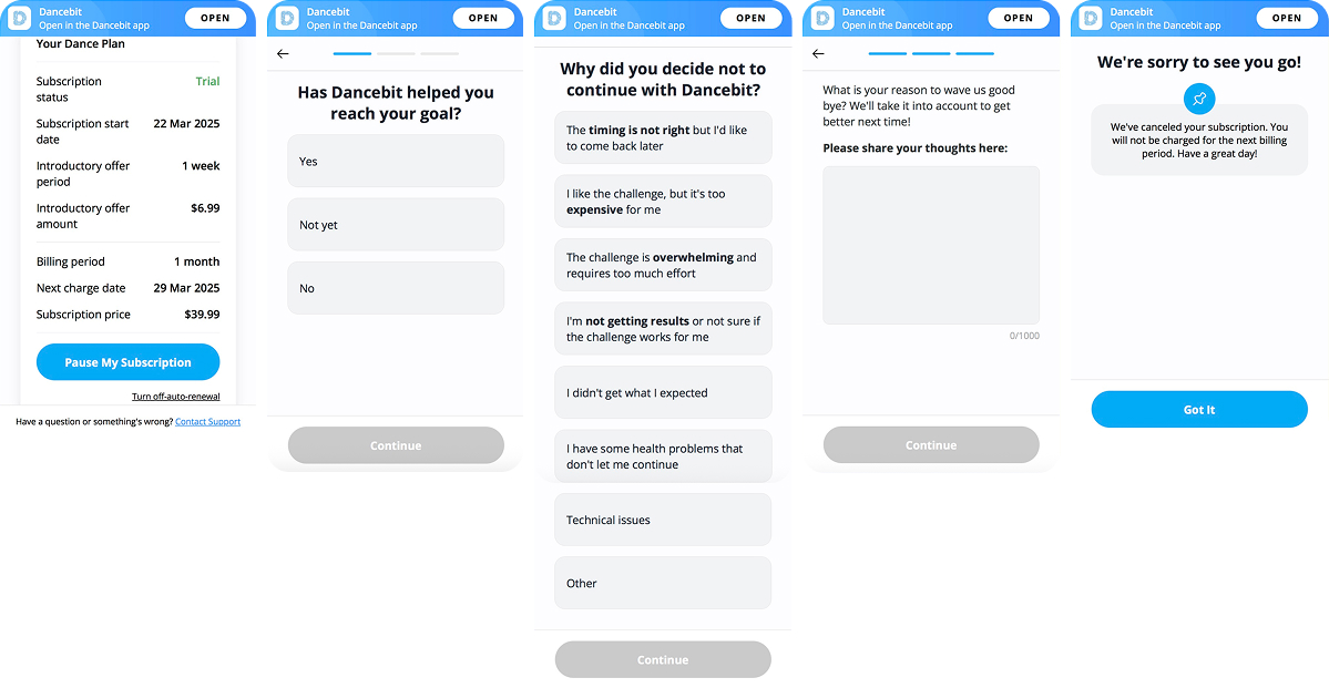
What they do right:
- Pause option is offered upfront: Users can pause right in the subscription screen, without digging through support or extra steps.
- Friendly, well-paced UX: The flow is smooth, mobile-optimized, and includes progress indicators so users know where they are.
- Layered exit survey: First, they ask if the user reached their goal, then dig into reasons for leaving (cost, effort, expectations, etc.), then offer an open field for more context. Excellent structure.
- Respectful closure: Final screen is simple, confirms cancellation, and ends with “Have a great day!” — no guilt or last-minute drama.
What could be better:
- No save offer: Nowhere in the flow is there a discount, pause suggestion, downgrade, or even a reminder of what the user is giving up. The flow captures insights, but makes no real effort to change the outcome.
- No FOMO factor: They could’ve shown unused features or upcoming content to prompt reconsideration.
- No win-back hint: No email CTA, no soft return path, no mention of how the user could come back later.
Dancebit nails the feel of the flow — it’s fun, respectful, and clean. But if you’re capturing intent and reasons, why not respond with an offer or nudge? The infrastructure’s there, all it needs is a second act.
8. Blinkist: Clear value reminders, but too much friction mid-flow
Blinkist is a reading app that distills non-fiction books into 15-minute summaries. This cancellation flow example starts strong, but loses momentum right where it counts.
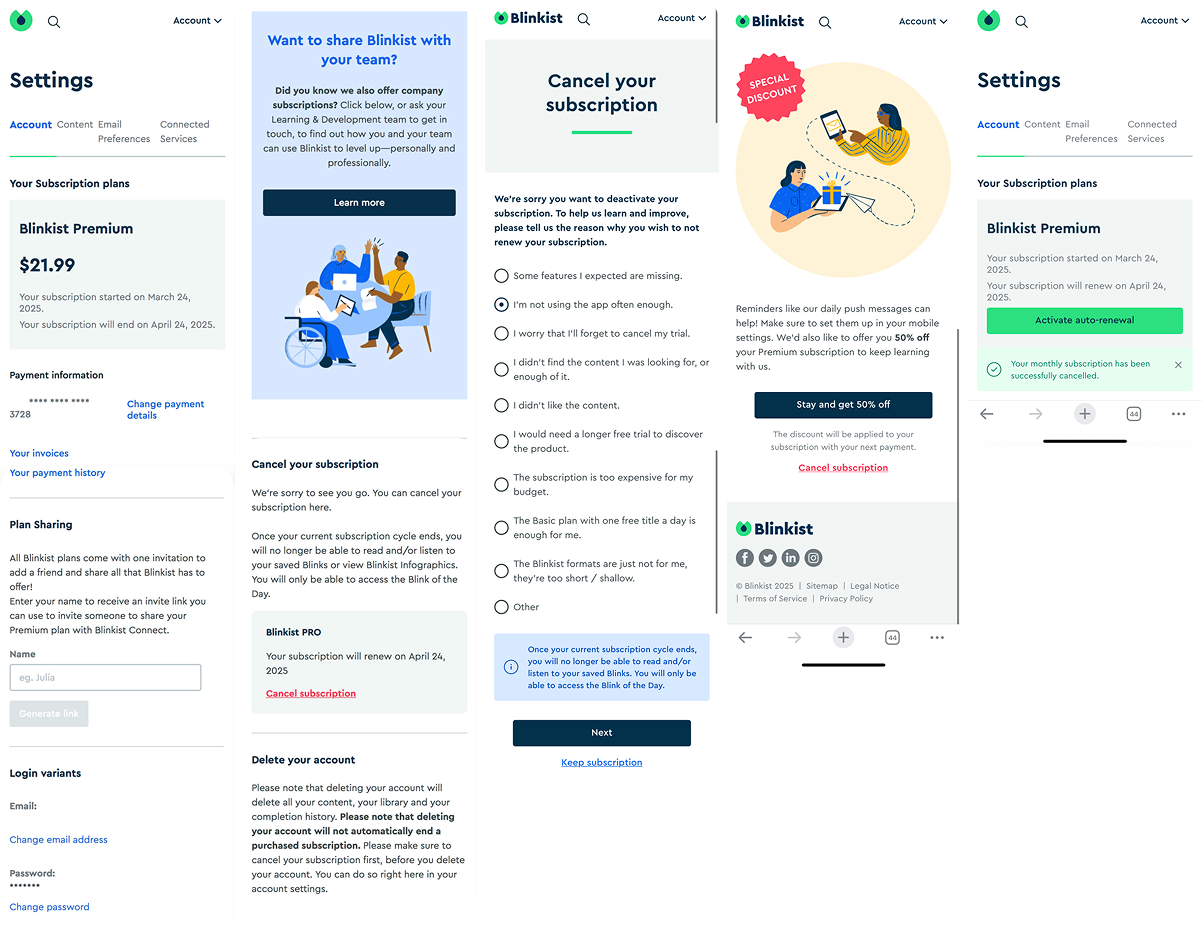
What they do right:
- Exit survey is short and clear: Users are asked why they’re leaving with solid, relevant options: missing features, content didn’t match expectations, etc.
- Timed discount offer: After the survey, you get a 50% discount framed as “keep your learning going.” It’s framed positively, and it fits their tone.
- On-brand visuals: The illustration reinforces the idea of learning as a gift. Softens the sales message.
- Email confirmation & renewal toggle: Once canceled, users can easily re-activate. Transparent and user-friendly.
What could be better:
- No soft off-ramp: It’s cancel or commit. That leaves no room for middle-ground users.
- No emotional anchor: Beyond the price cut, there’s no visual or content reminder of what the user would lose (e.g., stats, saved titles, favorites).
- Flow feels disjointed: The journey bounces between pages and sections. The visual design is clear, but UX-wise, it lacks pacing and clarity. You’re not always sure what comes next.
Blinkist does a lot right — it respects the user and doesn’t make canceling hard. But the save logic feels passive. There’s no real attempt to remind people what they’ll lose or nudge them toward a better-fit plan. A more structured and emotional value reminder (or even a simple “pause” offer) could have made this flow way more effective.
9. Headspace: Emotion-first flow with strong brand voice and multiple save chances
Headspace is one of the most well-known meditation apps, and this cancellation flow example reflects that maturity. It’s emotional, visual, and full of soft-touch save mechanisms.
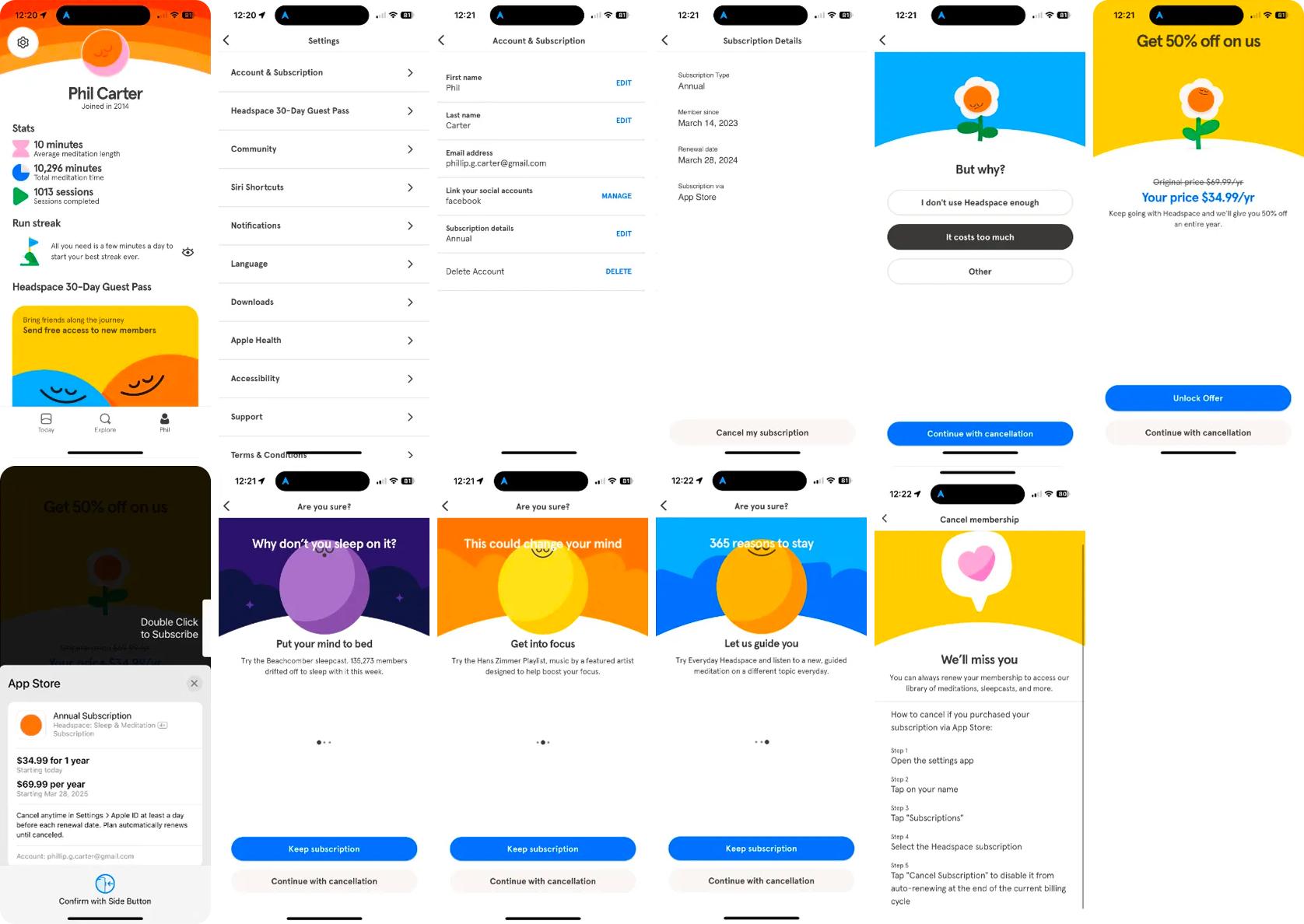
What they do right:
- Strong emotional framing: The flow opens with vibrant, calming visuals and friendly prompts: “Why don’t you sleep on it?” or “365 reasons to stay.” It speaks like a therapist, not a sales rep.
- Multiple save attempts: Instead of a single discount, users are offered a carousel of benefits, each trying to reframe the value: sleep help, focus, and daily content.
- Discount offer: A clear 50% off annual plan, presented in a non-pushy way. If value is the blocker, this could work.
- Polite and respectful tone: There’s no pressure, just options. Even the goodbye screen says “We’ll miss you” in a soft, friendly tone.
- App Store–compliant exit path: Since subscriptions are through the App Store, Headspace guides users step by step through how to cancel. Not ideal UX-wise, but transparent.
What’s missing or could be better:
- No survey or insight capture: There’s no structured exit survey, so Headspace loses the chance to collect real churn data or personalize offers dynamically.
- No pause/downgrade option: It’s cancel or nothing. A pause would be very aligned with the product’s brand and could save hesitant users.
- The journey is long: There are a lot of screens before the user can cancel. It’s visually beautiful, but still may annoy some users, especially those just looking to cancel quickly.
Headspace leverages emotion over logic. Instead of hitting users with reasons or stats, it gently reminds them how the product supports their wellbeing with empathy and creativity. While it lacks segmentation or data capture, the tone and polish carry a lot of weight.
10. BetterMe: Aggressive discounts with real-time escalation and clear logic
BetterMe (Mental Health) runs one of the most conversion-optimized cancellation flows in mobile wellness with tiered discounts and fast reactions to user intent.
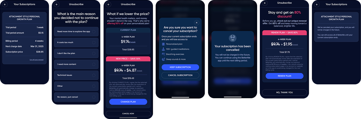
What they do right:
- Exit survey with reason logic: The user picks why they’re leaving, which then directly shapes the next screen. Smart and clean.
- Real-time offer escalation: If the user skips the 50% offer, they get an 80% offer before the final step. It’s direct, but logical: price resistance → bigger discount.
- Plan comparison visual: Current plan vs. discounted one, clear pricing side-by-side. Helps frame the value and reduce friction.
- Clear consequence framing: Before the final cancel, they highlight what will be lost: access to meditations, sleep tools, etc. Subtle but effective.
- Immediate confirmation: The user sees cancellation confirmed, with access until period end. Then, an option to return with a final promo.
What could be better:
- The language is purely functional: There’s no warmth or brand voice here, which makes the journey feel mechanical.
- No graceful goodbye: No thank-you, no acknowledgment of time spent with the product. The final screens are abrupt.
- No pause or downgrade path: You either cancel or get hit with a discount. There’s no “not now” option, which could save softer churn.
BetterMe knows its audience and plays hard on price sensitivity. For many users, that final 80% discount is a better nudge than emotional design or storytelling. It’s one of the more aggressive but effective flows, especially for subscription products where cost is the top churn driver.
Build your own cancellation flow in minutes
All these examples show what’s possible, but you don’t need a big growth team to implement them. With Cancellation Funnels from FunnelFox, you can launch a retention-first cancellation flow straight out of the box.
Here’s what you can do:
- Offer flexible off-ramps: pause, downgrade to a cheaper plan, gift a free period, or cancel gracefully.
- Start fast with a ready-made cancellation template in the FunnelFox builder.
- Configure each action: set pause duration, discount amounts, or custom messages.
- Link the flow from your customer portal using a profile ID.
- Safely test everything in preview mode before going live.
- Works today with Stripe and Paddle.
Instead of a dead end, cancellation becomes a structured touchpoint — one that helps you keep users, learn why they leave, and plan smarter win-back campaigns.

Wrap up
No cancellation flow is perfect, but the best ones share a few key traits:
- They’re easy to find
- They’re honest about what’s happening
- They use feedback to trigger real-time, relevant offers
- And they respect the user’s decision without slamming the door
If your flow does those four things, you’re already ahead of most.