


In the App Store and Google Play, you get a standard checkout flow with almost no room for changes. But checkout on the web is fully customizable: you control the entire experience. That freedom can work both ways: done well, it lifts conversion; done poorly, it drags it down.
Fixing just a few UX details can add 20–30% more completed payments without touching pricing or spend.
Read on to learn the four quick checkout fixes for an instant revenue lift. We’ll also break down how apps handle checkout web flows to show what works, what fails, and which ideas are worth adopting in your own funnel.
1. Cut the clutter
Every extra field is a reason to hesitate. Asking for a phone number or ZIP code when you don’t actually need it adds friction, and friction is the #1 conversion enemy.
Strip your checkout to the essentials. In most cases, that means an email address and a payment method. Nothing more.
When apps switch from default flows to a custom checkout web setup, the lift is immediate: 20–30% more users finish payment without changing a single thing about pricing or the offer.
2. Add the payment methods your users expect
Users don’t adapt to your checkout web form; they expect it to adapt to them. If their usual way to pay isn’t available, many will simply drop off.
Global methods cover most bases, but they aren’t enough on their own. Apple Pay and Google Pay drive higher conversion on mobile because they shorten the path to payment. In Germany, PayPal remains the default. In LATAM and Asia, wallets and vouchers are often the only way to complete a purchase.
Cover global methods and layer in local ones where they matter. And don’t just add them — order them smartly. Put the most relevant option on top, so users spot it instantly.
3. Earn trust before asking for card details
Getting a user to the pay button doesn’t guarantee the payment. Many stop at the last step because they don’t feel safe sharing card details or worry they’ll get stuck with a subscription they can’t cancel.
Baymard reports that 19% of users abandon checkouts on the web because they don’t trust the site with their credit card information. You can reduce that anxiety with a few clear signals:
- prominent “Secure checkout” and PCI-compliance badges
- a simple, visible cancellation policy — users feel safer when the cancellation process is straightforward
- support contacts right on the screen
4. Keep checkout inside your funnel
A redirect to an external page breaks the flow. Users hesitate, question whether the page is safe, or lose patience waiting for it to load. Each extra step adds friction and increases the chance they won’t complete the payment.
The safer path is to keep the checkout web screen within the funnel itself:
- as a dedicated screen in the flow,
- as a modal overlay,
- or as a paywall embedded directly into the journey.
This way, the experience feels continuous, and users stay focused on completing the purchase.
Checkout tear-downs: the good, the bad, the ugly
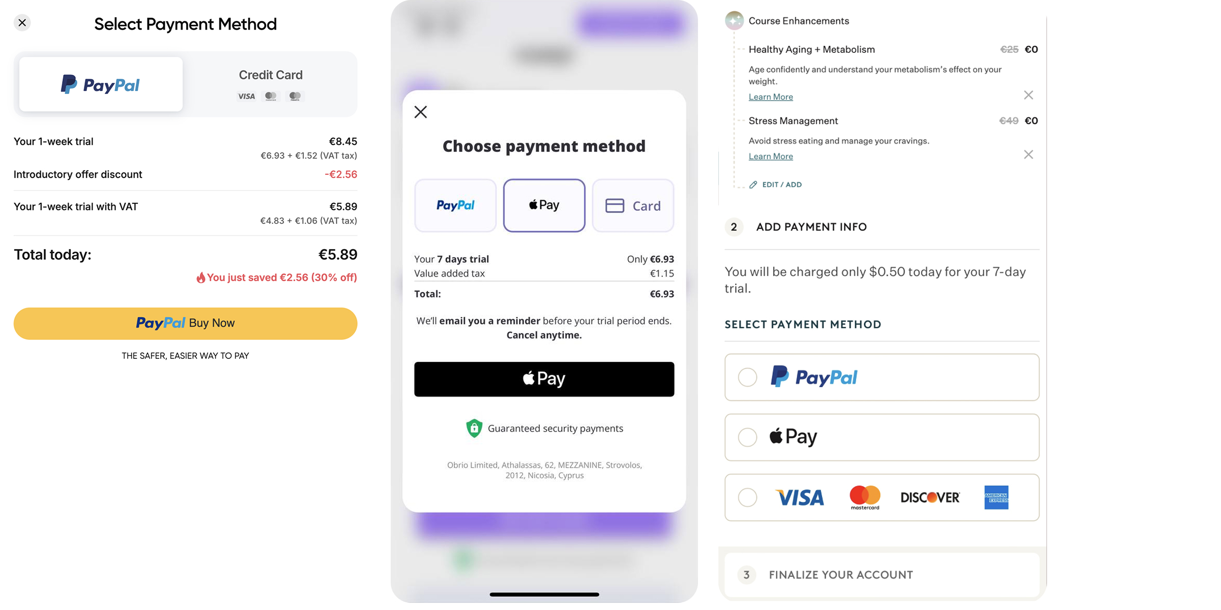
1. Simple: Trust first, payment later
After the paywall, Simple doesn’t take users straight to payment. Instead, its checkout web flow first builds trust with social proof — “15+ million users,” customer reviews, and a money-back guarantee — before moving on to payment methods.

What works well
- Strong social proof (user count, store ratings, reviews) right before checkout.
- Money-back guarantee presented clearly, which reduces risk perception.
- Payment methods are balanced: Apple Pay is highlighted for mobile, PayPal is available, and card logos add credibility.
- An extra line mentions SSL/TLS encryption, signaling that data is transmitted securely, which helps reduce last-minute hesitation.
Under the checkout, Simple placed legal fine print: it covers subscription terms and renewal details, which increases transparency and helps avoid disputes.
Opportunities to go further
The trust-building section is a bit long. Breaking it into shorter steps could speed up checkout for users who are already ready to pay.
For Simple’s main audience in the US and Europe, the offered payment methods are solid. But if the app aims to expand in LATAM or Asia, adding local wallets and vouchers would help reach full coverage.
2. Promova: clean checkout web page at the end of a long flow
After the onboarding quiz and a “personalized plan” screen, Promova’s checkout journey moves through multiple trust-building steps before reaching the actual payment form: customer reviews, a money-back guarantee, subscription plan options, fine print, and a “Pay safe & secure” section with logos. Only after that does the user see the final checkout.
What works well
- Structured trust-building. Reviews and a clear money-back guarantee reduce hesitation and show social proof.
- Transparent pricing. Plan options are presented clearly, with a highlighted “best offer” and per-month breakdown.
- Security cues. Logos for Visa, Mastercard, PayPal, Apple Pay, and others reinforce credibility before payment.
- Clean checkout form. The final payment screen is simple, uncluttered, and easy to complete — one of the stronger implementations out there.
Opportunities to go further
The journey is long: users must scroll through multiple screens before reaching the payment form. This extra distance could slow down high-intent users.
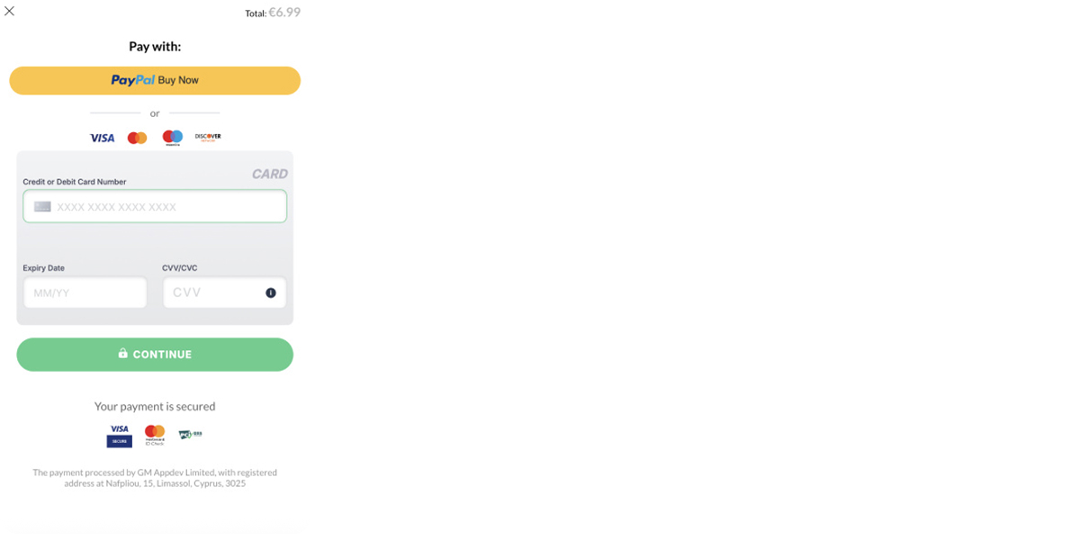
3. Flo: Minimal setup with urgency on top
Flo’s checkout skips long warm-up steps: users land directly on a payment screen where they pick a method and confirm. A countdown timer at the top adds urgency by showing that the “trial upgrade” is reserved only for 15 minutes.

What works well
- Simplicity. Three clear options: Apple Pay, credit card, or PayPal. Nothing else on the screen distracts from paying.
- Mobile-first logic. Apple Pay is preselected and emphasized with a large CTA, which shortens the path for iOS users.
- Security cues. Mentions SSL/TLS encryption and shows card/PayPal logos for credibility.
- Transparent pricing. The $1 trial fee and the post-trial renewal price are written out directly under the form.
Opportunities to go further
The design prioritizes speed, but there’s little room for reassurance — no reviews, no guarantees. Adding one lightweight trust cue (e.g., cancellation clarity) could balance urgency with confidence.
Local payment methods are absent. For Flo’s global audience, that may leave gaps outside the US and Europe. But Flo most likely adapts checkout web flows by region, so users in other markets may see different options.
4. Blinkist: Feature-rich checkout that risks overload
Blinkist’s checkout screen tries to cover everything at once: pricing, discounts, multiple payment methods, and a full manual card-entry form — all visible in a single view.

What works well
- Strong value signal. At the top, Blinkist reminds users that “91% of members create a better reading habit.” This primes the purchase with a success stat.
- Discount visibility. Original price, discount, and new total are shown clearly, reinforcing perceived value.
- Payment flexibility. Multiple fast options — PayPal, Google Pay, Apple Pay — alongside card entry cover a wide audience.
- Transparency. Fine print about billing frequency and cancellation is displayed, reducing risk of user backlash.
Opportunities to go further
- The screen is crowded: too many options and too much text compete for attention. Some users may pause instead of acting.
- Asking for country, ZIP, and full card details adds friction. For digital subscriptions, these fields could be simplified.
Blinkist’s web checkout is flexible and transparent, but also busy. Simplifying the form and elevating trust signals could speed up completion without sacrificing clarity.
5. Paired: Simple checkout with strong reassurance cues
Paired’s checkout is straightforward: one plan option with a visible discount, a clean card-entry form, and multiple reassurance elements stacked above and below the form.
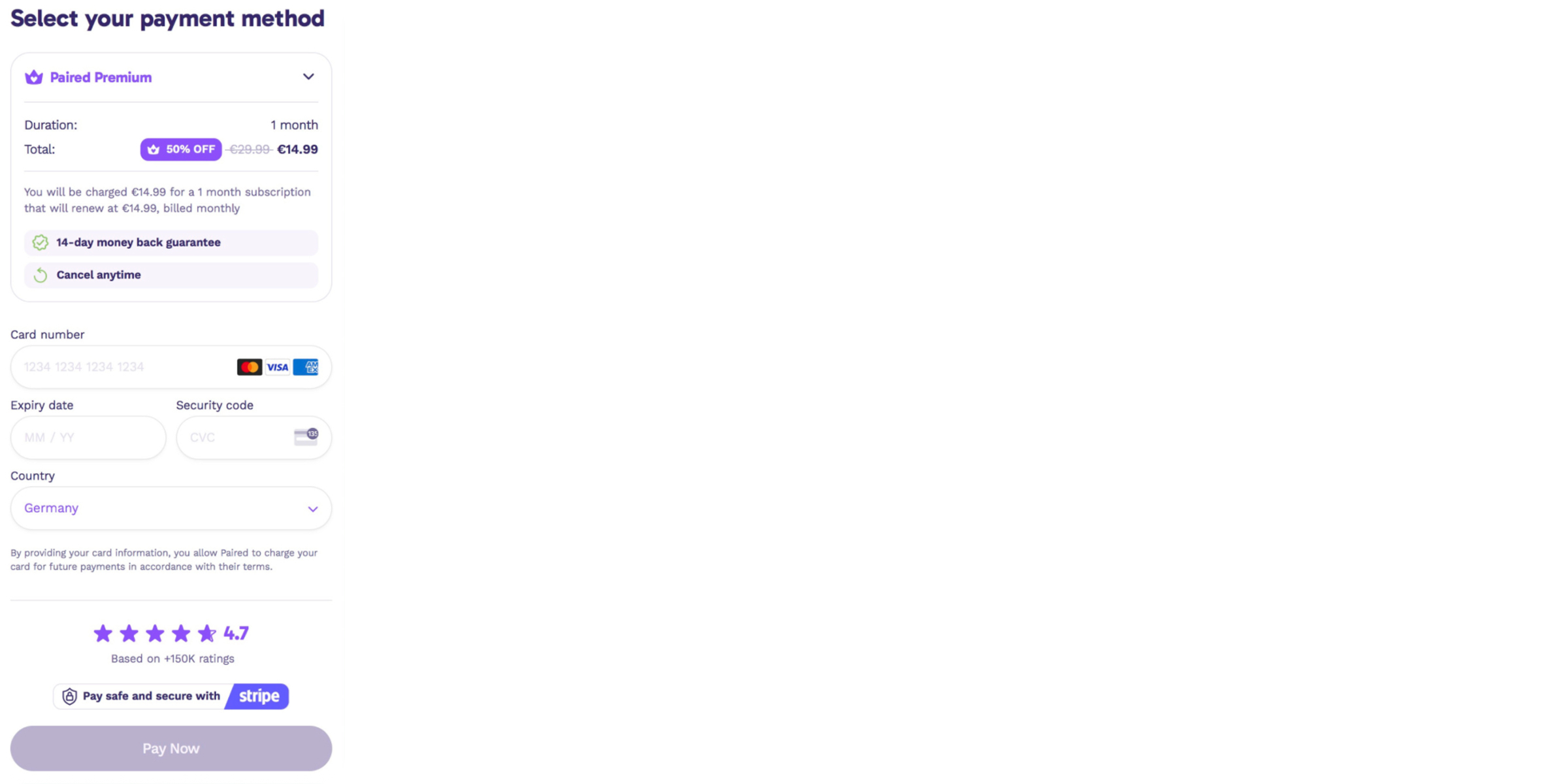
What works well
- Clarity on pricing. Discounted price is shown with the original crossed out — users see the perceived value right away.
- Reassurance before payment. “14-day money back guarantee” and “Cancel anytime” badges sit right above the form, making it safe to continue.
- Trust signals. A 4.7-star rating with “150k+ ratings” reinforces credibility.
- Secure processing. Stripe logo and “Pay safe and secure” line build trust in the payment process.
- Minimal fields. Only card details and country are requested, no unnecessary friction.
Opportunities to go further
- Checkout is card-only. For a wider audience, adding PayPal or Apple/Google Pay would shorten the path to payment.
- The “Pay Now” button is muted in grey. A more prominent CTA color could increase click-through.
6. Mimika: Trust badges plus flexible plan options
Mimika is a subscription app that offers tiered plans (1-month, 3-month, 6-month). The checkout combines plan selection, reassurance badges, and payment entry on a single screen.
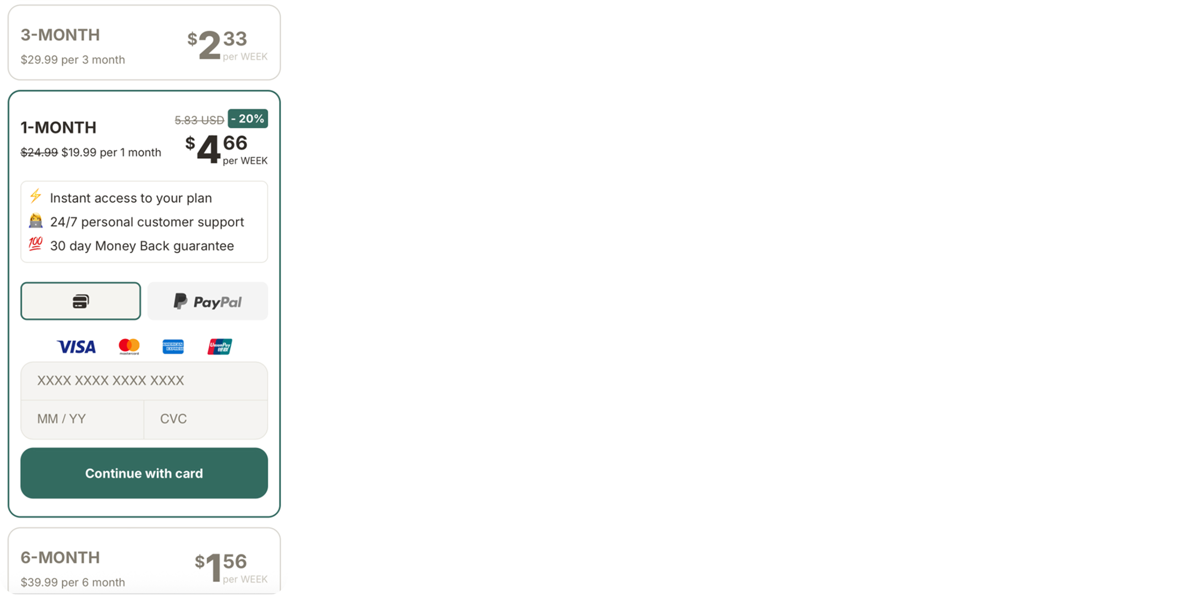
What works well
- Plan clarity. Users can see pricing per week and total per period, with a highlighted discount on the 1-month plan.
- Trust upfront. Badges like instant access, 24/7 support, and 30-day money back guarantee are presented right above the payment section, reducing hesitation.
- Payment coverage. Supports card payments and PayPal, with logos clearly displayed.
- Concise layout. All steps fit into one screen: plan choice, reassurance, and payment. No scrolling through multiple sections.
Opportunities to go further
- Visual hierarchy could be sharper: trust badges and payment options blend in, rather than guiding the eye to the CTA.
- The “Continue with card” CTA could be more prominent; currently it looks secondary to the PayPal button.
- Displaying trial/cancellation details in fine print could make the guarantee even more credible.
7. Ewa: Straightforward checkout with strong basics
Ewa’s checkout web design is simple: a one-month subscription with a promo code applied, a money-back guarantee, and three payment options (Apple Pay, PayPal, and card). Everything is laid out on a single screen.

What works well
- Clear offer. Price is transparent, with a promo code applied and total cost visible.
- Trust signal. A 14-day money-back guarantee is placed prominently above payment options.
- Payment flexibility. Apple Pay and PayPal are highlighted, with card entry available for those who prefer it.
- Direct CTA. The green “Subscribe now” button stands out and makes the next step obvious.
- Legal transparency. Fine print at the bottom explains billing cycle and terms, which helps avoid disputes.
Opportunities to go further
The design is functional but plain. A bit more visual hierarchy — for example, elevating trust and guarantee badges — could reinforce confidence before payment.
Wrapping up
Checkout is where intent turns into revenue — and where many apps still lose half their paying users. The good news: most leaks aren’t about pricing or product, but about UX choices that are easy to fix.
Streamline the flow, add the payment methods your users expect, earn trust before asking for card details, and keep everything inside your funnel. These tweaks can lift conversion by double digits.
Top apps don’t leave checkout to chance, and neither should you
With FunnelFox, you don’t have to reinvent checkout web flows. Our libraries and templates are built from top-performing, conversion-tested elements — pick what works, assemble in minutes, and ship best-practice web2app funnels, paywalls, and web checkouts without weeks of trial and error.