


Looking for real‑world mobile app paywall examples and what makes them work?
In this guide, you’ll find breakdowns of paywall screens from top apps like Spotify, Duolingo, Noom, and more — including what works, what doesn’t, and how you can apply these insights to your own product.
Whether you’re a product owner, mobile marketer, or subscription app founder, you’ll learn how to:
- Design paywalls that convert — both in-app and on the web
- Apply 7 proven best practices for paywall UX and messaging
- Analyze what industry leaders get right (and wrong)
- Build and A/B test your own paywall without writing code
TL;DR:
- The best mobile paywalls build trust fast, communicate value clearly, and reduce friction.
- Consistent messaging from ad to onboarding to paywall increases conversions.
- Benefit-driven CTAs (“Start my plan”) outperform generic ones (“Subscribe”).
- Social proof (reviews, logos, media mentions) boosts credibility.
- Web-based paywalls offer more design freedom and can help avoid app store fees.
How do I create an engaging paywall screen that encourages subscriptions?
To design a paywall screen that encourages users to subscribe — whether inside your app or on the web — you need to build trust, show value, and remove friction. However, not all environments give you the same level of control. In-app paywalls are subject to platform limitations (especially on iOS), while web-based paywalls offer far more freedom in design, messaging, and experimentation. Here’s how they compare:
| Web paywall | In-app paywall | |
|---|---|---|
| Location | Hosted on the web (mobile landing page or WebView) | Native screen inside the app |
| Design control | Full freedom (layout, copy, A/B tests, animations) | Restricted by App Store guidelines |
| Store fees | Avoids Apple/Google fees (up to 30%) | Subject to 15–30% commission |
| Speed of testing | Rapid iterations, no app review needed | Slower — requires app updates and approvals |
| User experience | May break flow if not well integrated (unless web2app used) | Seamless, familiar UX |
| Integration | Requires additional setup (e.g., web2app platforms) | Native billing flows via StoreKit/Billing APIs |
| Trust signals | Can include logos, testimonials, external reviews | Limited — often only what’s allowed by the platform |
| Use cases | Ideal for acquisition funnels, A/B testing, upsells & upgrades | Best for basic subscriptions and native flows |
The principles we’re about to discuss apply to both web and in-app paywalls, but some tactics are much easier to implement on the web due to greater flexibility in layout, copy, and testing.
In practice, these web paywalls are usually built and optimized inside visual web-to-app funnel builders such as FunnelFox. These tools let teams configure paywall layouts, messaging, pricing blocks, and CTAs without code, and run rapid A/B tests without waiting for app store reviews. This makes it easier to apply the principles below and continuously improve subscription conversion.
1. Build trust early
Show customer testimonials, review scores, or logos of known brands. Use clear language (“Cancel anytime”). Keep layouts clean; place trust signals near pricing and CTA.
2. Match the paywall to the user’s journey
If the ad says one thing, onboarding shows another, and the paywall pitches something else, users bounce. The message has to stay consistent. Pick up the same tone, visuals, and promise they saw earlier. If they clicked for a custom plan, show the plan — not just “unlock premium.”
3. Highlight benefits, not features
Replace vague feature lists with specific, tangible benefits. Instead of “Premium content,” say “Reach your goal 3x faster.” Keep this section short and skimmable — 3–5 points max.
4. Use simple, clear pricing
Highlight the best‑value plan. Use toggles for monthly vs yearly. Show savings clearly (“Save 50%”). Test which plan is pre‑selected.
5. Add urgency that feels real
Urgency works best when it’s rooted in real value, not manufactured FOMO. Instead of fake countdowns or flashing timers, show why acting now matters for the user.
Examples that feel real:
- “Your personalized plan is reserved for 24h”
- “Prices may increase soon” (only if true)
- “Offer ends Sunday” — when tied to campaigns
6. Answer questions before they’re asked
Unclear billing details create hesitation. A visible, friendly FAQ near the CTA can remove friction.
Include: Is this a one‑time payment or subscription? When does billing start? Can I cancel during the trial? Is a credit card required now?
7. End with a strong, benefit-driven CTA
Don’t just say “Subscribe”. Say what the user gets — e.g., Start my plan, Unlock full access, or Get my personalized report.
Also test CTA placement (bottom of page, sticky bar, inline) and visual contrast.
7 Examples of paywall screens used in popular apps
Let’s explore some effective paywall screen designs for mobile apps. Many of the paywalls you’ll see below follow the same proven industry patterns. Similar layouts, pricing structures, offer framing, and CTA logic are reused and adapted across different products, including in web paywalls inside web2app funnels built in tools like FunnelFox.
1. Spotify: Transparent pricing grid with strong free trial, but heavy on fine print
Spotify uses a straightforward grid to present all Premium options — Individual, Student, Duo, and Family. The design is minimal and consistent, with color-coded CTAs that stand out. It’s easy to compare, and the “$0 for 1 month” hook is front and center.

What they do right:
- Free trial upfront: “$0 for 1 month” leads every card, lowering the barrier to entry.
- Clear segmentation: Each plan has its audience (students, couples, families) with benefits spelled out.
- Consistent layout: Clean black background with bold color accents keeps it on-brand and scannable.
- Flexible exit promise: “Cancel anytime” is repeated across all tiers, reducing anxiety.
What could be better:
- Fine print overload: The legal disclaimers (“Offer only available if… Terms apply”) clutter the cards and weaken the friendly tone.
- Audiobooks offer feels tacked on: “15 hours/month of audiobooks” is squeezed in but doesn’t feel compelling or clearly positioned.
- CTA hierarchy: “Try 1 month for $0” works, but Duo/Family CTAs (“Get Premium…”) don’t emphasize the trial, which may hurt uptake.
- No emotional framing: Everything is functional and transactional. There’s no headline tying Premium to outcomes like “Enjoy music without interruptions” or “Soundtrack your day together.”
2. Fastic: Clean layout, heavy on proof, light on emotion
Fastic leans into social validation — millions of users, nearly half a million 5-star reviews, and a big App Store badge front and center. It’s a classic credibility-first approach, and it works for reassuring skeptical users.

What they do right:
- Strong social proof: 9.6M downloads and 493k 5-star reviews give instant legitimacy.
- Simple, clean plan cards: Three options, one highlighted as “Most Popular” with a bright frame and 50% off — no confusion about the recommended choice.
- Clear value framing: Weekly cost is shown alongside percentage savings, helping users process the deal.
- Reassuring footer: “Free to cancel anytime” reduces perceived risk.
What could be better:
- Generic messaging: “Proven success with millions of users” builds trust, but it doesn’t connect to my reason for downloading. Adding benefit-led copy (“Lose weight steadily with guided fasting”) would tie proof to outcomes.
- Price-heavy experience: The entire screen is discounts and savings. No benefits, no visuals of what Plus unlocks — it feels transactional.
- CTA ambiguity: A single “Continue” button isn’t as compelling as “Start my plan” or “Unlock fasting tools.”
3. KetoCycle: Aggressive savings pitch with trust badges on top
KetoCycle sells a structured keto plan, and their paywall goes straight for the hard sell with heavy discounts and bold savings framing. It’s clear, direct, and unmissable — but it trades subtlety for urgency.
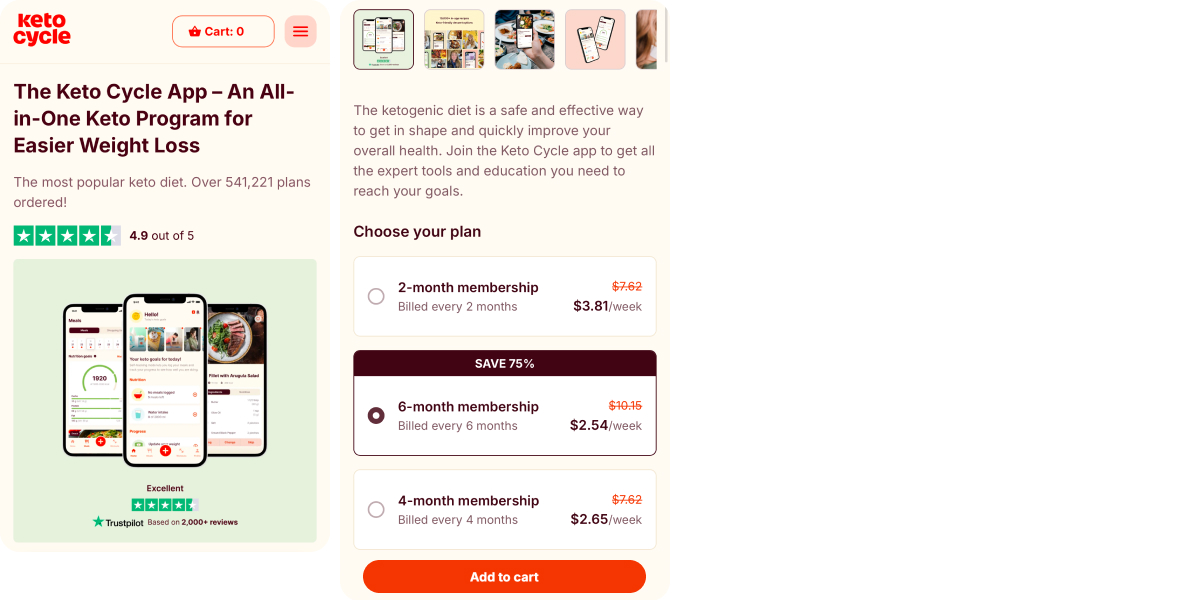
What they do right:
- Strong discount framing: “Save 75%” takes center stage, making the six-month plan feel like the obvious choice.
- Clear price breakdown: Weekly cost is shown alongside full billing terms — users know exactly what they’ll pay.
- Trust signals up front: Trustpilot badge and 2,000+ reviews add credibility, especially for first-time buyers.
- Visual consistency: Simple cards with bold highlights guide the eye toward the intended option.
What could be better:
- Overloaded plan options: Three plans with close price points risk creating friction. Highlighting fewer, more distinct choices could speed decisions.
- Generic headline: “The ketogenic diet is safe and effective” doesn’t connect to the user’s specific motivation — it reads like ad copy, not a personalized hook.
- Weak benefit framing: The value is framed in terms of “membership” length, not outcomes (e.g., “reach your goal in 3 months”).
- Harsh urgency: Heavy strike-through pricing can feel too salesy, especially without context for the discount.
4. Noom: low-friction trial, high-friction price
Noom positions itself as a psychology-based weight loss app, and the paywall leans on accessibility and perceived personalization. A low-cost trial lowers the barrier to entry, and the screen highlights plan details and expected progress. But the full price is hidden in fine print, and the screen misses opportunities to reinforce the app’s unique value.

What they do right:
- Low-barrier trial: Entry cost is just $0.50 (or $1 in some flows), making it easy to test the product before committing.
- Clear trial window: Users see exactly how long the trial lasts and when billing starts — including the specific date.
- Plan preview: The screen shows a timeline of expected progress, reinforcing the idea of a personalized experience.
- Detailed breakdown: Billing, course modules, and payment methods are all laid out — no guessing.
What could be better:
- Price hidden in disclaimers: Full pricing after the trial ($44.99/month) is buried in a dense legal block rather than shown upfront.
- Weak value framing: The screen focuses on logistics and pricing but fails to emphasize benefits or outcomes (“what you’ll get”).
- No emotional appeal: There’s no story, motivational framing, or future-state visualization — which feels off-brand for a psychology-first app.
- Missing social proof: Unlike their landing pages, the paywall includes no user testimonials, reviews, or success metrics.
- Flat CTAs: Both “Continue” and “Let’s go” are generic — no mention of personalization or transformation.
5. BetterMe: Transparent trial timeline, but clunky execution
BetterMe leans heavily into personalization and trust-building. The paywall shows a custom avatar with body stats and fitness level, a personalized workout plan, social proof via user photos and reviews, media logos, and even a countdown timer to add urgency. But all this content competes for attention — and can undermine clarity.
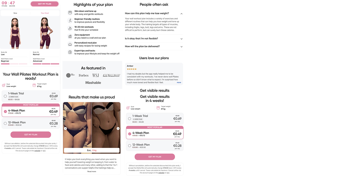
What they do right:
- Strong personalization: The avatar with weight goals and fitness level makes the offer feel tailored and relatable.
- High trust signaling: Before-and-after photos, testimonials, and media logos (Forbes, WSJ) help build credibility quickly.
- Clear value promise: “Get visible results in 4 weeks” is a tangible, time-bound benefit.
- Pricing transparency: Weekly cost is displayed for all plans (1, 4, and 12 weeks), with the most popular plan clearly highlighted.
- Urgency element: The countdown timer adds a nudge to act now.
What could be better:
- Visual overload: The screen is packed — avatars, testimonials, logos, FAQs, multiple pricing blocks, and disclaimers compete for focus.
- Duplicated pricing section: Two pricing tables appear on the same page without serving a new purpose — this adds friction.
- CTA could be stronger: “Get My Plan” is serviceable, but something like “Start My Plan Now” or “See My Results” could better convey urgency and value.
- Small, dense legal text: The disclaimer block is long and visually dominant, making the bottom half of the page harder to digest.
6. Fabulous: Immersive storytelling, but confusing CTA path
Fabulous stays true to its brand identity — colorful illustrations, inspiring tone, and a focus on building healthy routines. The paywall feels like a natural part of the app’s onboarding, with clear emotional hooks. But the layout and call-to-action structure introduce confusion.

What they do right:
- Emotional, goal-oriented framing: “Build a Routine based on your goals” and the four colorful pillars (“Take it easy”, “Get energized”, etc.) make the offer feel personalized and purpose-driven.
- On-brand visuals: The hand-drawn illustration and bold colors match the app’s aesthetic and add emotional warmth.
- Price reframing: “Only $3.33 per week” makes the quarterly fee ($39.99) feel more digestible.
- Free trial stated clearly: “Try 7 Days for Free” appears twice — once in the body, once in the button — reinforcing a low-risk start.
What could be better:
- Too many CTAs: Users see a toggle (“Enable a free trial”), a white “Continue” button, and a pink “Try Free for 7 Days” button — it’s unclear which to press or in what order.
- Hierarchy confusion: There’s no dominant action; visually, the buttons and toggle compete rather than guide the user down a clear path.
- Vague trial disclaimer: The fine print “One week free, then $39.99 every 3 months” is small and easy to overlook — more visibility would reduce surprises.
- Hesitant microcopy: “Not sure yet?” beneath the toggle sounds unsure, which slightly undercuts the otherwise confident, motivational tone.
7. Duolingo: Playful visual identity, clear plan structure, but weak value communication
Duolingo delivers a polished, on-brand paywall with its signature color palette, gradients, and mascot. It communicates the free trial clearly and keeps the layout minimal. But it leans too heavily on pricing without explaining what users actually get from “Super”.
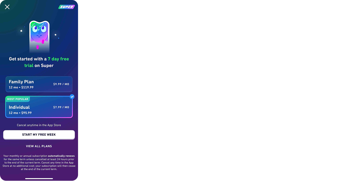
What they do right:
- Consistent branding: Bright gradients, cheerful tone, and the Duo mascot make the paywall feel fun and familiar.
- Risk-free entry: “Get started with a 7 day free trial” is the headline, and “Cancel anytime” is stated plainly underneath the plans.
- Clean, simple layout: Two options only — Family and Individual — with the “Most Popular” tag clearly marking the recommended plan.
- Clear CTA: “Start my free week” is user-centric and action-oriented.
What could be better:
- Missing value proposition: The paywall doesn’t explain what “Super” includes — no ads? offline access? progress boosts? Users unfamiliar with the upgrade won’t know why it matters.
- No social proof or emotional hook: There’s no mention of how many people use it, success stories, or benefit-driven copy like “Learn faster” or “Stay motivated”.
- Heavy legal text at the bottom: The auto-renew disclaimer is long and dense — better formatting or tooltips could improve clarity without hurting the layout.
Key takeaways
- If you’re building for the web, you control everything: copy, design, testing, and personalization.
- If you’re limited to in-app, you can still influence results: structure the offer, refine the visuals, and experiment with messaging.
- Treat your paywall as a product, not just a form.
- Make it clear, relevant, and low‑friction.
- Show the value, reduce uncertainty, and align the message with what brought the user in.
- Test everything — layout, copy, timing.
- Use no-code web paywall tools to build, test, and iterate faster.
Best practices only drive results when they’re tested on real users. That’s why teams typically validate paywall layouts, pricing structures, trial logic, and CTA wording through continuous A/B testing in web-based paywall and web-to-app funnel platforms such as FunnelFox. This setup allows teams to iterate quickly, roll out winning variants without shipping new app versions, and turn design principles into measurable subscription growth.