





Most subscription apps treat lifecycle email as an afterthought. They ship one welcome email at sign-up, one generic “come back” blast, maybe a newsletter to the whole list, and leave dunning to the billing provider. Sometimes they do nothing at all.
The problem with that approach is not effort. It’s that it ignores how users actually move through a funnel. Every user is sitting in a specific state, for a specific reason, at a specific moment. Someone who abandoned your quiz is not the same as someone who hit the paywall and hesitated, and neither is the same as someone who paid but never opened the app. Send all three the same message and it lands as noise for at least two of them.
What the user needs is narrow: a message that names why they stalled, a single next action deep-linked back to where they left off, timing tied to their behaviour rather than the calendar, and a different ask depending on whether they’ve already paid.
What follows is a map of ten states a web funnel user can be in, what converts at each one, and the order to build them in. Each state is a trigger. The user’s own behaviour fires it, which is what separates this from a campaign you blast on a schedule. The states fall into three phases, defined by where the user sits relative to the moment of payment: before they’ve paid, after they’ve paid but before they’ve found value, and when revenue you already earned starts to slip away.
Lifecycle emails before the first payment
In this phase the user is somewhere in the funnel but hasn’t paid. What separates the three states here is the objection holding them back, and the objection changes depending on where they stopped. The mechanism is the same throughout: return them to the point they left, and answer the one thing keeping them from buying.
State 1. Abandoned quiz: the resume-nudge email
A user who finishes most of your quiz and then disappears has usually not lost interest. Something interrupted them. A dog needed to go out, a child walked in, work pulled them back. The job of this email is to resume where they left off and remove the friction of restarting.
Simple does the hard part well. The email is signed by a named person, Emily, a nutritionist, and written like a one-to-one message rather than an automated campaign. It tells the user their plan is already pre-filled based on their answers, which removes the sense of effort, and it offers risk reversal: try it for a month, cancel or switch if it doesn’t fit.
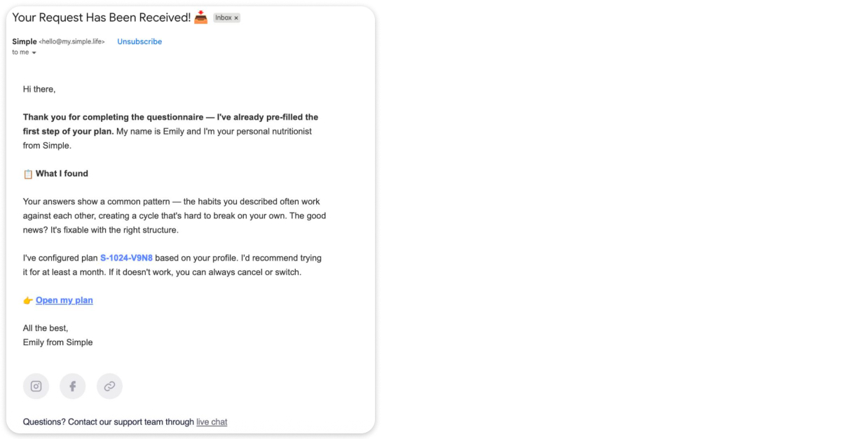
What it misses is the next step. The subject line reads like a support auto-reply instead of “your plan is ready,” and the greeting is a blank “Hi there” after a completed questionnaire. The data to personalise was collected. It just wasn’t fully used.
“The more that you can customize and personalize, the better. When a user feels that you’re speaking to them, that’s when they’re going to react. And there are a lot of reasons why people abandon. They got through the quiz, and it wasn’t that they weren’t interested. Things happen. We all have lives.”
 |
Nicole Weiss Founder of Brass Finch |
People don’t abandon because they dislike the product. Life gets in the way. An email that says we know life happens, you did this, we’ve already customized the plan, here’s the next step works far harder than a generic thank-you.
What this means: capture quiz responses in a form you can actually use, then send the user back to the exact question they dropped at, so they resume mid-funnel instead of restarting.
State 2. Saw the paywall, didn’t buy: objection-handling email
When a user reaches the paywall, the funnel has already done its work. The ad, the onboarding, and the offer all landed. If they then leave, that’s rarely lost interest. It’s an unresolved objection.
Three reasons they walk: the price feels high, the commitment feels long, or the product hasn’t earned enough trust to justify handing over card details. The email’s one job is to name the likely objection and answer it, without making the user start over.
What ZOE gets right:
- Deep-links straight back to the paywall screen, so there’s no penalty for hesitating and no funnel to repeat
- Reflects the user’s own goal back, pulled from quiz data, so it reads as a continuation rather than a cold reminder
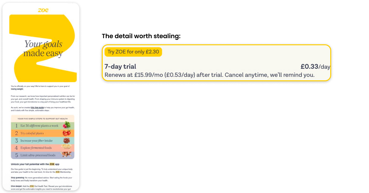
What it misses is the objection itself. The subject line is content-led and references nothing about the offer the user just abandoned. Price, commitment, and fit all go unaddressed.
Visible shows the other half of the problem. It’s a health product, so the email is signed by the founder, with a real face, because when the product is medical-adjacent, trust is the objection. The lesson across both is that the objection you answer depends on what stopped the user, and that changes case by case.

“There are competing CTAs, so you want to make sure that you’re always clear in what you do. And like you said, you want to get them back to where they left off. Don’t make them restart a quiz.”
|
Nicole Weiss Founder of Brass Finch |
One message, one action, back to where they left off. Competing CTAs are the most common way these emails leak.
What this means: treat a paywall-exit email as a targeted answer to one objection, delivered without resetting progress. A generic “come back” reminder leaves the real blocker in place.
State 3. Trial ending: the expiry-reminder email
A user approaching the end of a trial has one underlying worry: that the value won’t continue once they’re paying. The job of this email is to give them a sense of control over what happens next, and to make the terms explicit.
Shopify runs two versions of the same moment, and the split is instructive:
- Card on file: the charge happens whether or not they act, so the job is to prevent a surprise. State the exact amount, the exact date, and give a clear way to cancel.
- No card on file: nothing happens unless they choose, so the job is to force a decision before the deadline. State the deadline plainly, make the plan choice the CTA, and add a softer second CTA for the undecided.
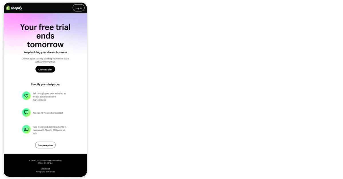
What’s missing from both is a reflection of what the user built during the trial, the store, the content, the progress they’re about to lose access to. That’s the strongest argument a trial-ending email has, and it goes unused.
There’s a deeper point here about trust. Apps often fear sending a trial-ending reminder because it might prompt a cancellation. The opposite tends to be true.
“A lot of apps are nervous to send a trial-ending email, even for someone on auto-renew, because they think they’re going to remind someone that they have a trial and then they’re going to cancel. But it comes back to trust and belief in the brand. If they know that you’re looking out for them and reminding them, they’re going to stick around.”
|
Nicole Weiss Founder of Brass Finch |
When a brand stops sending these reminders, users feel ambushed by a charge they forgot about, and that’s what ends up on Reddit or X as a complaint. The reminder you were afraid to send is often what builds the trust that keeps the subscription.
What this means: state the exact terms, hand the user control, and reflect their own trial usage back to them. On a seven-day trial especially, a well-timed reminder does retention work, and the fear that it triggers cancellations rarely plays out.
Section takeaway: don’t send one generic email for three different churn points
Where the user dropped tells you why they dropped, and the message changes with it:
| They churned at | What that means | So send |
| The quiz | Distracted or interrupted | A link back to the question they stopped at |
| The paywall | A price, fit, or trust objection | Proof against that one objection |
| The trial end | Unsure the value will continue | Their own usage, plus the exact terms |
Post-purchase activation: from payment to first value
Here the user has paid, and nothing about that guarantees they ever open the product. What separates these states is what sits between the payment and the first moment of value. The further a paying user gets from that first meaningful action, the less likely they are to renew.
State 4. Paid, never installed: the activation email
It’s not uncommon to see 10 to 20% of users who sign up through a web funnel pay but never install or open the app. Some don’t realise there’s an app to download at all. Users who convert on web skew slightly older, and the step from web checkout to app store isn’t always obvious. The job here is to get them installed and remove every point of guesswork in between.
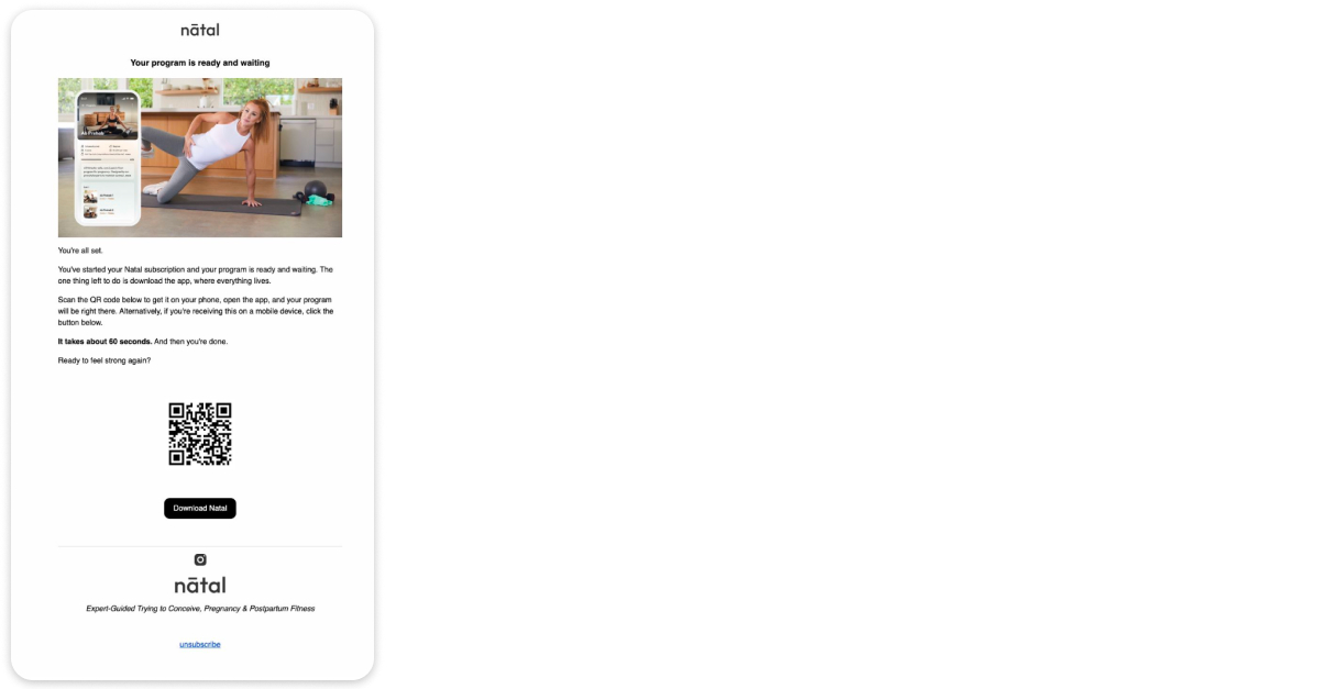
Natal runs this as a short sequence:
- One hour after checkout: “Your plan is ready. Open it in the app.” It names what they paid for, gives a QR code for desktop and a button for mobile, and reassures on effort with “it takes about 60 seconds.” One action, no newsletter, no upsell.
- Follow-up: objection handling. Four of the most common questions, is it safe for me, do I need to be fit, how long does it take, answered outright in the email. The CTA shifts from the chore (“download”) to the reward (“Open Natal”).
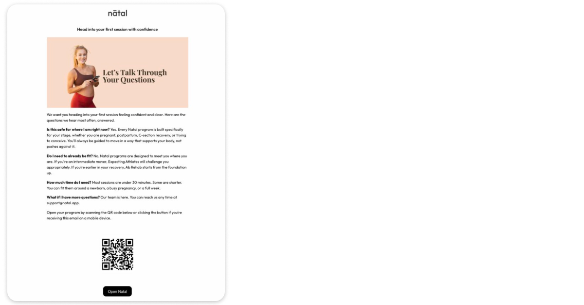
The blocker here isn’t price. They’ve already paid. It’s often fear: is this safe for where I am right now, do I need to already be fit. That’s the same objection-handling technique used at the paywall, aimed at a completely different worry.
One thing worth adding that even Natal skips: an explicit, step-by-step guide to installing.
“I would add a step-by-step guide. Step one, take out your phone. Open the camera. Scan the QR code. It seems obvious to a lot of people in the app space because we’re mobile native, but for people coming from web, it might not be. It seems silly, like you’re holding hands, but I’ve seen it really make a difference.”
|
Nicole Weiss Founder of Brass Finch |
What this means: this is the cheapest cohort you will ever recover. They’ve already paid and already proven they’ll convert. A short sequence with a working deep link, and instructions plain enough to feel like over-explaining, is usually all it takes.
State 5. Installed, not activated: the onboarding-nudge email
Installing isn’t activating. A user who opens the app but never takes the first meaningful action hasn’t reached the point where the product’s value becomes real. The email’s job is to get them to that first action, and sometimes the first action depends on someone who isn’t even your user.
Everlove is a relationship app, so activation means inviting a partner. The email handles that well:
- Personalised to both people, the user’s name and the partner’s, in the subject of the ask
- Names the actual blocker instead of re-pitching the product
- Hands over a script, the exact words to send the partner, reframed so it sounds like a game rather than couples therapy
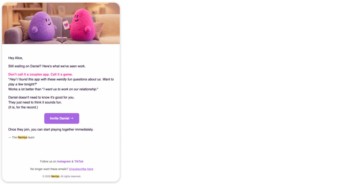
What it misses is a fallback when the partner never joins. Everlove can be used solo, but the email treats the invite as the only path forward, leaving the person who’s already in the app without a next step.
“There’s an opportunity to make them feel better. Like, hey, while you’re waiting on Daniel, here are all these great resources you can be using today. And even though Daniel hasn’t been using it, you have. You’re doing a great job.”
|
Nicole Weiss Founder of Brass Finch |
The single person already in the app may be feeling hurt or rejected, and there’s a chance to reassure them and keep them engaged on what they’re doing, rather than staking everything on the second person signing up.
What this means: when activation depends on a second person, the email’s job isn’t to persuade your user. She’s already convinced. It’s to arm her with the words that work on the partner, and to keep her engaged if they don’t.
State 6. Active: progress and engagement emails
An active, engaged user has no blocker to remove. The job shifts from conversion to keeping momentum: progress recaps, streaks, reminders of how far they’ve come, a newsletter with a clear next action rather than generic content. There’s no single email to dissect here. The work is steady reinforcement tied to what the user is doing in the product, which is also where real personalisation pays off.
What this means: don’t let the cadence for active users drift to arbitrary calendar sends. Tie it to their behaviour and their progress, the same way you tie everything else.
Section takeaway: paid, never installed is pure revenue loss
Run the math on your own numbers. Take 1,000 web checkouts in a month. If 15% never open the app, that’s 150 paying users getting nothing. Those 150 renew at close to zero, refund at a higher rate than any other cohort, and remain the cheapest users you will ever recover, because they already gave you money. Three emails with a working deep link can be all it takes to fix it.
The question worth asking: can you report that number today? Many teams can’t, because the journey from web funnel to app install was never stitched together, which means the cohort stays invisible.
Retention and recovery emails: dunning to winback
This is where revenue you already earned starts to slip away. What separates these states is whether the user chose to leave, and whether they ever paid at all. The recovery is almost always cheaper than acquiring someone new.
State 7. Payment failed: the dunning email
A failed payment is usually involuntary churn: an expired card, a billing address mismatch, a technical issue. These users never chose to leave, which makes them some of the easiest revenue to recover. The job is to tell them exactly what happened and exactly what to do, with no friction.
Dropbox gets the substance right:
- Names the problem in three words in the subject, with no marketing tone
- States the exact amount and plan, $99.00 for Dropbox Pro
- Diagnoses the likely cause, an expiry date or billing address, without blaming the user
- Gives a specific deadline date rather than a vague “soon,” and says plainly what access changes: no files deleted, but no new files added
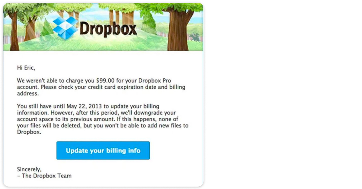
What to watch is the layout. The email is text-heavy, in large blocks, with header art pushing the substance down. For a transactional message where you need one action, that’s a real risk.
“You want to be very clear. What’s going on? Why is it happening? How do you fix it? Make it something someone could scan and essentially not read most of it, and very quickly understand what’s happening and what they need to do to fix it.”
|
Nicole Weiss Founder of Brass Finch |
Keep the call to action near the top, and resist the dark patterns. Vague threats that everything will be deleted create panic and support tickets, and they often backfire. Transparency about what actually changes is the more durable approach.
What this means: recovery here is close to free. These users already paid and probably still want the product. Make the fix scannable, state the exact terms, and lead with the one action.
State 8. Renewal coming: the value-recap email
A user with a renewal approaching hasn’t left and isn’t failing, but the charge is a decision point whether you treat it as one or not. The job is to recap the value before the money moves, so the renewal feels earned rather than extracted. There’s no single email to dissect here, but the principle matches the trial-ending reminder: transparency about what’s coming builds the trust that makes people stay, where silence invites the ambushed-charge complaint.
What this means: treat the renewal as a value moment. A silent charge protects nothing, while the same reminder you might fear sending is what protects the relationship.
State 9. Cancelling: the cancellation-confirmation email
A user who has chosen to cancel has made a decision. The email confirming it is not the place to fight that decision. The job is to confirm cleanly, state how long paid access continues, and explain what happens after.
Headspace treats the confirmation as a receipt:
- The subject does the operational job immediately, with no “wait!” and no vague account language
- Confirms the cancellation, tells the user how long they keep access, and explains what changes after that date
- No CTA, because it doesn’t use the moment to pressure someone who has just chosen to leave
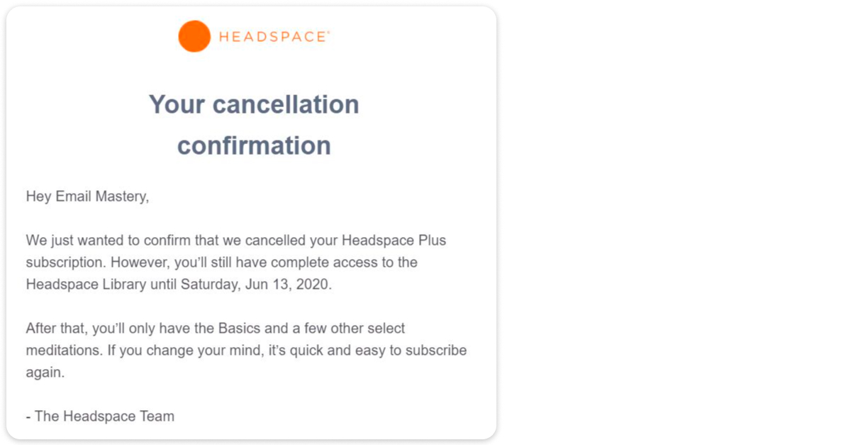
That restraint is the interesting part. An email that doesn’t desperately try to win the user back can leave them wondering whether they’re missing something.
“A lot of brands try to immediately hit you with a win-back offer. I’m very against that. Those are the types of things people screenshot and send out to Reddit or X. If you’re not always trying to sell, and you’re just saying, hey, you canceled, we understand, we’re going to miss you, but you still have access to the basics, people use it, they remember, and they come back.”
|
Nicole Weiss Founder of Brass Finch |
An immediate win-back offer at the point of cancellation is exactly the kind that gets screenshotted and passed around, training users to cancel in order to trigger a discount. What the email could add is a lower-barrier path, a free tier or resources on the site, so a user whose circumstances changed stays in your database rather than leaving entirely.
What this means: confirm the cancellation with transparency and let the user leave cleanly. If you have a free version, point there. It’s often how you reconvert the user months later.
State 10. Churned: the winback email
A churned user has already gone, and some time has passed. This is where the single most important split in the whole map applies: a former payer and a never-paid signup need two completely different win-backs.
obé Fitness handles the former-payer case well:
- Leads with what changed since they left: new workouts, programs, instructors, a new podcast-style class
- Makes the return concrete with specific things to explore rather than a generic “we miss you”
- Keeps the offer to a single line: four months at $10/month, with a clear deadline, so the return path supports the email rather than filling it
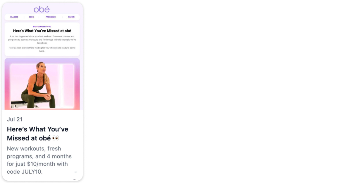
The line that makes it work is “a lot has happened since your last workout.” That frames it as a former-member email rather than a signup email. It doesn’t re-explain what obé is. It gives someone who already knew the product a reason to look again. What it misses is reflecting the user’s own history. A former daily user and someone who took one class get the same email.
“I’ve seen some of the apps I’ve worked on where 50% of their new subscribers are win-back subscribers. People leave for a reason, but it doesn’t mean they don’t love the app. If you have a strong win-back program, these are people who already showed interest.”
|
Nicole Weiss Founder of Brass Finch |
A user who had your app and left showed real intent, which is often a cheaper path to growth than someone who only ever abandoned the paywall.
What this means: the recovery is only as good as how precisely you target it, and the biggest lever is whether the churned user ever paid.
Section takeaway: payer vs signup, two different winbacks
A churned former payer and a churned never-paid signup look alike in a database and need opposite emails.
Former payer — they already believed you:
- The pitch is done. Something changed since they left: price, life, a missing feature.
- Lead with what’s new. Ship notes since they left, with their data sitting exactly where they left it.
- Ask for the return directly. One tap to resume the old plan, with no new decision to make.
Never-paid signup — they never bought the premise:
- Reminding them the product exists changes nothing. The value was never established.
- Lead with the outcome. Re-pitch the value from the top, with proof. This is top-of-funnel work.
- Ask for a smaller step. Back into the quiz, a free tool, or a single result, where a full subscription would be too large a request.
The three highest-ROI lifecycle emails for web funnels
Ten states is the full map, but you don’t build them all at once. If you build only three, build these:
- Paid, never installed (State 4). Revenue you’ve already collected and are actively wasting. It’s the fastest payback on the map, because these users converted. They just never arrived.
- Payment failed (State 7). Involuntary churn from people who never asked to leave. Recovery is close to free, with no acquisition cost attached.
- Saw the paywall, didn’t buy (State 2). The largest addressable audience of the three, users you already pulled through the funnel to the decision point.
Then work outward. Every state needs an exit rule and a suppression list before you add the next one, so sequences don’t collide.
There’s a reasonable disagreement worth surfacing on how to sequence this. The order above leads with the cohorts where recovery is cheapest and the revenue is already yours. There’s a strong case for weighting win-back higher instead. On some apps, returning users make up a large share of new subscribers, because a churned user who once paid has already shown intent that a paywall-abandoner never did. Both views point the same direction: the cheapest growth usually comes from users who already gave you a signal, well before you reach the top of the funnel for someone new.
The same map, already automated
Everything above is a build list, ten sequences someone has to write, wire to triggers, and keep from colliding. The FunnelFox × Adapty Mail integration automates most of that map, off the signals that already arrive with every profile: country, locale, timezone, and experiment ID, so language and funnel variant are handled without a manual step.
FunnelFox forwards the emails you collect in your funnels, along with each customer’s purchase and subscription history, into Adapty Mail, which builds and sends the sequences. Cancellations, billing issues, and expirations are passed on as they happen, so a churned subscriber never reads as an active one, and the email matches the state the user is actually in. The states worth building first are the same either way. Start where the revenue is already yours.
This article draws on a FunnelFox webinar with Alice Muir Kocourková, an independent growth and subscription consultant. You can reach her at [email protected]