


This article is part of the AIM Conference 2026 series—a conference for mobile growth professionals organized by FunnelFox and Adapty at Nasdaq HQ, New York. Watch the full session.
About the author: I’m Katerina Clark, Head of Optimizations at The Economist, where I lead optimization across SEO and ASO. I’ve been at The Economist for almost three years. When I was first hired, my primary role was to bring app marketing in-house and build a comprehensive organic and paid app marketing roadmap. As a result, I was able to grow revenue by 26% YoY by focusing on optimizing our paywall and App Store product pages.
This article walks through four of the paywall tests we’ve run at The Economist: what we expected, what actually happened, and what we took away from each.
Test 1: Urgency copy on the offer banner
January is one of our top seasonal months, so we like to run New Year sales. During the sale, we ran a three-way test on what we call internally the “yellow pill”—the small yellow banner sitting on top of our annual plan card. Everything else on the paywall stayed identical. Only the copy in the banner changed:
- Version A: “Special offer”
- Version B: “New Year sale—50% off”
- Version C: “New Year sale: ends 16 Jan”
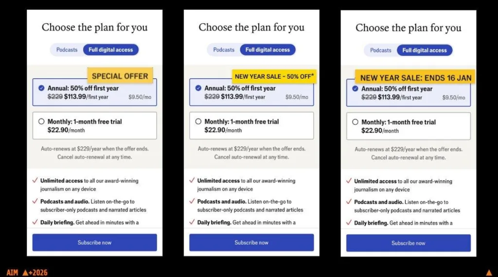
Three versions of the “yellow” pill: Special offer, New Year sale 50% off, and New Year sale ends 16 Jan
Version C won. “Sale ends” outperformed “50% off” and “special offer” because it created urgency. Without urgency, users default to “I’ll decide later”, which usually means never. Additionally, pairing “Ends in:” with a discount creates FOMO – fear of missing out. From a psychological standpoint it also reduces cognitive load. Instead of spending time evaluating whether I need this product and looking at alternatives, the timer narrows that decision process – I need this now before it expires.
Changing only this one small piece of banner copy, with nothing else altered, lifted subscriptions significantly.
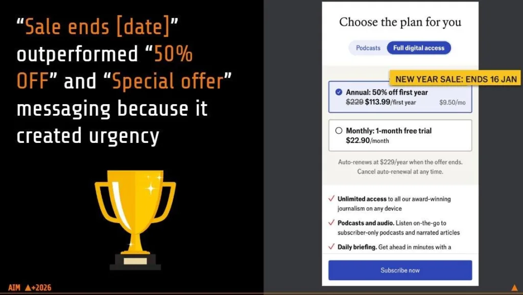
“Sale ends [date]” outperformed “50% off” and “Special offer” because it created urgency
The principle we took from this: countdown timers and urgency on the paywall drive conversions. What we’d love to test next is an actual live timer—a countdown with the minutes and seconds ticking, like on New Year’s Eve. Our in-house capabilities didn’t allow it for this test, but it’s definitely on the list.
Test 2: Pricing copy clarity vs. simplicity
The second test was on our podcast subscription paywall, where we changed the copy around pricing.
In Version A, we wanted to make everything explicit: exactly how much you save, how it’s billed, when it auto-renews, and how much it costs once it does. A lot more copy, a lot more clarity. The annual plan said “save 42% versus monthly,” billed at £41 the first year and auto-renewing at £59.
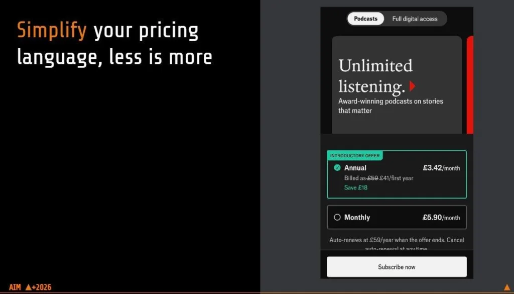
In Version B, we cut the auto-renew detail. It just showed the first-year price (£59 £41) and a “Save £18” line:
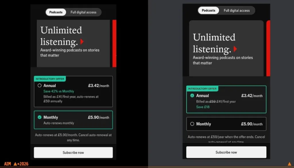
Podcast paywall: Version A with detailed pricing copy vs. Version B with simplified copy
Version B won, and we were honestly surprised. We had expected more copy and more clarity to help, but what it actually did was confuse users. They were left thinking: “How much am I paying? It says £41, but then it auto-renews at £59?” Too much copy created too much confusion. Simplifying the language and showing less of it performed far better.
Winning paywall with simplified copy
There’s a famous quote from Apple that resonated with our test: “simplicity is not the absence of clutter, but a clear sense of the product’s purpose”. But simplicity doesn’t mean stripping a paywall down to just the price and the subscribe button. A lot of what sits on our paywall is necessary. Links and supporting elements are helpful. The goal is to simplify the copy and make it easy to digest, because that is what converts.
Test 3: Adding visual elements to the paywall
For this test, we wanted to see how a visual element affects conversion. Version A was text only. Version B added a bold red banner with our brand promise.
- Version A: No banner, plan cards directly under the “Choose the plan for you” header.
- Version B: Red brand banner above the plan cards.
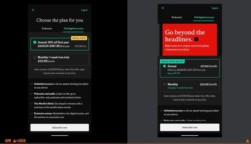
Paywall with red “Go beyond the headlines” banner vs. paywall without it
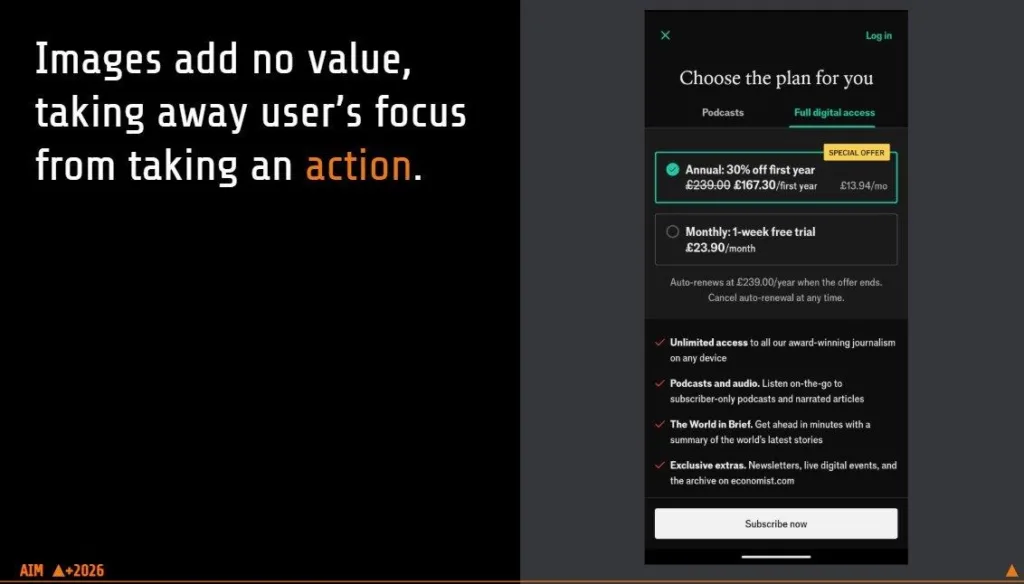
The version with no banner won. The conversion rate on Version B dropped drastically. The image took attention away from the actual decision area. The offer message became more copy-heavy and complex; pricing context became harder to parse at a glance; the displayed prices looked less intuitive, less immediately attractive than before.
So again, simpler outperforms when it comes to lower funnel paywall placements.
The highest CVRs we see with cleaner layouts where the page is mostly just the offer cards. Once the large editorial-style red header is introduced we see sharp decline. That strongly suggests the added hero creative is hurting focus and reducing purchase intent capture.
We used red because it had tested well for us before in other channels and placements. When you download our app and look at the screenshots, we had tested lighter-color versions against red ones, and red performed strongly. We had also just been through a major rebrand, and the agency we brought in pushed us to lean into the brand and use our red everywhere. So we did—but the paywall was not the place for it.
The principle: use your visual assets in the upper funnel, not on the paywall. Images, copy, and design work belong in your entry points, where they drive people towards the paywall. Once a user reaches the paywall, keep it simple: present the plans and the subscribe button, nothing more.
Test 4: Free trial length
The fourth test tackled the most controversial topic of the four: free trials. Plenty of people and studies argue free trials do more harm than good. Others defend them. It’s still a relatively new approach that not many subscription apps use, and when you’re trying to drive revenue, the standard advice runs the other way: run a hard paywall, don’t give your content away, because trials supposedly cost you revenue and retention.
We tested three setups:
- Version A: No trial. Annual and monthly plans only, pay to access.
- Version B: 30-day free trial on the monthly plan.
- Version C: 7-day free trial on the monthly plan.
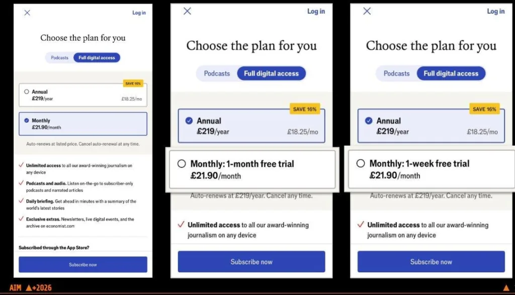
Three trial variants: no trial, 1-month free trial, 1-week free trial
The 30-day free trial won. It outperformed the 7-day trial, which came in second, and “no trial” clearly hurt our conversions.
We were tracking conversion rate, total volume of subscriptions, CLTV, and retention rates. The 30-day free trial drove success across every one of those metrics.
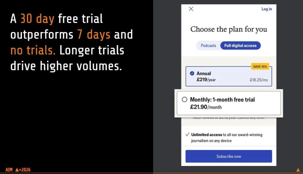
A 30-day free trial outperforms 7 days and no trials. Longer trials drive higher volumes.
When we dug into why, the answer was time. One week wasn’t enough for people to get into the app and consume the news. People are busy. They signed up for the trial, but the seven days passed with no timer reminding them it was ending. The trial lapsed before they had a chance to use the product. The number one reason they gave for cancelling was simply that they did not have time to consume all the content.
A month was enough time. Users spent a weekend on the app, read the news, came back the next week, and built the habit of reading every week. By the end of the trial they could say, “I’ve actually spent a lot of time on this app—I need to resubscribe.” These users also had our highest retention rate.
This might not hold for every app. Our product is very specific. News changes constantly, and we want people on the app to engage by reading, watching videos, listening to audio, or playing games.
Another quote from Apple I like is: “people don’t know what they want until you show it to them”. Introducing the free trial was our way of showing them. All of our content is paywalled, and we don’t run special promotions giving people free access, so the trial became the way to demonstrate why The Economist belongs in your everyday life. The trial is only for new subscribers—once someone has used it, they can’t get another one, even if they resubscribe after the first year.
Much of our marketing focuses on bringing in new, younger users. Around 60% of our downloads come from people who have never had our app and have never heard of The Economist. If you’re a new user who doesn’t yet know what you’re subscribing to, a trial is a strong way to show what the product offers.
There was also a downstream effect we hadn’t expected. The volume of subscriptions and in-app purchases signaled to Apple that people were engaging with and subscribing to the app, and Apple boosted our rankings as a result—so the trial helped our visibility too.
The user habits were interesting to analyze. After the monthly free trial ended, many users moved to an annual subscription. Our mix shifted considerably, and we now drive far more annual subscriptions than monthly ones.
What sales frequency taught us about pricing
A few related points that came up during the Q&A:
On sales frequency. Every year we go through a price rise, and it hurts our conversions. Running more frequent sales has helped win some of those conversions back. The old thinking was that running too many sales too often dilutes the premium brand. But running too few costs you subscriptions. You can see this across the market right now: The New York Times and other large brands run near-constant promotions. That’s why trials sell well during our big seasonal periods. Black Friday is a major one, because people tend to gift and subscribe. New Year is another, driven by the resolution to read more and become smarter.
On discount percentages. Black Friday is consistently 50%; non-peak seasonal moments are lower, around 30%. Any time we run an offer versus no offer, we see roughly a 20% increase in subscriptions.
On copy framing. I was at another conference recently where The New York Times presented. One of their big takeaways from paywall testing was, again, copy. Their headline “Support our journalism” lost them a lot of subscriptions—people said it felt like a guilt trip: “I have to subscribe just to support them.” Copy matters.
Takeaways
To recap the four principles from the tests:
- Creating urgency through countdown timers helps drive conversions. Our optimization work is highly seasonal and tracks big news cycles, which is why creating urgency with sales and countdown timers drives conversions for us. It’s something we’ll keep using for upcoming sales.
- Adding images at checkout results in higher drop-off and lower conversions. Images, videos, or any assets that pull attention away from subscribing caused a major drop-off for us. We lost a lot of subscriptions and conversions during that test, but it was worthwhile learning.
- Increasing trial length lets users engage with your product and build consumption habits. We’ll continue offering free trials so people can test the product and see if it fits.
- Don’t overcomplicate pricing, reduce paywall noise, and keep pricing simple. Be clear about your pricing and what you charge, without burying it under too much information.
The lesson across all four tests is that the paywall rewards testing, often in counterintuitive ways. The constraint is speed: running these experiments in-house is slow and limits how much you can learn. If you have the budget, a dedicated provider that runs A/B tests, delivers clean readouts, and lets you iterate faster is what turns paywall optimization into a reliable engine for subscription growth.
Learn more on web2app funnels, paid UA strategy, and subscription growth on FunnelFox blog.