


Web and app funnels reach fundamentally different people — not just through different channels, but in terms of who they are, what they expect, and how ready they are to buy. That changes everything downstream: how you write ads, how you structure pricing, and how you monetize beyond the first purchase.
Marcus Burke, Meta ads & app growth consultant, sat down with Christian Rotari, Monetization Lead at Zing Coach, who runs the full monetization funnel at one of the more sophisticated fitness apps in the space. They covered pricing, upsells, and retention mechanics for web funnels. Here’s what came out of it.
How web and app funnels differ and why it changes your entire approach
Web and app funnels diverge on three levels:
- who they reach,
- what creative works,
- and what intent users bring when they arrive.
Each of those differences has downstream consequences for how you price, structure, and monetize.
Audience and placement: Same targeting, completely different delivery
Most people think about web vs. app as a monetization decision. In practice, the difference starts earlier — at the ad level, before anyone has clicked anything.
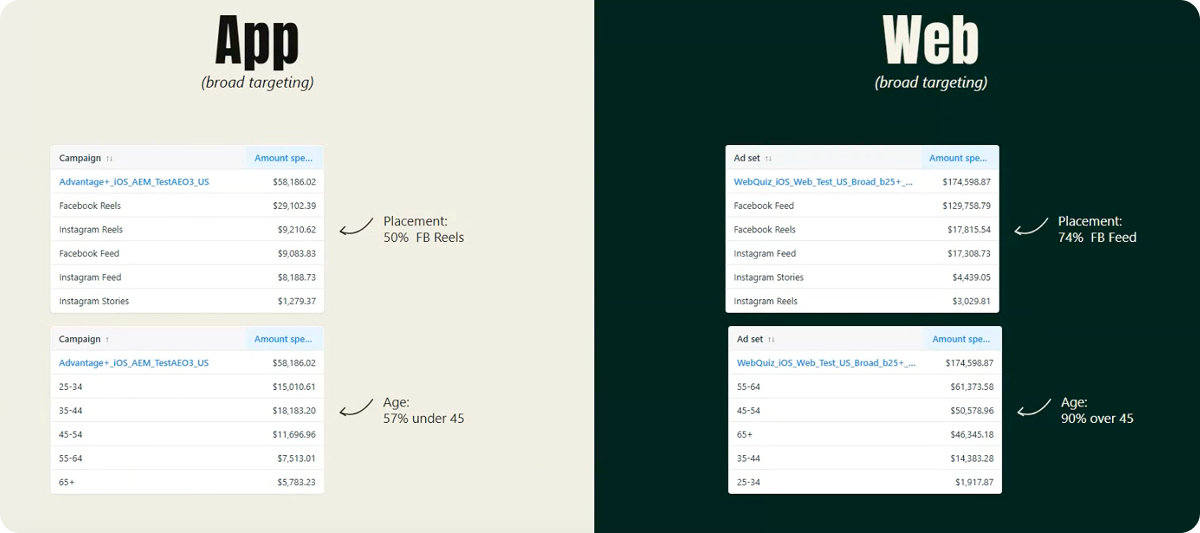
Running the same broad targeting on two campaign types — one sending to a web quiz, one to the App Store — produces completely different delivery:
- App promotion campaigns are video-heavy, so Meta routes them to Reels. The result is a relatively young audience: in this dataset, 57% were under 45.
- Web campaigns flip the picture. Most delivery lands on Facebook Feed — a slower, more static placement that skews older. The CPM can be double what you’d pay on Reels. So before a single user has entered your funnel, you’re already working with a more expensive, older, and generally more qualified audience.
This placement dynamic also explains why web campaigns perform better with static creatives: some advertisers run 60–80% statics, which is also a testing advantage since they are faster and cheaper to produce.
Always target broad — no matter if you’re running app promotion or web. Don’t use hard restrictions on targeting; use your creatives to target instead. If you have two different user buckets you want to reach, put them in separate adsets — otherwise Meta will mush everything together and one ad ends up taking 99% of spend.

Benchmarks: What to expect on web vs. app
The cost and signal dynamics follow directly from the placement difference:
- CPMs: web runs roughly 3x higher than app promotion
- Conversion rate: a competent web funnel converts around 5% of clicks to paid; top performers approach 10%
- App promotion: optimizes for trial starts, where 20%+ is a reasonable benchmark; individual trial events cost around $10–15 in the US
The two models trade off directly:
- App promotion gives you more signal, cheaper.
- Web gives you higher purchase intent but fewer conversion events, which makes creative testing harder — you simply have less data to rate creatives against.
Neither is inherently better; the economics just require different conversion rates to justify the spend.
Creative: Web ads don’t sell the product — they sell the problem
The creative logic for app and web campaigns is almost opposite.
For the app campaign, everything is condensed. You need to communicate what the app is, what it does, and that it’s an app — before someone clicks. The App Store isn’t a great landing page: it looks the same for every advertiser, there’s little room to differentiate beyond screenshots, and there are a lot of exit points. So the ad carries most of the selling weight in the app promotion campaign.
Web ads operate differently:
Your funnel is the extension of your ad, so you can be a lot less intrusive with how hard you’re selling things. Some of the most effective web creatives barely mention the product at all.
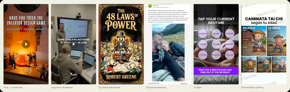
Nibble runs ads hyper-specific by topic — interior design, geopolitics, politics — because on the web, they can build a separate funnel for each. The ad sells the topic; the funnel sells the product.
Deep Stash goes further: their ad is pure content — a visualized book summary — and doesn’t mention the product until 50 seconds in.
Rise runs a simple static: “Tap your current bedtime.” No product mention, just a hook that gets the click.
The pattern across all of these: low-intent entry, high-intent exit. You’re not trying to sell on the first touchpoint. You’re creating just enough curiosity to get someone into the funnel, where the real work happens.
On the web, you create ads for a much lower intent — you’re creating awareness and moving the selling into the funnel. That’s the biggest difference in how you run ads, and the audiences you end up working with.
That low-intent entry point shapes what users expect when they arrive in the funnel and how you need to structure what comes next.
Intent: Web users are problem-aware, not product-aware, and that changes everything
App users arrive product-aware. They’ve navigated to the App Store, found your listing, and chosen to download. The onboarding can be technical and feature-forward, because users expect exactly that.
Web users arrive problem-aware.
When someone lands on a web quiz, they’re not thinking ‘I’m looking for an app to help me sleep better.’ They’re thinking ‘I feel tired all the time.’ They have a problem, not a product in mind.

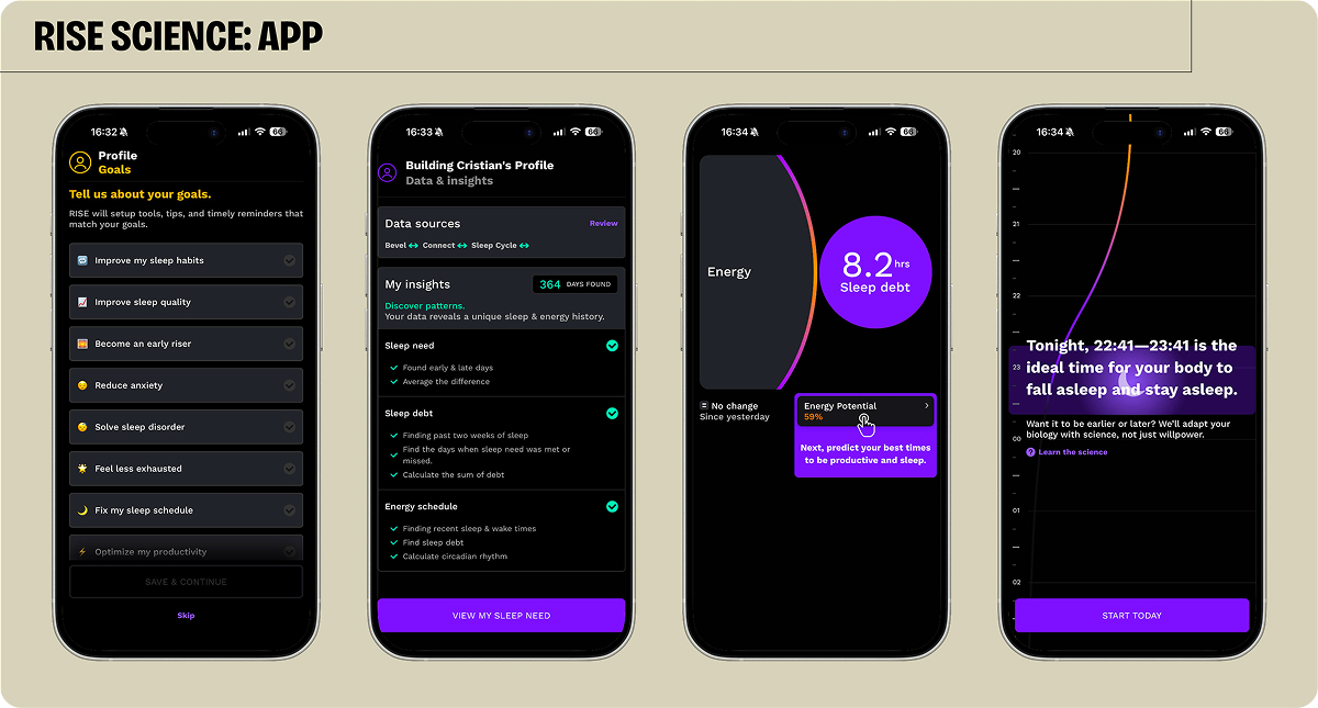
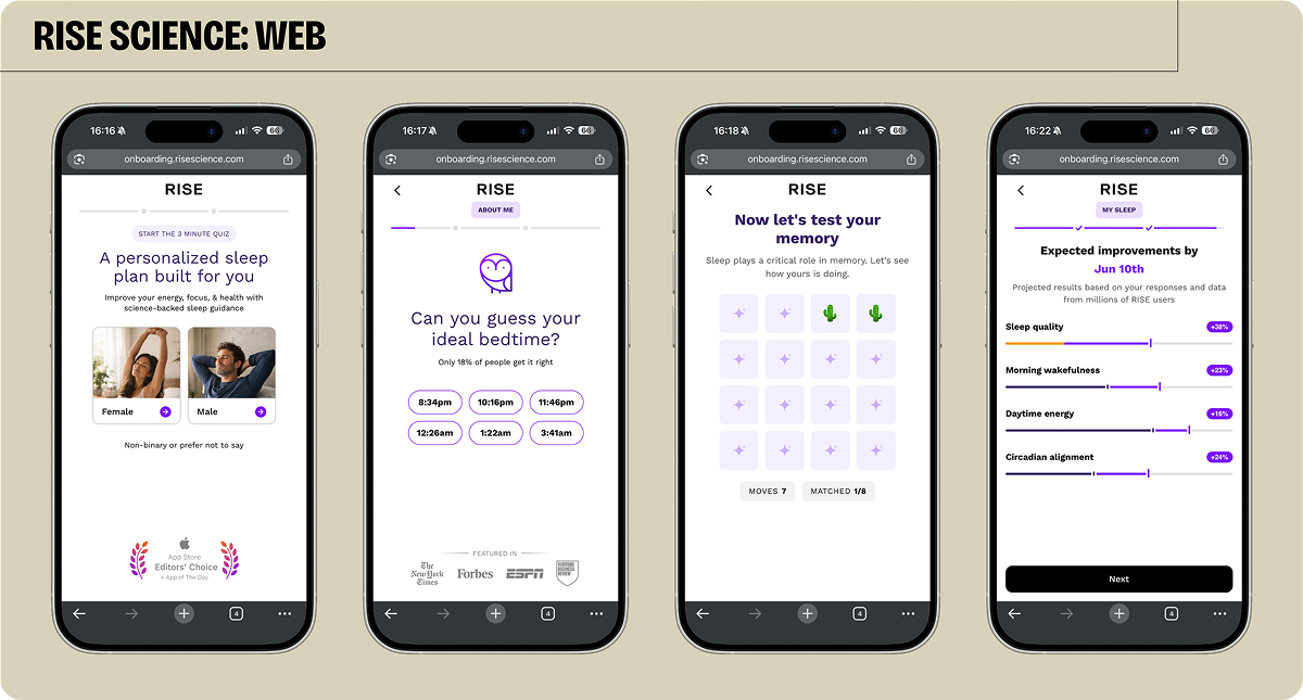
Look at Rise: their app onboarding is detailed and technical — Apple Health, motion tracking, push notifications — built for someone who has consciously decided to track their sleep with an app.
Their web funnel starts with “guess your ideal bedtime,” runs users through memory and reaction-time games to surface the problem, and only then presents a solution. The paywall doesn’t follow a traditional format — it pops up after the plan “loads,” no before/after, no feature list. Just: we’ll fix this, here’s the cost.
The intent gap also affects plan selection.
On the web, users aren’t thinking about subscriptions. They’re thinking about a 12-week plan to lose weight. A yearly subscription feels like a completely different decision.
The implication: build plan duration into the funnel narrative from the start, not just on the paywall.
On first-screen drop-off — roughly 50% is normal — the fix isn’t a better hook, it’s keeping the entry broad. Easy questions first, diagnostic framing, gradual ramp. The goal of the first few screens is intent generation, not conversion.
This logic has limits, though, and doesn’t apply to every product. If the core value proposition is fundamentally app-based — a 3D scanner, a specific hardware integration, a tool where users are explicitly coming to get an app — then routing them through a web quiz creates friction instead of intent.
Web2app works when users arrive with a problem to solve and don’t care how it gets solved. If they already know they want an app, send them to the App Store.
All three of these differences — who shows up, how they got there, and what they’re looking for — feed directly into every monetization decision that follows: whether you need a trial, how to structure your plans, when upsells land, and how to keep users around long enough to see value.
Why web funnels don’t need trials and what to offer instead
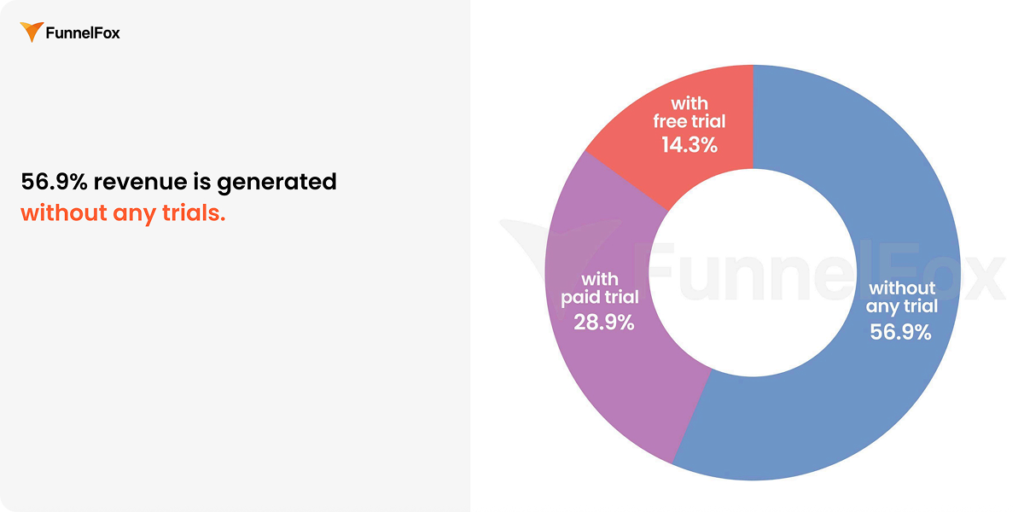
According to the FunnelFox State of Web2App report, 56–57% of web subscription revenue is generated without any trial.
That’s not accidental. Two reasons:
- Psychology. App users expect a trial — the ecosystem has trained them to, and showing up without one generates negative reviews. On the web, that expectation doesn’t exist. A user who just spent time going through a quiz isn’t waiting for a free trial. They’re evaluating whether the plan is worth paying for.
- Signal quality. A free trial on the web generates a conversion event that’s nearly worthless for optimization. The card someone enters to get a free trial may have no funds — they’re giving you access details, not payment intent. On the app, Apple pre-validates payment information. On the web with a free trial, you’re training Meta on users who will never pay.
A direct purchase — even a discounted one — is a fundamentally stronger signal. It tells Meta: this is what a real buyer looks like.
One distinction worth making: intro offers and paid trials aren’t the same thing.
- A paid trial is, for example, $1 for 7 days, then the regular price.
- An intro offer is the first billing period at a significant discount before renewing at full price.
Both can work — the right choice depends on whether you’re optimizing for quick payback or long-term LTV.
On the $1 paid trial specifically:
Most PSPs can validate a card without charging anything, so that $1 isn’t about validation. It’s psychological. Someone who’s willing to pay even a dollar has already made a commitment. That’s a very different signal from a $0 trial, where there’s no friction to just cancel right away.
Pricing ethics: Where the line is
The pricing freedom web funnels give you is real, but it creates genuine risk if misused.
On the app, Apple shows users the full billing breakdown at purchase: what you’re paying now, what it renews to, when.
On the web, that disclosure lives in the small print. Technically, it’s there; in practice, many users don’t read it.
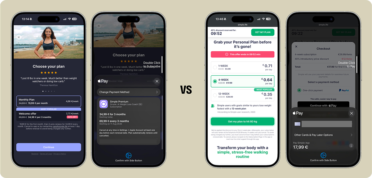
There’s an additional constraint: with Apple Pay via certain PSPs, you can’t surface the second charge amount at checkout at all — the flow can only reflect the first charge.
This creates a situation where steep intro offers — $7 for three months renewing into $99 — are technically compliant but operationally predatory. Users convert, hit the renewal, dispute it. The refund spike comes 12 weeks later. Chargebacks follow.
The sustainable approach: a discount large enough to convert but proportionate enough to retain. And when Apple Pay via certain PSPs won’t let you surface the renewal price at checkout, put it on the paywall instead — the disclosure has to live somewhere in the flow.
$20 into $40 is defensible. A $5 seven-day paid trial converting into a yearly plan works well for early-stage apps that need fast payback signals without the renewal shock problem.
If you can’t build a sustainable web funnel without going gray-hat, something is wrong. The business shouldn’t depend on that.
Once you’ve decided on your pricing model, the next question is how to structure the plans themselves.
How to structure your paywall: Plans, duration, and pricing display
Three plans outperform two in most web funnel contexts, particularly in health, fitness, and education. The standard structure is 1 week / 4 weeks / 12 weeks, or 4 weeks / 12 weeks / 52 weeks.
The logic: different plan lengths serve different intent levels. Someone who converts on weekly is a different user from someone who converts on yearly, and the funnel should accommodate both.
Two-plan setups (monthly + yearly) work in categories where commitment signals are cleaner — productivity tools, some learning apps — but using monthly purely as an anchor to push yearly conversions is unreliable.
As for price per day, it consistently outperforms price per month on the web.
Every time we tested price per month at Zing, it failed. Price per day just works — a dollar a day feels categorically different from $30 a month, even when the math is identical.
This is something Apple doesn’t allow in-app, which is part of why web paywalls can convert differently from app paywalls on the same product.
After the purchase: Upgrades, upsells, and monetizing willingness to pay
Upgrades: Capturing additional intent right after the purchase
Once a user has paid, they’re in a brief window where they’re more likely to make additional purchase decisions. The web lets you use that window. Apple doesn’t.
The mechanic is simple: after a user purchases a shorter plan, present them with an offer to extend.
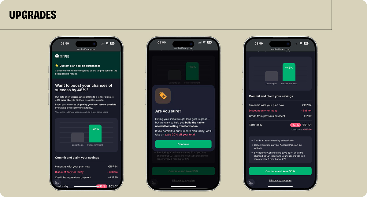
Simple does this well — after a 4-week purchase, they show a screen explaining that the chance of success drops by 46% on a shorter plan, display the equivalent per-month cost of upgrading, and offer an additional discount if the user declines the first offer. Conversion rate on this, when priced correctly, runs around 15–20%.
When you’ve just made a purchase decision, you’re in this dopamine rush and more likely to make more purchase decisions. Web funnels use exactly this — stacking offers right after checkout, just like any apparel store does. Apple doesn’t allow it.
Not every buyer is the right target for an upgrade, though. Simple, for example, doesn’t push weekly plan buyers toward upgrades because a user who paid $5 for a week isn’t the right target for a pitch to commit to a year. The upgrade play is for medium-to-high intent buyers — 4-week or 12-week plans. For weekly buyers, the better play is a different kind of add-on.
Upsells: Adding revenue without raising prices
Upgrades change the plan duration. Upsells add something new — a product or piece of content that sits outside the core subscription. The distinction matters because they serve different intent levels and different audiences.
A supplement guide, a meal plan, a PDF program — none of these is something users expect to be included in a weight loss subscription. That expectation gap is what makes them sellable as add-ons without generating backlash.
At Zing, the supplement guide started with a simple question to existing users: what would help you reach your goals?
Users wanted help navigating the supplements noise, and they weren’t expecting that from their core subscription. That combination of genuine need and low expectation of inclusion is exactly the right condition for an upsell.
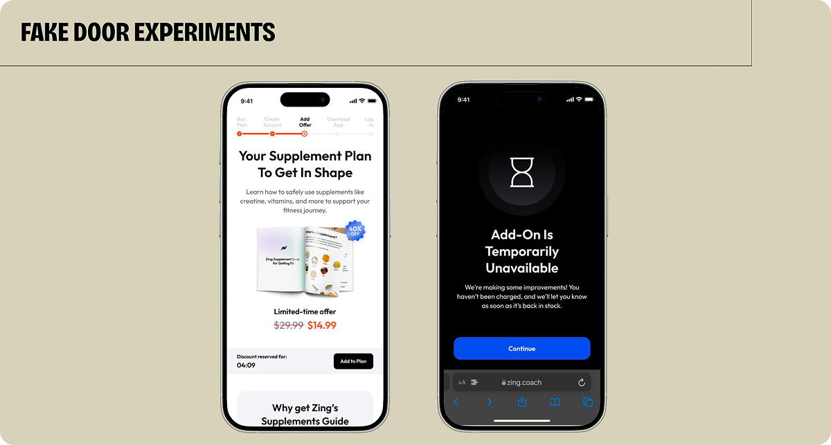
Validation came through a fake door test: same design as existing upsells and “add to my plan” button that didn’t add anything yet, just measured click-through intent. When ~10% clicked, that was enough signal to build. The product launched about 10 days later.
On placement: upsells belong after the main purchase, not before. Bundling add-ons into checkout creates technical complexity — separate price points for every combination — and generates lower conversion anyway. The right sequence is: purchase → account creation → upsell flow. Account creation first ensures users don’t drop out and lose access to what they’ve already paid for.
Whether upsells are necessary depends on your payback target. But if you’re seeing strong intent signals, leaving that revenue on the table is a real cost. At Zing, 40% of yearly plan buyers converted on at least one upsell. The alternative — raising the subscription price — typically reduces conversion. Upsells let you monetize willingness to pay without touching conversion on the core product.
Important: As with any upsell, keep the disclaimer and skip option as visible as the accept button — the mechanics matter here as much as the offer itself.
Delivery is simple: PDF-type products go via email immediately after purchase. Content integrated into the app experience gets delivered there. Either way, delivery should feel immediate — users just paid for something.
Retention and cancellation: How web gives you more control than the App Store
Overall, cancellation rates between web and app are comparable, but when users cancel differs significantly.
On the app, a meaningful share cancel within the first 15 minutes: they convert, then immediately open the App Store as a precaution, before they’ve touched the product. On the web, users tend to cancel later, typically after some experience with what they paid for.
At Zing, this informed a deliberate product decision. Users go through app onboarding, see their first workout, and only then have access to the cancellation portal.
We don’t put a cancel link in the first email — users cancel through the app. They go through onboarding, see their first workout, and only then can they reach the subscription portal. That gives us some time to get users to an aha moment first.
The result is a longer runway to activation before cancellation becomes an option.
Beyond delaying the cancellation window, the web gives you a second layer of control: what happens when a user actually tries to cancel. On the app, you’re largely at Apple’s mercy — cancellation flows are standardized and offers are available only to select publishers. On the web, you decide what to show: a discounted plan, a pause option, an extended free period. Done well, a cancellation flow can save 5–10% of users who would otherwise churn.
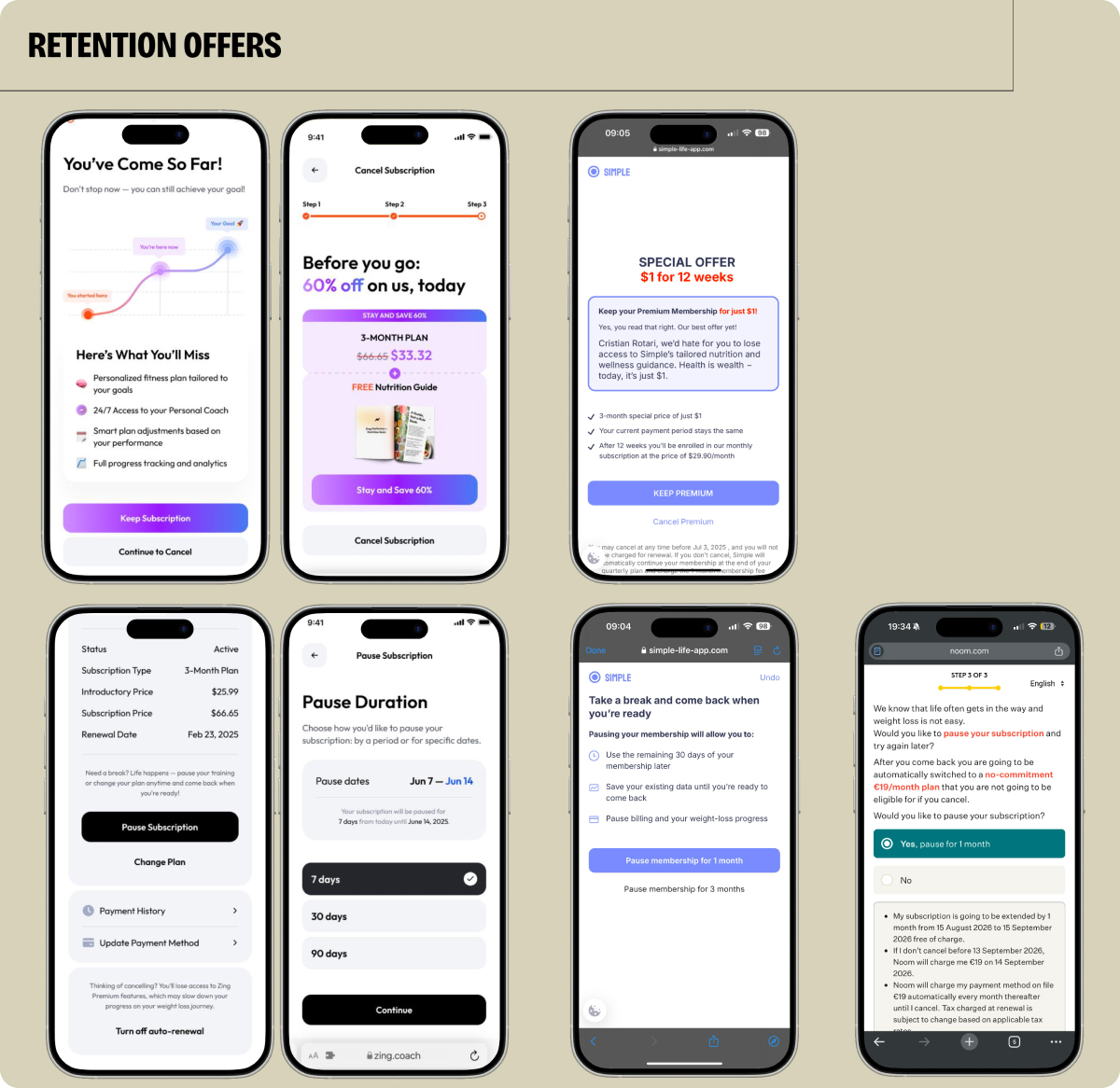
One sequencing detail matters here: the retention offer should come after the user confirms they want to cancel, not before. In the screens above, the first two steps show a win-back offer (‘Before you go: 60% off’) ahead of the actual cancel confirmation — a sequence worth avoiding. The safer flow: let the user complete the cancel request first, then present the offer as a chance to reverse it.
The bottom line
Web2app funnels work because they meet users at an earlier stage of intent — before they’re looking for an app, while they’re still trying to understand their problem. That’s what makes web a fundamentally different system: the funnel has to build awareness and value first, and sell the subscription second.
That difference cascades through everything — creative, pricing, post-purchase mechanics.
Web traffic is more expensive and generates fewer optimization signals, but the users who convert are warmer and more qualified. And once they’ve paid, the web gives you tools the App Store either doesn’t allow or heavily restricts: upgrades immediately after purchase, upsells outside the core subscription, and retention offers at the point of cancellation. Used well, these raise LTV without touching the base subscription price.